4. Measuring wellbeing Working in Python
Download the code
To download the code chunks used in this project, right-click on the download link and select ‘Save Link As…’. You’ll need to save the code download to your working directory, and open it in Python.
Don’t forget to also download the data into your working directory by following the steps in this project.
Python-specific learning objectives
In addition to the learning objectives for this project, in this section you will learn how to convert (‘reshape’) data from wide to long format, and vice versa.
Getting started in Python
Head to the ‘Getting Started in Python’ page for help and advice on setting up a Python session to work with. Remember, you can run any page from this project as a notebook by downloading the relevant file from this repository and running it on your own computer. Alternatively, you can run pages online in your browser over at Binder.
Preliminary settings
Let’s import the packages we’ll need and also configure the settings we want:
import pandas as pd
import matplotlib as mpl
import matplotlib.pyplot as plt
import numpy as np
from pathlib import Path
import pingouin as pg
from skimpy import skim
from lets_plot import *

LetsPlot.setup_html(no_js=True)
Part 4.1 GDP and its components as a measure of material wellbeing
Learning objectives for this part
- Check datasets for missing data.
- Sort data and assign ranks based on values.
- Distinguish between time series and cross-sectional data, and plot appropriate charts for each type of data.
The GDP data we will look at is from the United Nations’ National Accounts Main Aggregates Database, which contains estimates of total GDP and its components for all countries over the period 1970 to present. We will look at how GDP and its components have changed over time, and investigate the usefulness of GDP per capita as a measure of wellbeing.
To answer the questions below, download the data and make sure you understand how the measure of total GDP is constructed.
- Go to the United Nations’ National Accounts Main Aggregates Database website.
- Under the subheading ‘GDP and its breakdown at constant 2015 prices in US Dollars’, select the Excel file ‘All countries for all years – sorted alphabetically’.
- Save it in a subfolder of the directory you are coding in such that the relative path is
data/Download-GDPconstant-USD-countries.xlsx.
Python walk-through 4.1 Importing the Excel file (
.xlsxor.xlsformat) into PythonFirst, make sure you move the saved data to a folder called
datathat is a subfolder of your working directory. The working directory is the folder that your code ‘starts’ in, and the one that you open when you start Visual Studio Code. Let’s say you called itcore, then the file and folder structure of your working directory would look like this:📁 core │──📁data └──Download-GDPconstant-USD-all.xlsx │──empirical_project_4.pyThis is similar to what you should see in Visual Studio Code under the explorer tab (although the working directory,
core, won’t appear). You can check your working directory by running the following lines of code in Visual Studio Code:import os os.getcwd()Before importing the file into Python, open the file in Excel, OpenOffice, LibreOffice, or Numbers to see how the data is organized in the spreadsheet, and note the following:
- There is a heading that we don’t need, followed by a blank row.
- The data we need starts on row three.
Using this knowledge, we can import the data using the
Pathmodule to create the path to the data:df = pd.read_excel("data/Download-GDPconstant-USD-countries.xlsx", skiprows=2) df.head()
Area/CountryID Area/Country IndicatorName 1970 1971 1972 1973 1974 1975 1976 ... 2010 2011 2012 2013 2014 2015 2016 2017 2018 2019 0 1 World Final consumption expenditure 1.407658e+13 1.471021e+13 1.547790e+13 1.624870e+13 1.658903e+13 1.717994e+13 1.791836e+13 ... 4.875022e+13 5.005980e+13 5.126395e+13 5.255100e+13 5.387176e+13 5.538710e+13 5.690357e+13 5.859288e+13 6.035363e+13 6.185429e+13 1 1 World Household consumption expenditure (including N... 1.035693e+13 1.084386e+13 1.147363e+13 1.210090e+13 1.227802e+13 1.264545e+13 1.323398e+13 ... 3.738964e+13 3.848842e+13 3.948548e+13 4.055752e+13 4.163991e+13 4.286196e+13 4.407794e+13 4.546361e+13 4.682931e+13 4.793928e+13 2 1 World General government final consumption expenditure 3.716902e+12 3.860622e+12 3.996625e+12 4.138637e+12 4.305327e+12 4.531862e+12 4.682747e+12 ... 1.135533e+13 1.156536e+13 1.176947e+13 1.198689e+13 1.222256e+13 1.251001e+13 1.280957e+13 1.310784e+13 1.350042e+13 1.389068e+13 3 1 World Gross capital formation 4.498515e+12 4.622966e+12 4.840791e+12 5.303193e+12 5.406454e+12 5.143859e+12 5.640857e+12 ... 1.588746e+13 1.685123e+13 1.742526e+13 1.803677e+13 1.874605e+13 1.933678e+13 1.974630e+13 2.073245e+13 2.157186e+13 2.203811e+13 4 1 World Gross fixed capital formation (including Acqui... 4.155661e+12 4.364629e+12 4.617120e+12 4.984883e+12 4.942678e+12 4.957705e+12 5.280600e+12 ... 1.523050e+13 1.607289e+13 1.683424e+13 1.744210e+13 1.810611e+13 1.874677e+13 1.928192e+13 2.008485e+13 2.095530e+13 2.154916e+13
- You can see from the tab ‘Download-GDPconstant-USD-countr’ that some countries have missing data for some of the years. Data may be missing due to political reasons (for example, countries formed after 1970) or data availability issues.
- Make and fill a frequency table similar to Figure 4.1, showing the number of years that data is available for each country in the category ‘Final consumption expenditure’.
- How many countries have data for the entire period (1970 to the latest year available)? Do you think that missing data is a serious issue in this case?
| Country | Number of years of GDP data |
|---|---|
Figure 4.1 Number of years of GDP data available for each country.
Python walk-through 4.2 Making a frequency table
We want to create a table showing how many years of
Final consumption expendituredata are available for each country.Looking at the dataset’s current format, you can see that countries and indicators (for example,
AfghanistanandFinal consumption expenditure) are row variables, while year is the column variable. This data is organized in ‘wide’ format (each individual’s information is in a single row).For many data operations and making charts it is more convenient to have indicators as column variables, so we would like
Final consumption expenditureto be a column variable, and year to be the row variable. Each observation would represent the value of an indicator for a particular country and year. This data is organized in ‘long’ format (each individual’s information is in multiple rows). This is also called ‘tidy’ data and it can be recognised by having one variable per column and one observation per row. Many data scientists consider it good practice to keep data in tidy format.To change data from wide to long format, we use the
pd.meltmethod. Themeltmethod is very powerful and useful, as you will find many large datasets are in wide format. In this case,pd.melttakes the data from all columns not specified as beingid_vars(via a list of column names), and uses them to create two new columns: one contains the name of the row variable created from the former column names, which is the year here; we can set that new column’s name withvar_name="year". The second new column contains the values that were in the columns we unpivoted and is automatically given the namevalue. (We could have set a new name for this column by passingvalue_name=, too.)Compare
df_longto the widerdfto understand how themeltcommand works. To learn more about organizing data in Python, read the Working with Data section of ‘Coding for Economists’.df_long = pd.melt( df, id_vars=["CountryID", "Country", "IndicatorName"], var_name="year" ) df_long.head()
Area/CountryID Area/Country IndicatorName year value 0 1 World Final consumption expenditure 1970 1.407658e+13 1 1 World Household consumption expenditure (including N... 1970 1.035693e+13 2 1 World General government final consumption expenditure 1970 3.716902e+12 3 1 World Gross capital formation 1970 4.498515e+12 4 1 World Gross fixed capital formation (including Acqui... 1970 4.155661e+12 To create the required table, we only need the
Final consumption expenditureof each country, which we extract using the.locfunction. We’d like all columns, so we pass the condition in the first position of.locand leave the second entry as:to indicate that we want all columns.cons = df_long.loc[df_long["IndicatorName"] == "Final consumption expenditure", :]Now let’s use
countto create our table.year_count = cons.groupby("Country").count() year_count
CountryID IndicatorName year value Country Afghanistan 52 52 52 52 Albania 52 52 52 52 Algeria 52 52 52 52 Andorra 52 52 52 52 Angola 52 52 52 52 ... ... ... ... ... Yemen Democratic (Former) 52 52 52 21 Yugoslavia (Former) 52 52 52 21 Zambia 52 52 52 52 Zanzibar 52 52 52 32 Zimbabwe 52 52 52 52 This code created a new column called
valuethat counts the number of available years of GDP data for each country.Now we can establish how many of the 220 countries and areas in the dataset have complete information. A dataset is complete if it has the maximum number of available observations (given by
year_count["available_years"].max()).sum(year_count["value"] == year_count["value"].max())179In this case, the full set of data is available for 179 out of 220 countries and areas.
If you add up the data on the right-hand side of this equation, you may find that it does not add up to the reported GDP value. The UN notes this discrepancy in Section J, item 17 of the ‘Methodology for the national accounts’: ‘The sums of components in the tables may not necessarily add up to totals shown because of rounding’.
There are three different ways in which countries calculate GDP for their national accounts, but we will focus on the expenditure approach, which calculates gross domestic product (GDP) as:
\[\begin{align*} \text{GDP} &= \text{Household consumption expenditure} \\ &+ \text{General government final consumption expenditure} \\ &+ \text{Gross capital formation} \\ &+ \text{(Exports of goods and services − imports of goods and services)} \end{align*}\]Gross capital formation refers to the creation of fixed assets in the economy (such as the construction of buildings, roads, and new machinery) and changes in inventories (stocks of goods held by firms).
- Rather than looking at exports and imports separately, we usually look at the difference between them (exports minus imports), also known as net exports. Choose three countries that have GDP data over the entire period (1970 to the latest year available). For each country, create a variable that shows the values of net exports in each year.
Python walk-through 4.3 Creating new variables
We will use Brazil, the US, and China as examples.
Before we select these three countries, we will calculate the net exports (exports minus imports) for all countries, as we need that information in Python walk-through 4.4. We will also shorten the names of the variables we need, to make the code easier to read. We will use a dictionary to map names into shorter formats. A dictionary is a built-in object type in Python and always has the structure
{key1: value1, key2: value2, ...}where the keys and values could have any type (e.g. string, integer, dataframe). In our case, both keys and values will be strings. We will use a convention for our naming that is known as ‘snake case’. This means we use all lowercase words with spaces replaced by underscores (it looks a bit like a snake!). There are packages that will auto-rename long variables for you, but let’s see how to do it manually here.short_names_dict = { "Final consumption expenditure": "final_expenditure", "Household consumption expenditure (including Non-profit institutions serving households)": "hh_expenditure", "General government final consumption expenditure": "gov_expenditure", "Gross capital formation": "capital", "Imports of goods and services": "imports", "Exports of goods and services": "exports", } # rename these values df_long["IndicatorName"] = df_long["IndicatorName"].replace(short_names_dict)
df_longstill has several rows for a particular country and year (one for each indicator). We will reshape this data using the.pivotmethod to ensure that we have only one row per country/area and per year. Note thatpivotpreserves the list of columns we pass as theindex=and pivots (transposes/reshapes) the columns we pass tocolumns=so that they are wide.df_table = df_long.pivot( index=["CountryID", "Country", "year"], columns=["IndicatorName"] ) df_table.head()
value IndicatorName Agriculture, hunting, forestry, fishing (ISIC A-B) Changes in inventories Construction (ISIC F) Gross Domestic Product (GDP) Gross fixed capital formation (including Acquisitions less disposals of valuables) Manufacturing (ISIC D) Mining, Manufacturing, Utilities (ISIC C-E) Other Activities (ISIC J-P) Total Value Added Transport, storage and communication (ISIC I) Wholesale, retail trade, restaurants and hotels (ISIC G-H) capital exports final_expenditure gov_expenditure hh_expenditure imports CountryID Country year 4 Afghanistan 1970 7.797721e+09 NaN 4.829657e+07 1.046759e+10 1.653901e+09 1.027537e+09 1.029146e+09 4.318674e+08 9.969872e+09 2.634881e+08 4.298280e+08 1.654637e+09 1.546737e+08 3.068715e+09 3.288787e+08 2.734161e+09 1.622465e+08 1971 7.499719e+09 NaN 4.829657e+07 1.043873e+10 1.764161e+09 1.077057e+09 1.077777e+09 3.923603e+08 9.620515e+09 2.393842e+08 3.905074e+08 1.764946e+09 1.997868e+08 2.957075e+09 3.375334e+08 2.614420e+09 2.367204e+08 1972 7.191561e+09 NaN 5.027363e+07 9.101517e+09 1.543641e+09 1.127088e+09 1.127731e+09 3.806628e+08 9.336689e+09 2.322475e+08 3.788652e+08 1.615795e+09 2.420059e+08 2.886788e+09 3.530078e+08 2.529175e+09 2.478413e+08 1973 7.530719e+09 NaN 5.676967e+07 8.917725e+09 1.543641e+09 1.177119e+09 1.179560e+09 4.367777e+08 9.878990e+09 2.664839e+08 4.347151e+08 1.566079e+09 3.011881e+08 3.100416e+09 3.704164e+08 2.724908e+09 2.592801e+08 1974 7.854370e+09 NaN 5.846427e+07 9.354451e+09 1.984681e+09 1.281825e+09 1.285003e+09 4.726411e+08 1.043700e+10 3.220254e+08 4.717595e+08 1.914097e+09 4.078667e+08 3.328662e+09 3.810549e+08 2.941860e+09 3.587346e+08 Note that
df_longpreviously had information in five columns:CountryID,Country,IndicatorName,year, andvalue.CountryID,Country, andyearare still columns indf_table, as we declared them as theindexof the new dataframe. The unique values ofIndicatorNamehave now become their own variables (columns), filled in with data from thevaluecolumn. That last column was not mentioned in the previous line of code (it was clear topandaswhat had been left out) but it is the values of that column that now appear in the body of thedf_tabledataframe. See what happens if you leave two of the original columns unmentioned, for instance takeyearout of the index list. You should find that you get an error message because it is then ambiguous as to how to createdf_tablefromdf_long.Now we create a
net_exportscolumn based on the existing columns (exports - imports), and we know that this will be a unique country–year combination for each row. First we need to drop the top level of the column index, which is currently calledvalue: we don’t need this any more. Doing so will allow us to access theexportsandimportscolumns directly. We’ll also reset the index to row numbers rather than those three columns we used in the pivot. We’ll also remove the name of the columns as we won’t need that any longer.df_table.columns = df_table.columns.droplevel() df_table = df_table.reset_index() df_table.columns.name = "" df_table["net_exports"] = df_table["exports"] - df_table["imports"]Let us select our three chosen countries to check that we calculated net exports correctly.
sel_countries = ["Brazil", "United States", "China"]
cols_to_keep = ["Country", "year", "exports", "imports", "net_exports"]


df_sel_un = df_table.loc[df_table["Country"].isin(sel_countries), cols_to_keep]
df_sel_un.head()
Country year exports imports net_exports 1092 Brazil 1970 1.081500e+10 1.961365e+10 −8.798644e+09 1093 Brazil 1971 1.141087e+10 2.347561e+10 −1.206475e+10 1094 Brazil 1972 1.416813e+10 2.820028e+10 −1.403215e+10 1095 Brazil 1973 1.618776e+10 3.395635e+10 −1.776859e+10 1096 Brazil 1974 1.656551e+10 4.354633e+10 −2.698082e+10
Now we will create charts to show the GDP components in order to look for general patterns over time and make comparisons between countries.
- Evaluate the components over time, for two countries of your choice.
- Create a new row for each of the four components of GDP (Household consumption expenditure, General government final consumption expenditure, Gross capital formation, Net exports). To make the charts easier to read, convert the values into billions (for example, 4.38 billion instead of 4,378,772,008). Round your values to two decimal places.
- Plot a separate line chart for each country, showing the value of the four components of GDP on the vertical axis and time (the years 1970–Present) on the horizontal. (Use more than one line chart per country if necessary, to show the data more clearly). Name each component in the chart legend appropriately.
- Which of the components would you expect to move together (increasing or decreasing together) or move in opposite directions, and why? Using your charts from Question 3(a), describe any patterns you find in the relationship between the components. Does the data support your hypothesis about the behaviour of the components?
- For each country, describe any patterns you find in the movement of components over time. Which factors could explain the patterns that you find within countries, and any differences between countries (for example, economic or political events)? You may find it helpful to research the history of the countries you have chosen.
- Extension: For one country, add data labels to your chart to indicate the relevant events that happened in that year.
Python walk-through 4.4 Plotting and annotating time series data
Extract the relevant data
We will work with the
df_longdataset, as the long format is well suited to produce charts with thelets_plotpackage. In this example, we use the US and China (which we will now save as the dataframecomp).# take a copy of df_long that just has data for the US and China comp = df_long.loc[df_long["Country"].isin(["United States", "China"]), :].copy() # Convert value to billion USD comp["value"] = comp["value"] / 1.0e9 # Filter down to certain cols and values comp = comp.loc[ comp["IndicatorName"].isin( ["gov_expenditure", "hh_expenditure", "capital", "imports", "exports"] ), ["Country", "year", "IndicatorName", "value"], ] comp.head()
Country year IndicatorName value 675 China 1970 hh_expenditure 136.272429 676 China 1970 gov_expenditure 28.925787 677 China 1970 capital 76.821414 680 China 1970 exports 5.240282 681 China 1970 imports 5.603186 Plot a line chart
We can now plot this data using the
lets_plotdata visualization library. We’ll plot the US data first.( ggplot( comp.loc[comp["Country"] == "United States", :], aes( x="year", y="value", color="IndicatorName", linetype="IndicatorName", ), ) + geom_line(size=1) )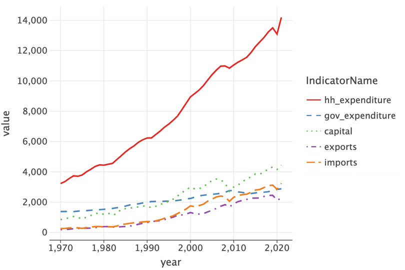
![The US’s GDP components (expenditure approach).]()
Figure 4.2 The US’s GDP components (expenditure approach).
There are plenty of problems with this chart:
- The vertical axis label is uninformative.
- There is no chart title.
- The vertical axis dips below zero (even though the data can’t take on negative values).
- The legend is uninformative.
To improve this chart, we add features to the figure by creating the axis,
ax, explicitly. We’ll also use a trick where we invert the dictionary from earlier and use this to supply full names to the legend via a new ‘indicator’ column.In Python walk-through 4.3, we had a dictionary,
short_names_dict, that mapped the long names, such asFinal consumption expenditure, into short names, such asfinal_expenditure. To make our plot, we’d like to reverse this so that the long names are used in the legend instead of the short names. The first line of code reverses the dictionary—you don’t need to understand the details of the code, just know that it’s an inversion so thatfinal_expendituremaps intoFinal consumption expenditureand so on.# reverse the dictionary from earlier rev_name_dict = {v: k.split("(")[0] for k, v in short_names_dict.items()} # create a new col with the original names comp["Indicator"] = comp["IndicatorName"].replace(rev_name_dict) ( ggplot( comp.loc[comp["Country"] == "United States", :], aes(x="year", y="value", color="Indicator", linetype="Indicator"), ) + geom_line(size=2) + labs( y="USD ($Billions)", x="Year", title="GDP components over time", color="Indicator", ) + ggsize(800, 500) + scale_x_continuous(format="d") )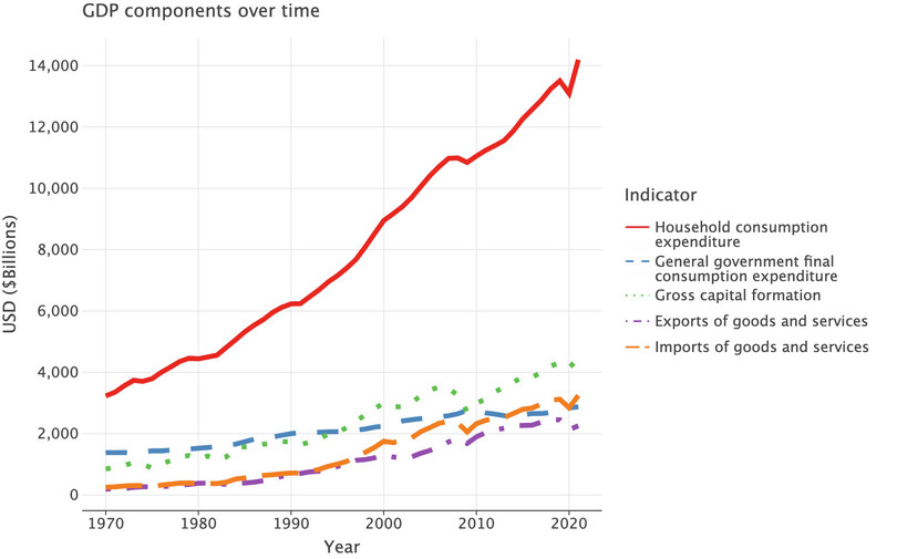
![The US’s GDP components (expenditure approach), amended chart.]()
Figure 4.3 The US’s GDP components (expenditure approach), amended chart.
We can make a chart for more than one country simultaneously using
comprather than just a subset ofcomp.( ggplot(comp, aes(x="year", y="value", color="Indicator", linetype="Indicator")) + geom_line(size=2) + labs( y="USD ($Billions)", x="Year", title="GDP components over time", color="Indicator", ) + ggsize(1000, 500) + scale_x_continuous(format="d") + facet_wrap(facets="Country", ncol=2) )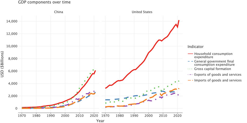
![GDP components over time (China and the US).]()
Figure 4.4 GDP components over time (China and the US).
- Another way to visualize the GDP data is to look at each component as a proportion of total GDP. Use the same countries that you chose for Question 3.
- For each country used in Question 3, create a new column showing the proportion of each component of total GDP (in other words, as a value ranging from 0 to 1). (Hint: to calculate the proportion of a component, divide the value of that component by the sum of all four components.)
- Plot a separate line chart for each country, showing the proportion of the component of GDP on the vertical axis and time (the years 1970 to the latest year available) on the horizontal axis.
- Describe any patterns in the proportion of spending over time for each country, and compare these patterns across countries.
- Compared to the charts in Question 3, what are some advantages of this method for making comparisons over time and between countries?
Python walk-through 4.5 Calculating new variables and plotting time series data
Calculate proportion of total GDP
We will use the
compdataset created in Python walk-through 4.4. First we will calculate net exports, as that contributes to GDP. As the data is currently in long format, we will reshape the data into wide format so that the variables we need are in separate columns instead of separate rows (using thepivotmethod, as in Python walk-through 4.3), calculate net exports, then transform the data back into long format using themeltmethod.We’ll end up dropping the indicator names, and dropping the top level
value:comp_wide = comp.drop("Indicator", axis=1).pivot( index=["Country", "year"], columns="IndicatorName" ) comp_wide.columns = comp_wide.columns.droplevel() comp_wide = comp_wide.reset_index() comp_wide.head()
IndicatorName Country year capital exports gov_expenditure hh_expenditure imports 0 China 1970 76.821414 5.240282 28.925787 136.272429 5.603186 1 China 1971 83.888985 6.274381 33.929948 141.980944 5.609614 2 China 1972 80.281758 7.587016 35.626445 149.603204 6.824620 3 China 1973 91.842331 10.690313 36.481480 160.172298 10.578897 4 China 1974 94.781286 12.711351 39.181109 163.443553 14.701894 To figure out what
.droplevel()and.reset_index()do, you should comment out each of the two lines in turn and re-run the block of code to see what difference these lines make.Add a new column called
net_exports(exports minus imports):comp_wide["net_exports"] = comp_wide["exports"] - comp_wide["imports"] comp_wide.head()
IndicatorName Country year capital exports gov_expenditure hh_expenditure imports net_exports 0 China 1970 76.821414 5.240282 28.925787 136.272429 5.603186 -0.362903 1 China 1971 83.888985 6.274381 33.929948 141.980944 5.609614 0.664767 2 China 1972 80.281758 7.587016 35.626445 149.603204 6.824620 0.762396 3 China 1973 91.842331 10.690313 36.481480 160.172298 10.578897 0.111416 4 China 1974 94.781286 12.711351 39.181109 163.443553 14.701894 -1.990543 We create another dataframe called
comp2which returnscomp_wideto long format with the household expenditure, capital, and net export variables:comp2 = pd.melt( comp_wide.drop(["exports", "imports"], axis=1), id_vars=["year", "Country"], var_name="indicator", value_name="2015_bn_usd", ) comp2.head()
year Country indicator 2015_bn_usd 0 1970 China capital 76.821414 1 1971 China capital 83.888985 2 1972 China capital 80.281758 3 1973 China capital 91.842331 4 1974 China capital 94.781286 Now we will create a new dataframe (
props) that also contains the proportions for each GDP component (proportion), using method chaining to link functions together.props = comp2.assign( proportion=comp2.groupby(["Country", "year"])["2015_bn_usd"].transform( lambda x: x / x.sum() ) )In words, we did the following: Take the
comp2dataframe and add in a new column calledproportion(.assign(proportion=) that, within area and year groups (.groupby(["Country", "year"])) takes the value (["2015_bn_usd"]) and divides it by the total value for that group (.transform(lambda x: x/x.sum())). For example, the first row gives capital as a proportion of GDP for China in 1970.The result is then saved in
props. Look at thepropsdataframe to confirm that the above command has achieved the desired result. (You can check the answer withprops.groupby(["Country", "year"])["proportion"].sum().)Plot a line chart
Now we redo the line chart from Python walk-through 4.4 using the variable
props.# Update dictionary for net exports, which is new rev_name_dict.update({"net_exports": "Net exports"}) props["Component"] = props["indicator"].map(rev_name_dict) ( ggplot( props, aes(x="year", y="proportion", color="Component", linetype="Component") ) + labs( y="Proportion", x="Year", ) + geom_line(size=2) + facet_wrap(facets="Country", ncol=2) )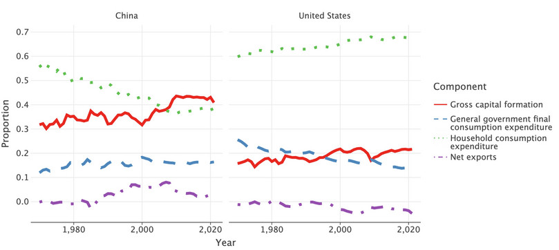
![GDP component proportions over time (China and the US).]()
Figure 4.5 GDP component proportions over time (China and the US).
- time series data
- A time series is a set of time-ordered observations of a variable taken at successive, in most cases regular, periods or points of time. Example: The population of a particular country in the years 1990, 1991, 1992, … , 2015 is time series data.
- cross-sectional data
- Data that is collected from participants at one point in time or within a relatively short time frame. In contrast, time series data refers to data collected by following an individual (or firm, country, etc.) over a course of time. Example: Data on degree courses taken by all the students in a particular university in 2016 is considered cross-sectional data. In contrast, data on degree courses taken by all students in a particular university from 1990 to 2016 is considered time series data.
So far, we have done comparisons of time series data, which is a collection of values for the same variables and subjects, taken at different points in time (for example, GDP of a particular country, measured each year). We will now make some charts using cross-sectional data, which is a collection of values for the same variables for different subjects, usually taken at the same time.
- Choose three developed countries, three countries in economic transition, and three developing countries (for a list of these countries, see Tables A–C in the UN country classification document).
- For each country, calculate each component as a proportion of GDP for the year 2015 only.
- Now create a stacked bar chart that shows the composition of GDP in 2015 on the horizontal axis, and country on the vertical axis. Arrange the columns so that the countries in a particular category are grouped together. (See the walk-through in Figure 3.8 of Economy, Society, and Public Policy for an example of what your chart should look like.)
- Describe the differences (if any) between the spending patterns of developed, economic transition, and developing countries.
Python walk-through 4.6 Creating stacked bar charts
Calculate proportion of total GDP
This walk-through uses the following countries (selected for purposes of illustration):
- developed countries: Germany, Japan, United States
- transition countries: Albania, Russian Federation, Ukraine
- developing countries: Brazil, China, India.
The relevant data are still in the
dfdataframe. Before we select these countries, we first calculate the required proportions for all countries for capital, final expenditure, and net exports (out of those columns).columns_to_track = ["capital", "final_expenditure", "net_exports"] countries_to_use = [ "Germany", "Japan", "United States", "Albania", "Russian Federation", "Ukraine", "Brazil", "China", "India", ] # Find the proportions for these columns and create new columns called "prop_" + original col name for col in columns_to_track: df_table["prop_" + col] = df_table[col].divide( df_table[columns_to_track].sum(axis=1) ) # filter this down to 2015 for the countries and cols we want cols_to_keep = ["prop_" + col for col in columns_to_track] + ["Country", "year"] df_2015 = df_table.loc[ (df_table["Country"].isin(countries_to_use)) & (df_table["year"] == 2015), cols_to_keep, ] df_2015.head()
prop_capital prop_final_expenditure prop_net_exports Country year 97 0.257269 0.914777 −0.172046 Albania 2015 1137 0.174116 0.837416 −0.011532 Brazil 2015 2073 0.430328 0.537384 0.032288 China 2015 3737 0.197429 0.726618 0.075953 Germany 2015 4465 0.323575 0.699562 −0.023138 India 2015 Plot a stacked bar chart
Now let’s create the bar chart. First we need to
meltthe data into a format where each row is an observation, each column a variable.df_2015_melt = pd.melt( df_2015, id_vars=["Country", "year"], value_name="Proportion", var_name=["Component"], ) df_2015_melt["Per cent"] = df_2015_melt["Proportion"] * 100 # Create the bar chart ( ggplot(df_2015_melt, aes(x="Country", y="Per cent", fill="Component")) + geom_bar(stat="identity") + coord_flip() + labs(fill="Components of GDP") )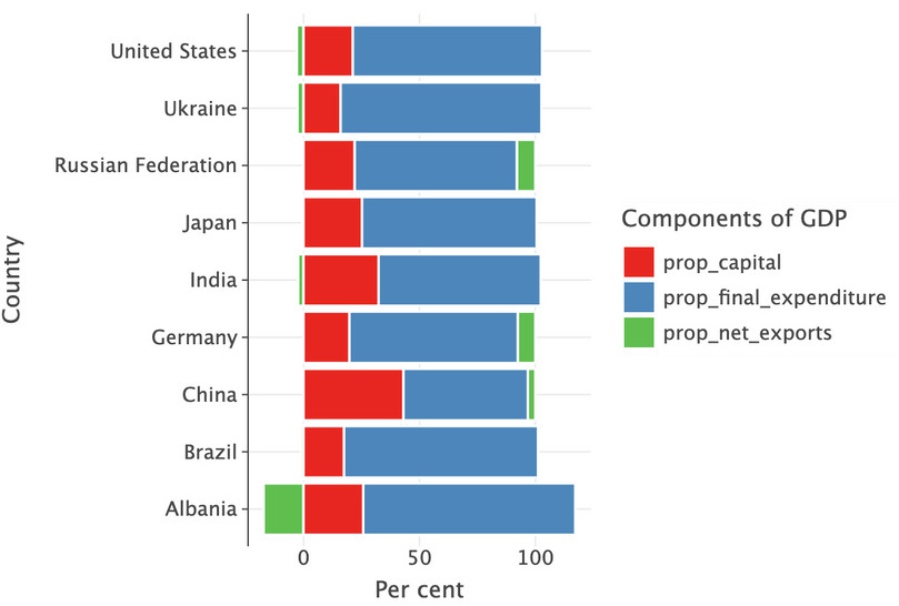
![GDP component proportions in 2015.]()
Figure 4.6 GDP component proportions in 2015.
Note that even when a country has a trade deficit (proportion of net exports less than 0), the proportions will add up to 1, but the proportions of final expenditure and capital will add up to more than 1.
-
GDP per capita is often used to indicate material wellbeing instead of GDP, because it accounts for differences in population across countries. Refer to the following articles to help you to answer the questions:
- ‘The Economics of Well-being’ in the Harvard Business Review
- ‘Statistical Insights: What does GDP per capita tell us about households’ material well-being?’ in the OECD Insights.
- Discuss the usefulness and limitations of GDP per capita as a measure of material wellbeing.
- Based on the arguments in the articles, do you think GDP per capita is an appropriate measure of both material wellbeing and overall wellbeing? Why or why not?
Part 4.2 The HDI as a measure of wellbeing
Learning objectives for this part
- Sort data and assign ranks based on values.
- Distinguish between time series and cross-sectional data, and plot appropriate charts for each type of data.
- Calculate the geometric mean and explain how it differs from the arithmetic mean.
- Construct indices using the geometric mean, and use index values to rank observations.
- Explain the difference between two measures of wellbeing (GDP per capita and the Human Development Index).
In Part 4.1, we looked at GDP per capita as a measure of material wellbeing. While income has a major influence on wellbeing because it allows us to buy the goods and services we need or enjoy, it is not the only determinant of wellbeing. Many aspects of our wellbeing cannot be bought, for example, good health or having more time to spend with friends and family.
We are now going to look at the Human Development Index (HDI), a measure of wellbeing that includes non-material aspects, and make comparisons with GDP per capita (a measure of material wellbeing). GDP per capita is a simple index calculated as the sum of its elements, whereas the HDI is more complex. Instead of using different types of expenditure or output to measure wellbeing or living standards, the HDI consists of three dimensions associated with wellbeing:
- a long and healthy life (health)
- knowledge (education)
- a decent standard of living (income).
We will first learn about how the HDI is constructed, and then use this method to construct indices of wellbeing according to criteria of our choice.
The HDI data we will look at is from the Human Development Report by the United Nations Development Programme (UNDP). To answer the questions below, download the data and technical notes from the report:
- Go to the UNDP’s website.
- Click ‘Table 1: Human Development Index and its components’ to download the HDI data as an Excel file.
- Save the file in an easily accessible location, and make sure to give it a suitable name.
- The ‘Technical notes’ give a diagrammatic presentation of how the HDI is constructed from four indicators.
- Refer to the technical notes and the spreadsheet you have downloaded. For each indicator, explain whether you think it is a good measure of the dimension, and suggest alternative indicators, if any. (For example, is GNI per capita a good measure of the dimension ‘a decent standard of living’?)
- Figure 4.7 shows the minimum and maximum values for each indicator. Discuss whether you think these are reasonable. (You can read the justification for these values in the technical notes.)
| Dimension | Indicator | Minimum | Maximum |
|---|---|---|---|
| Health | Life expectancy (years) | 20 | 85 |
| Education | Expected years of schooling (years) | 0 | 18 |
| Mean years of schooling (years) | 0 | 15 | |
| Standard of living | Gross national income per capita (2011 PPP $) | 100 | 75,000 |
Figure 4.7 Maximum and minimum values for each indicator in the HDI.
United Nations Development Programme. 2022. ‘Technical notes’ in Human Development Report 2021/22: p. 2.
We are now going to apply the method for constructing the HDI, by recalculating the HDI from its indicators. We will use the formula below, and the minimum and maximum values in the table in Figure 4.7. These are taken from page 2 of the technical notes, which you can refer to for additional details.
The HDI indicators are measured in different units and have different ranges, so in order to put them together into a meaningful index, we need to normalize the indicators using the following formula:
\[\text{Dimension index } = \frac{\text{actual value − minimum value}}{\text{maximum value − minimum value}}\]Doing so will give a value in between 0 and 1 (inclusive), which will allow comparison between different indicators.
- Refer to Figure 4.7 and calculate the dimension index for each of the dimensions:
- Using the HDI indicator data in Column E of the spreadsheet, calculate the dimension index for a long and healthy life (health).
- Using the HDI indicator data in Columns G and I of the spreadsheet, calculate the dimension index for knowledge (education). Note that the knowledge dimension index is the average of the dimension index for expected years of schooling for those entering school, and mean years of schooling for adults aged 25 or older. When calculating the index for expected years of schooling you need to restrict the values to take a maximum value of 1.
- Using the HDI indicator data in Column K of the spreadsheet, calculate the dimension index for a decent standard of living (income). Note (from the technical notes) that you should calculate the GNI index using the natural log of the values. (See the ‘Find out more’ box below for an explanation of the natural log and how to calculate it in Python.)
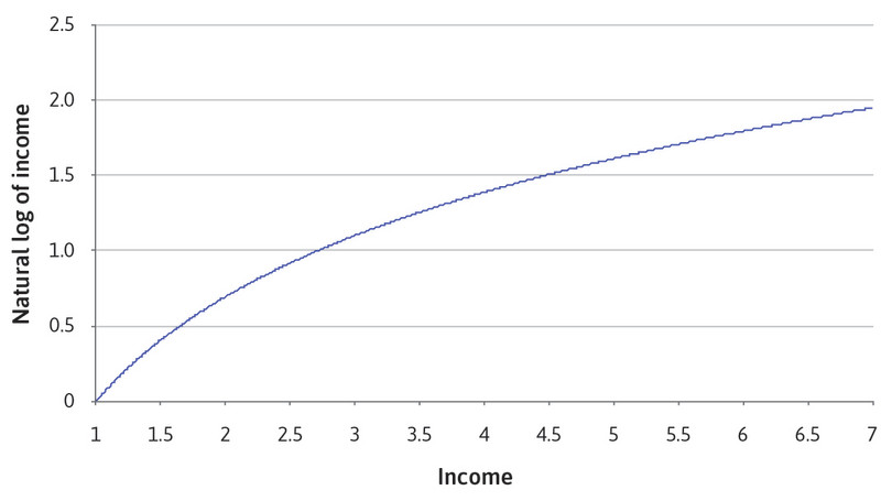
Find out more The natural log: What it means, and how to calculate it in Python
The natural log turns a linear variable into a concave variable, as shown in Figure 4.8. For any value of income on the horizontal axis, the natural log of that value on the vertical axis is smaller. At first, the difference between income and log income is not that big (for example, an income of 2 corresponds to a natural log of 0.7), but the difference becomes bigger as we move rightwards along the horizontal axis (for example, when income is 100,000, the natural log is only 11.5).
![In this chart, the horizontal axis shows income, ranging from 1 to 7, and the vertical axis shows the natural log of income, ranging from 0 to 2.5. Coordinates are (income, natural log of income) The natural log of income is an upward-sloping concave curve that passes through the points (0, 0) and (2, 0.7).]()
Figure 4.8 Comparing income with the natural logarithm of income.
The reason why natural logs are useful in economics is because they can represent variables that have diminishing marginal returns: an additional unit of input results in a smaller increase in the total output than did the previous unit. (If you have studied production functions, then the shape of the natural log function might look familiar.)
When applied to the concept of wellbeing, the ‘input’ is income, and the ‘output’ is material wellbeing. It makes intuitive sense that a $100 increase in per capita income will have a much greater effect on wellbeing for a poor country compared to a rich country. Using the natural log of income incorporates this notion into the index we create. Conversely, the notion of diminishing marginal returns (the larger the value of the input, the smaller the contribution of an additional unit of input) is not captured by GDP per capita, which uses actual income and not its natural log. Doing so makes the assumption that a $100 increase in per capita income has the same effect on wellbeing for rich and poor countries.
The
numpylog function in Python calculates the natural log of a value for you. To calculate the natural log of a value,x, typenp.log(x). If you have a scientific calculator, you can check that the calculation is correct by using thelnorlogkey.Now that you know about the natural log, you might want to go back to Question 3(c) in Part 4.1, and create a new chart using the natural log scale. The natural log is used in economics because it approximates percentage changes; that is, log(x) – log(y) is a close approximation to the percentage change between x and y. So, using the natural log scale, you will be able to ‘read off’ the relative growth rates from the slopes of the different series you have plotted. For example, a 0.01 change in the vertical axis value corresponds to a 1% change in that variable. This will allow you to compare the growth rates of the different components of GDP.
- geometric mean
- A summary measure calculated by multiplying N numbers together and then taking the Nth root of this product. The geometric mean is useful when the items being averaged have different scoring indices or scales, because it is not sensitive to these differences, unlike the arithmetic mean. For example, if education ranged from 0 to 20 years and life expectancy ranged from 0 to 85 years, life expectancy would have a bigger influence on the HDI than education if we used the arithmetic mean rather than the geometric mean. Conversely, the geometric mean treats each criteria equally. Example: Suppose we use life expectancy and mean years of schooling to construct an index of wellbeing. Country A has life expectancy of 40 years and a mean of 6 years of schooling. If we used the arithmetic mean to make an index, we would get (40 + 6)/2 = 23. If we used the geometric mean, we would get (40 × 6)1/2 = 15.5. Now suppose life expectancy doubled to 80 years. The arithmetic mean would be (80 + 6)/2 = 43, and the geometric mean would be (80 × 6)1/2 = 21.9. If, instead, mean years of schooling doubled to 12 years, the arithmetic mean would be (40 + 12)/2 = 26, and the geometric mean would be (40 × 12)1/2 = 21.9. This example shows that the arithmetic mean can be ‘unfair’ because proportional changes in one variable (life expectancy) have a larger influence over the index than changes in the other variable (years of schooling). The geometric mean gives each variable the same influence over the value of the index, so doubling the value of one variable would have the same effect on the index as doubling the value of another variable.
Now, we can combine these dimensional indices to give the HDI. The HDI is the geometric mean of the three dimension indices (IHealth = Life expectancy index, IEducation = Education index, and IIncome = GNI index):
\[\text{HDI }=(\text{I}_{\text{Health}} \times \text{I}_{\text{Education}} \times \text{I}_{\text{Income}})^{1/3}\]- Use the formula above and the data in the spreadsheet to calculate the HDI for all the countries excluding those in the ‘Other countries or territories’ category. You should get the same values as those in Column C, rounded to three decimal places.
Python walk-through 4.7 Calculating the HDI
We will use
pd.read_excelto import the data file, which we saved using the easy-to-understand name of ‘HDI_data.xlsx’ in the data folder within our working directory. Before importing, open the Excel file so that you understand its structure and how it corresponds to the code options used below. It’s a long way from being a neat and tidy dataset! We will save the imported data as thedf_hdrdataframe. Having taken a look at the Excel file, we can see we should skip the first few rows and take row 1 as the header (which becomes our column names).df_hdr = pd.read_excel( Path("data/HDI_data.xlsx"), skiprows=3, header=1 ) df_hdr.head()
Unnamed: 0 Unnamed: 1 Human Development Index (HDI) Unnamed: 3 Life expectancy at birth Unnamed: 5 Expected years of schooling Unnamed: 7 Mean years of schooling Unnamed: 9 Gross national income (GNI) per capita Unnamed: 11 GNI per capita rank minus HDI rank Unnamed: 13 HDI rank 0 HDI rank Country Value NaN (years) NaN (years) NaN (years) NaN (2017 PPP $) NaN NaN NaN NaN 1 NaN NaN 2021 NaN 2021 NaN 2021 a 2021 a 2021 NaN 2021 b 2020 2 NaN VERY HIGH HUMAN DEVELOPMENT NaN NaN NaN NaN NaN NaN NaN NaN NaN NaN NaN NaN NaN 3 1 Switzerland 0.962 NaN 83.9872 NaN 16.500299 NaN 13.85966 NaN 66933.00454 NaN 5 NaN 3 4 2 Norway 0.961 NaN 83.2339 NaN 18.1852 c 13.00363 NaN 64660.10622 NaN 6 NaN 1 Looking at the
df_hdrdataframe, we see that there are rows that have information that isn’t data (for example, all the rows with an ‘NaN’ in them), as well as variables and columns that do not contain data, or are a mix of ‘NaN’ and data.Cleaning up the dataframe can be easier to do in Excel by deleting irrelevant rows and columns, but one advantage of doing it in Python is replicability. Suppose in a year’s time you carried out the analysis again with an updated spreadsheet containing new information. If you had done the cleaning in Excel, you would have to redo it from scratch, but if you had done it in Python, you can simply rerun the code below. (This works for new data that is in the same format, too.)
Let’s do some data cleaning.
First, we rename the last column by picking up the year entry below it (
.iloc[1, -1]) so we can distinguish between different years of HDI rank. Next, we use a list comprehension to replace any columns that are calledUnnamedwith entries from the first row of observations. Then we eliminate rows that do not have any numbers in the"HDI rank"column. (To learn more about the list comprehension syntax and how to use it, read this tutorial by W3Schools.)df_hdr = df_hdr.rename(columns={"HDI rank": "HDI_rank_" + str(df_hdr.iloc[1, -1])}) df_hdr.columns = [ df_hdr.columns[i] if "Unnamed" not in df_hdr.columns[i] else df_hdr.iloc[0, i] for i in range(len(df_hdr.columns)) ] df_hdr = df_hdr.loc[~pd.isna(df_hdr["HDI rank"]), :] df_hdr.head()
HDI rank Country Human Development Index (HDI) NaN Life expectancy at birth NaN Expected years of schooling NaN Mean years of schooling NaN Gross national income (GNI) per capita NaN GNI per capita rank minus HDI rank NaN HDI_rank_2020 0 HDI rank Country Value NaN (years) NaN (years) NaN (years) NaN (2017 PPP $) NaN NaN NaN NaN 3 1 Switzerland 0.962 NaN 83.9872 NaN 16.500299 NaN 13.85966 NaN 66933.00454 NaN 5 NaN 3 4 2 Norway 0.961 NaN 83.2339 NaN 18.1852 c 13.00363 NaN 64660.10622 NaN 6 NaN 1 5 3 Iceland 0.959 NaN 82.6782 NaN 19.163059 c 13.76717 NaN 55782.04981 NaN 11 NaN 2 6 4 Hong Kong, China (SAR) 0.952 NaN 85.4734 d 17.27817 NaN 12.22621 NaN 62606.8454 NaN 6 NaN 4 Now we can eliminate rows in HDI rank that do not have numbers in them (
~pd.isna) and, following that, eliminate columns that contain NaNs (.dropna). (You may need to replace 2020 with a later year, depending on the version of HDI data you’re using.)df_hdr = df_hdr.loc[~pd.isna(df_hdr["HDI_rank_2020"]), :] df_hdr = df_hdr.dropna(axis=1, how="any") df_hdr.head()
HDI rank Country Human Development Index (HDI) Life expectancy at birth Expected years of schooling Mean years of schooling Gross national income (GNI) per capita GNI per capita rank minus HDI rank HDI_rank_2020 3 1 Switzerland 0.962 83.9872 16.500299 13.85966 66933.00454 5 3 4 2 Norway 0.961 83.2339 18.1852 13.00363 64660.10622 6 1 5 3 Iceland 0.959 82.6782 19.163059 13.76717 55782.04981 11 2 6 4 Hong Kong, China (SAR) 0.952 85.4734 17.27817 12.22621 62606.8454 6 4 7 5 Australia 0.951 84.5265 21.05459 12.72682 49238.43335 18 5 Now let’s switch to shorter column names and check what datatypes we have in our data:
new_column_names = [ "hdi_rank", "country", "hdi", "life_exp", "exp_yrs_school", "mean_yrs_school", "gni_capita", "gni_hdi_rank", "hdi_rank_2020", ] df_hdr.columns = new_column_names df_hdr.info()<class 'pandas.core.frame.DataFrame'> Index: 191 entries, 3 to 196 Data columns (total 9 columns): # Column Non-Null Count Dtype --- ------ -------------- ----- 0 hdi_rank 191 non-null object 1 country 191 non-null object 2 hdi 191 non-null object 3 life_exp 191 non-null object 4 exp_yrs_school 191 non-null object 5 mean_yrs_school 191 non-null object 6 gni_capita 191 non-null object 7 gni_hdi_rank 191 non-null object 8 hdi_rank_2020 191 non-null object dtypes: object(9) memory usage: 14.9+ KBLooking at the structure of the data, we see that
pandasthinks that all the data consists of objects because the original datafile contained non-numerical entries (these rows have now been deleted). Apart from the"country"variable, which we want to be a categorical variable, all variables should be ‘double’ or ‘int’ (numbers).Now, we could make this change for each variable individually, by running:
df_hdr = df_hdr.astype({"hdi_rank": "int32"})and similar for each name and its corresponding type. (Note that the structure
{ ... : ...}is a dictionary, which has keys and values.)However, it would be quite tedious to have to retype the same line over and over again. Instead we can pass a dictionary with key-value pairs for all mappings of names to data types we’d like to have in our dataframe.
To do this, we’ll use a trick where we ‘zip’ two variables (the column names and datatypes) together into a dictionary that maps the column name into the datatype we’d like it to have. The
zipfunction brings an element of two lists together in turn, a bit like a zipper on your clothes brings two interlocking plastic teeth together.new_column_datatypes = [ "int", "category", "double", "double", "double", "double", "double", "int", "int", ] dict_of_names_to_types = {k: v for k, v in zip(new_column_names, new_column_datatypes)} dict_of_names_to_types{'hdi_rank': 'int', 'country': 'category', 'hdi': 'double', 'life_exp': 'double', 'exp_yrs_school': 'double', 'mean_yrs_school': 'double', 'gni_capita': 'double', 'gni_hdi_rank': 'int', 'hdi_rank_2020': 'int'}We now have a dictionary of all names and their associated types that we can use:
df_hdr = df_hdr.astype(dict_of_names_to_types) df_hdr.info()<class 'pandas.core.frame.DataFrame'> Index: 191 entries, 3 to 196 Data columns (total 9 columns): # Column Non-Null Count Dtype --- ------ -------------- ----- 0 hdi_rank 191 non-null int64 1 country 191 non-null category 2 hdi 191 non-null float64 3 life_exp 191 non-null float64 4 exp_yrs_school 191 non-null float64 5 mean_yrs_school 191 non-null float64 6 gni_capita 191 non-null float64 7 gni_hdi_rank 191 non-null int64 8 hdi_rank_2020 191 non-null int64 dtypes: category(1), float64(5), int64(3) memory usage: 19.4 KBNow we have a nice clean dataset that we can work with.
We start by calculating the three indices, using the information given. For the education index, we calculate the index for expected and mean schooling separately, then take the arithmetic mean to get
i_education. As some mean schooling observations exceed the specified ‘maximum’ value of 18, the calculated index values would be larger than 1. To avoid this, we first replace these observations with 18 to obtain an index value of 1.df_hdr.loc[df_hdr["exp_yrs_school"] > 18, "exp_yrs_school"] = 18 # Now create the indices df_hdr["i_health"] = (df_hdr["life_exp"] - 20) / (85 - 20) df_hdr["i_education"] = ( ((df_hdr["exp_yrs_school"] - 0) / (18 - 0)) + (df_hdr["mean_yrs_school"] - 0) / (15 - 0) ) / 2 df_hdr["i_income"] = (np.log(df_hdr["gni_capita"]) - np.log(100)) / ( np.log(75000) - np.log(100) ) df_hdr["hdi_calc"] = np.power( df_hdr["i_health"] * df_hdr["i_education"] * df_hdr["i_income"], 1 / 3 )Now we can compare the
HDIgiven in the table and our calculated HDI (they should be the same when rounded to three decimal places).df_hdr[["hdi", "hdi_calc"]]
hdi hdi_calc 3 0.962 0.962050 4 0.961 0.961086 5 0.959 0.959482 6 0.952 0.954481 7 0.951 0.950664 ... ... ... 192 0.426 0.426349 193 0.404 0.403530 194 0.400 0.400358 195 0.394 0.393726 196 0.385 0.385143
The HDI is one way to measure wellbeing, but you may think that it does not use the most appropriate measures for the non-material aspects of wellbeing (health and education).
Now we will use the same method to create our own index of non-material wellbeing (an ‘alternative HDI’), using different indicators. You can find alternative indicators to measure health and education from the World Bank’s World Development Indicators. Use the interactive menu on the left to select and download alternative indicators of health and education:
- In the ‘Country’ section, click the tick box to select all countries.
- In the ‘Time’ section, click the tick box to select all available years.
- In the ‘Series’ section, find and select two or three indicators to measure health, and two to three indicators to measure education (check Python walk-through 4.8 for some ideas). Also select the series ‘GNI per capita (constant 2015 US$)’, which we’ll use for the income indicator.
- Minimise all sections in the left-side menu. Then click ‘Apply Changes’ to preview the data.
- Click ‘Download options’ (near the top of the page) and select ‘CSV’ to download the data as a .csv file.
- The data will download as a .zip file containing two .csv files. The first file, with ‘Data.csv’ in the filename, contains the indicators we need. Save this file in your ‘data’ subfolder and give it an easy-to-remember name (like ‘world_bank_data.csv’).
- Create an alternative index of wellbeing. In particular, propose alternative Education and Health indices in (a) and (b), then combine these with the alternative Income index in (c) to calculate an alternative HDI. Examine whether the changes caused substantial changes in country rankings in (d).
- Choose two to three indicators to measure health, and two to three indicators to measure education. Explain why you have chosen these indicators.
- Choose a reasonable maximum and minimum value for each indicator and justify your choices.
- Calculate your alternative versions of the education and health dimension indices. Since you have chosen more than one indicator for this dimension, make sure to average the dimension indices as done in Question 3(b). Also ensure that higher indicator values always represent better outcomes. Recalculate the income dimension index using the GNI per capita data. Now calculate the alternative HDI as done in Questions 3 and 4.
- Create a new variable showing each country’s rank according to your alternative HDI, where 1 is assigned to the country with the highest value. Compare your ranking to the HDI rank. Are the rankings generally similar, or very different? (See Python walk-through 4.8 on how to do this.)
Python walk-through 4.8 Creating your own HDI
Merge data and calculate alternative indices
This example uses the following indicators:
- Education: Literacy rate, adult total (% ages 15 and above); School enrollment, tertiary (% gross); Trained teachers in primary education (% of total teachers).
- Health: Prevalence of stunting, height for age (% under age 5); Mortality rate, adult, female (per 1,000 female adults); Mortality rate, adult, male (per 1,000 male adults).
- Income: GNI per capita (in constant 2015 USD).
If you’re using different indicators, remember to adjust the code below accordingly.
First, we import the data, which we saved as
world_bank_data.csv, and check that it has been imported correctly. You can see that each row represents a different country, and each column represents a different year–indicator combination. Note that the data comes with several empty rows at the end before some metadata that has been inserted (information about where the data came from and the download date). To remove the metadata, we drop rows that haveNaNin the Country Code column.all_hdr = pd.read_csv(Path("data/world_bank_data.csv")).dropna( subset=["Country Code"], axis=0 ) all_hdr
Country Name Country Code Series Name Series Code 1960 [YR1960] 1961 [YR1961] 1962 [YR1962] 1963 [YR1963] 1964 [YR1964] 1965 [YR1965] ... 2013 [YR2013] 2014 [YR2014] 2015 [YR2015] 2016 [YR2016] 2017 [YR2017] 2018 [YR2018] 2019 [YR2019] 2020 [YR2020] 2021 [YR2021] 2022 [YR2022] 0 Afghanistan AFG Literacy rate, adult total (% of people ages 1... SE.ADT.LITR.ZS .. .. .. .. .. .. ... .. .. .. .. .. .. .. .. 37.266040802002 .. 1 Afghanistan AFG School enrollment, tertiary (% gross) SE.TER.ENRR .. .. .. .. .. .. ... .. 8.31087017059326 .. .. .. 9.96378993988037 .. 10.8584403991699 .. .. 2 Afghanistan AFG Trained teachers in primary education (% of to... SE.PRM.TCAQ.ZS .. .. .. .. .. .. ... .. .. .. .. .. .. .. .. .. .. 3 Afghanistan AFG Prevalence of stunting, height for age (% of c... SH.STA.STNT.ZS .. .. .. .. .. .. ... 40.4 .. .. .. .. 38.2 .. .. .. .. 4 Afghanistan AFG Mortality rate, adult, female (per 1,000 femal... SP.DYN.AMRT.FE 550.189 543.6 537.703 531.856 526.179 520.698 ... 214.871 212.215 209.573 204.096 196.522 193.284 190.261 210.053 214.241 .. ... ... ... ... ... ... ... ... ... ... ... ... ... ... ... ... ... ... ... ... ... ... 1857 World WLD Trained teachers in primary education (% of to... SE.PRM.TCAQ.ZS .. .. .. .. .. .. ... 86.6119384765625 86.3298873901367 85.9246826171875 84.8016510009766 85.599006652832 86.6845779418945 86.2046585083008 86.3962631225586 86.606086730957 85.6526412963867 1858 World WLD Prevalence of stunting, height for age (% of c... SH.STA.STNT.ZS .. .. .. .. .. .. ... .. .. .. .. .. .. .. .. .. .. 1859 World WLD Mortality rate, adult, female (per 1,000 femal... SP.DYN.AMRT.FE 302.23839310137 284.48339478412 264.599246966128 261.515942913558 256.345687314532 256.825165517128 ... 117.805291746937 116.934167334985 116.220022447097 115.161161407209 113.867167759306 112.363558656741 111.111154392665 119.443111464671 138.465381887828 .. 1860 World WLD Mortality rate, adult, male (per 1,000 male ad... SP.DYN.AMRT.MA 386.345709343829 365.917299719234 341.855302636778 338.074201833933 332.029766235342 337.657487077999 ... 186.161600673567 182.332619127125 177.465118028284 175.751796102991 174.57957030685 171.986914064584 170.283676576264 182.403699690544 206.345016669394 .. 1861 World WLD GNI per capita (constant 2015 US$) NY.GNP.PCAP.KD .. .. .. .. .. .. ... 9806.34774226996 10001.5565898911 10177.0396729044 10336.6271001545 10579.8337141469 10796.977476103 10975.7017030918 10500.2859821596 11044.6183686609 .. Then we need to filter to get the year we want. We’ll do this in a new dataframe. Note that two dots (
..) are a string that indicates a missing variable. Unfortunately, if we have a mix of strings and other data types (like double),pandasisn’t sure how to treat the column. So we need to replace the code for missing values in a string,.., with ‘proper’ numeric missing values (NaN), which will allow us to do operations like arithmetic on the column. To do this, we use thepd.to_numericfunction—once it has been applied using theerrors="coerce"option, you’ll see that any occurrences of..have been converted toNaN, which means not a number. (Remember to change the year number from 2021 to whatever year is in your HDI data from Questions 1–4).hdr_2021 = all_hdr.loc[ :, ["Country Name", "Country Code", "Series Name", "Series Code", "2021 [YR2021]"] ] hdr_2021["2021 [YR2021]"] = pd.to_numeric( hdr_2021["2021 [YR2021]"], errors="coerce" ).fillna(np.nan) hdr_2021.sample(5)
Country Name Country Code Series Name Series Code 2021 [YR2021] 269 Chad TCD Prevalence of stunting, height for age (% of c... SH.STA.STNT.ZS 31.1 1786 Pacific island small states PSS School enrollment, tertiary (% gross) SE.TER.ENRR NaN 36 Angola AGO School enrollment, tertiary (% gross) SE.TER.ENRR NaN 182 Brazil BRA Literacy rate, adult total (% of people ages 1... SE.ADT.LITR.ZS NaN 679 Jamaica JAM Literacy rate, adult total (% of people ages 1... SE.ADT.LITR.ZS NaN For ease of coding, we’ll introduce some short name versions of the series names and we will make some additional changes to the datatypes:
dict_to_shorter_hdi_names = {
    "SE.TER.ENRR": "enrollment",
    "SE.PRM.TCAQ.ZS": "trained_teachers",
    "SE.ADT.LITR.ZS": "literacy",
    "SP.DYN.AMRT.MA": "mortality_m",
    "SP.DYN.AMRT.FE": "mortality_f",
    "SH.STA.STNT.ZS": "stunting",
    "NY.GNP.PCAP.KD": "income",
}


dict_of_types = {
    "Country Name": "category",
    "Country Code": "category",
    "Series Code": "category",
    "indicator": "category",
    "Series Name": "string",
}

hdr_2021["indicator"] = hdr_2021["Series Code"].map(dict_to_shorter_hdi_names)
hdr_2021 = hdr_2021.astype(dict_of_types)
hdr_2021.head()
Country Name Country Code Series Name Series Code 2021 [YR2021] indicator 0 Afghanistan AFG Literacy rate, adult total (% of people ages 1... SE.ADT.LITR.ZS 37.266041 literacy 1 Afghanistan AFG School enrollment, tertiary (% gross) SE.TER.ENRR NaN enrollment 2 Afghanistan AFG Trained teachers in primary education (% of to... SE.PRM.TCAQ.ZS NaN trained_teachers 3 Afghanistan AFG Prevalence of stunting, height for age (% of c... SH.STA.STNT.ZS NaN stunting 4 Afghanistan AFG Mortality rate, adult, female (per 1,000 femal... SP.DYN.AMRT.FE 214.241000 mortality_f Now we can look at some summary statistics; we’ll use the
skimpypackage.You will need to install
skimpyon the command line of your computer by typingpip install skimpybefore running the code below.
skim(hdr_2021)╭──────────────────────────────────────────────── skimpy summary ─────────────────────────────────────────────────╮ │ Data Summary Data Types Categories │ │ ┏━━━━━━━━━━━━━━━━━━━┳━━━━━━━━┓ ┏━━━━━━━━━━━━━┳━━━━━━━┓ ┏━━━━━━━━━━━━━━━━━━━━━━━┓ │ │ ┃ dataframe ┃ Values ┃ ┃ Column Type ┃ Count ┃ ┃ Categorical Variables ┃ │ │ ┡━━━━━━━━━━━━━━━━━━━╇━━━━━━━━┩ ┡━━━━━━━━━━━━━╇━━━━━━━┩ ┡━━━━━━━━━━━━━━━━━━━━━━━┩ │ │ │ Number of rows │ 1862 │ │ category │ 4 │ │ Country Name │ │ │ │ Number of columns │ 6 │ │ string │ 1 │ │ Country Code │ │ │ └───────────────────┴────────┘ │ float64 │ 1 │ │ Series Code │ │ │ └─────────────┴───────┘ │ indicator │ │ │ └───────────────────────┘ │ │ number │ │ ┏━━━━━━━━━━━━━━━━━━━━┳━━━━━━━┳━━━━━━━━━━┳━━━━━━━━┳━━━━━━━━┳━━━━━━━┳━━━━━━━┳━━━━━━┳━━━━━━┳━━━━━━━━━━┳━━━━━━━━━┓ │ │ ┃ column_name ┃ NA ┃ NA % ┃ mean ┃ sd ┃ p0 ┃ p25 ┃ p50 ┃ p75 ┃ p100 ┃ hist ┃ │ │ ┡━━━━━━━━━━━━━━━━━━━━╇━━━━━━━╇━━━━━━━━━━╇━━━━━━━━╇━━━━━━━━╇━━━━━━━╇━━━━━━━╇━━━━━━╇━━━━━━╇━━━━━━━━━━╇━━━━━━━━━┩ │ │ │ 2021 [YR2021] │ 866 │ 46.51 │ 2600 │ 9400 │ 0.5 │ 76 │ 110 │ 280 │ 110000 │ ▇ │ │ │ └────────────────────┴───────┴──────────┴────────┴────────┴───────┴───────┴──────┴──────┴──────────┴─────────┘ │ │ category │ │ ┏━━━━━━━━━━━━━━━━━━━━━━━━━━━━━━━━━━━━┳━━━━━━━━━━━┳━━━━━━━━━━━━━━━┳━━━━━━━━━━━━━━━━━━━━━━━┳━━━━━━━━━━━━━━━━━━━┓ │ │ ┃ column_name ┃ NA ┃ NA % ┃ ordered ┃ unique ┃ │ │ ┡━━━━━━━━━━━━━━━━━━━━━━━━━━━━━━━━━━━━╇━━━━━━━━━━━╇━━━━━━━━━━━━━━━╇━━━━━━━━━━━━━━━━━━━━━━━╇━━━━━━━━━━━━━━━━━━━┩ │ │ │ Country Name │ 0 │ 0 │ False │ 266 │ │ │ │ Country Code │ 0 │ 0 │ False │ 266 │ │ │ │ Series Code │ 0 │ 0 │ False │ 7 │ │ │ │ indicator │ 0 │ 0 │ False │ 7 │ │ │ └────────────────────────────────────┴───────────┴───────────────┴───────────────────────┴───────────────────┘ │ │ string │ │ ┏━━━━━━━━━━━━━━━━━━━━━━━━━━━┳━━━━━━━━━┳━━━━━━━━━━━━┳━━━━━━━━━━━━━━━━━━━━━━━━━━━━━━┳━━━━━━━━━━━━━━━━━━━━━━━━━━┓ │ │ ┃ column_name ┃ NA ┃ NA % ┃ words per row ┃ total words ┃ │ │ ┡━━━━━━━━━━━━━━━━━━━━━━━━━━━╇━━━━━━━━━╇━━━━━━━━━━━━╇━━━━━━━━━━━━━━━━━━━━━━━━━━━━━━╇━━━━━━━━━━━━━━━━━━━━━━━━━━┩ │ │ │ Series Name │ 0 │ 0 │ 8.3 │ 15428 │ │ │ └───────────────────────────┴─────────┴────────────┴──────────────────────────────┴──────────────────────────┘ │ ╰────────────────────────────────────────────────────── End ──────────────────────────────────────────────────────╯Before we can calculate indices, we need to set minimum and maximum values, which we base on the minimum and maximum values in the data. Let’s look at the max and min by indicator:
min_max = hdr_2021.groupby(["indicator"])["2021 [YR2021]"].agg(["min", "max"])
min_max
min max indicator enrollment 2.411387 150.201767 income 265.277629 107243.417579 literacy 37.266041 100.000000 mortality_f 22.098000 432.957000 mortality_m 42.594000 552.668000 stunting 0.500000 46.000000 trained_teachers 22.573050 100.000000 We want observations to be within the interval of min to max. Let’s do this systematically for all of the indicators:
hdr_2021["index_indicator"] = hdr_2021.groupby(["indicator"])[
    "2021 [YR2021]"
].transform(lambda x: (x - x.min()) / (x.max() - x.min()))
hdr_2021.head(7)
Country Name Country Code Series Name Series Code 2021 [YR2021] indicator index_indicator 0 Afghanistan AFG Literacy rate, adult total (% of people ages 1... SE.ADT.LITR.ZS 37.266041 literacy 0.000000 1 Afghanistan AFG School enrollment, tertiary (% gross) SE.TER.ENRR NaN enrollment NaN 2 Afghanistan AFG Trained teachers in primary education (% of to... SE.PRM.TCAQ.ZS NaN trained_teachers NaN 3 Afghanistan AFG Prevalence of stunting, height for age (% of c... SH.STA.STNT.ZS NaN stunting NaN 4 Afghanistan AFG Mortality rate, adult, female (per 1,000 femal... SP.DYN.AMRT.FE 214.241000 mortality_f 0.467662 5 Afghanistan AFG Mortality rate, adult, male (per 1,000 male ad... SP.DYN.AMRT.MA 342.158000 mortality_m 0.587295 6 Afghanistan AFG GNI per capita (constant 2015 US$) NY.GNP.PCAP.KD NaN income NaN You should be able to see that the column
index_indicatoris the literacy indicator for Afghanistan, converted to index format by subtracting the minimum value (in the whole dataset) and dividing by the difference between the maximum and minimum for literacy.Now we’ll build the new health and education indicators. To do this, we’ll aggregate over existing indicators—so we’re going to end up with a smaller dataframe that only has each country in it once. For neatness, we can also pack these into a single dataframe.
# create educ index
educ_index_indicators = ["literacy", "enrollment", "trained_teachers"]
hdr_2021_educ = (
    hdr_2021.loc[hdr_2021["indicator"].isin(educ_index_indicators), :]
    .groupby(["Country Code"])["index_indicator"]
    .mean()
)


# create health index. These indicators are less good when the number is high
# so we invert this measure
health_index_indicators = ["stunting", "mortality_m", "mortality_f"]
hdr_2021_health = (
    1.0
    - hdr_2021.loc[hdr_2021["indicator"].isin(health_index_indicators), :]
    .groupby(["Country Code"])["index_indicator"]
    .mean()
)


# create income indicator
hdr_2021_income = (
    hdr_2021.loc[hdr_2021["indicator"].isin(["income"]), :]
    .groupby(["Country Code"])["index_indicator"]
    .mean()
)


# combine them all
hdr_2021_long = pd.concat([hdr_2021_educ, hdr_2021_health, hdr_2021_income], axis=1)
# give each sensible names (they both inherit column name of "index_indicator" by default)
hdr_2021_long.columns = ["educ_index", "health_index", "income_index"]
skim(hdr_2021_long.reset_index())
╭──────────────────────────────────────────────── skimpy summary ─────────────────────────────────────────────────╮ │ Data Summary Data Types Categories │ │ ┏━━━━━━━━━━━━━━━━━━━┳━━━━━━━━┓ ┏━━━━━━━━━━━━━┳━━━━━━━┓ ┏━━━━━━━━━━━━━━━━━━━━━━━┓ │ │ ┃ dataframe ┃ Values ┃ ┃ Column Type ┃ Count ┃ ┃ Categorical Variables ┃ │ │ ┡━━━━━━━━━━━━━━━━━━━╇━━━━━━━━┩ ┡━━━━━━━━━━━━━╇━━━━━━━┩ ┡━━━━━━━━━━━━━━━━━━━━━━━┩ │ │ │ Number of rows │ 266 │ │ float64 │ 3 │ │ Country Code │ │ │ │ Number of columns │ 4 │ │ category │ 1 │ └───────────────────────┘ │ │ └───────────────────┴────────┘ └─────────────┴───────┘ │ │ number │ │ ┏━━━━━━━━━━━━━━━━━━━┳━━━━━━┳━━━━━━━━━┳━━━━━━━━┳━━━━━━━━┳━━━━━━┳━━━━━━━━━┳━━━━━━━━━┳━━━━━━━━┳━━━━━━━┳━━━━━━━━━┓ │ │ ┃ column_name ┃ NA ┃ NA % ┃ mean ┃ sd ┃ p0 ┃ p25 ┃ p50 ┃ p75 ┃ p100 ┃ hist ┃ │ │ ┡━━━━━━━━━━━━━━━━━━━╇━━━━━━╇━━━━━━━━━╇━━━━━━━━╇━━━━━━━━╇━━━━━━╇━━━━━━━━━╇━━━━━━━━━╇━━━━━━━━╇━━━━━━━╇━━━━━━━━━┩ │ │ │ educ_index │ 64 │ 24.06 │ 0.59 │ 0.23 │ 0 │ 0.47 │ 0.61 │ 0.74 │ 1 │ ▁▂▃▇▆▃ │ │ │ │ health_index │ 42 │ 15.79 │ 0.68 │ 0.2 │ 0 │ 0.55 │ 0.7 │ 0.84 │ 1 │ ▁▅▅▇▆ │ │ │ │ income_index │ 85 │ 31.95 │ 0.12 │ 0.17 │ 0 │ 0.015 │ 0.048 │ 0.14 │ 1 │ ▇▁▁ │ │ │ └───────────────────┴──────┴─────────┴────────┴────────┴──────┴─────────┴─────────┴────────┴───────┴─────────┘ │ │ category │ │ ┏━━━━━━━━━━━━━━━━━━━━━━━━━━━━━━━━━━━━┳━━━━━━━━━━━┳━━━━━━━━━━━━━━━┳━━━━━━━━━━━━━━━━━━━━━━━┳━━━━━━━━━━━━━━━━━━━┓ │ │ ┃ column_name ┃ NA ┃ NA % ┃ ordered ┃ unique ┃ │ │ ┡━━━━━━━━━━━━━━━━━━━━━━━━━━━━━━━━━━━━╇━━━━━━━━━━━╇━━━━━━━━━━━━━━━╇━━━━━━━━━━━━━━━━━━━━━━━╇━━━━━━━━━━━━━━━━━━━┩ │ │ │ Country Code │ 0 │ 0 │ False │ 266 │ │ │ └────────────────────────────────────┴───────────┴───────────────┴───────────────────────┴───────────────────┘ │ ╰────────────────────────────────────────────────────── End ──────────────────────────────────────────────────────╯We’d like to merge our two new indicators back into the main dataset on the same basis as the existing ones. Our new indices are in a different shape, so to do this we have to either reshape
hdr_2021to be in wide format or reshapehdr_2021_longto be in wide format. Let’s try the latter, adding in the ‘missing’ columns as we go:new_indices_wide = pd.melt( hdr_2021_long.reset_index(), id_vars="Country Code", var_name="indicator", value_name="index_indicator", ) country_code_to_name = dict( zip( hdr_2021["Country Code"].drop_duplicates(), hdr_2021["Country Name"].drop_duplicates(), ) ) new_indices_wide["Series Name"] = new_indices_wide["indicator"] new_indices_wide["Series Code"] = new_indices_wide["indicator"] new_indices_wide["Country Name"] = new_indices_wide["Country Code"].map( country_code_to_name ) hdr_2021 = pd.concat([new_indices_wide, hdr_2021], axis=0) hdr_2021
Country Code indicator index_indicator Series Name Series Code Country Name 2021 [YR2021] 0 ABW educ_index NaN educ_index educ_index Aruba NaN 1 AFE educ_index 0.303252 educ_index educ_index Africa Eastern and Southern NaN 2 AFG educ_index 0.000000 educ_index educ_index Afghanistan NaN 3 AFW educ_index 0.479030 educ_index educ_index Africa Western and Central NaN 4 AGO educ_index NaN educ_index educ_index Angola NaN ... ... ... ... ... ... ... ... 1857 WLD trained_teachers 0.827012 Trained teachers in primary education (% of to... SE.PRM.TCAQ.ZS World 86.606087 1858 WLD stunting NaN Prevalence of stunting, height for age (% of c... SH.STA.STNT.ZS World NaN 1859 WLD mortality_f 0.283229 Mortality rate, adult, female (per 1,000 femal... SP.DYN.AMRT.FE World 138.465382 1860 WLD mortality_m 0.321034 Mortality rate, adult, male (per 1,000 male ad... SP.DYN.AMRT.MA World 206.345017 1861 WLD income 0.100762 GNI per capita (constant 2015 US$) NY.GNP.PCAP.KD World 11044.618369 Now we have added both of the alternative indicators to our original HDI data, we can now compute our own HDI indicator. First, we’ll flip (
pivot) the data to wide format, then repeat the same calculation as in Python walk-through 4.7.hdr_2021_w = hdr_2021.pivot( index=["Country Code", "Country Name"], columns="indicator", values="index_indicator", ) hdr_2021_w = hdr_2021_w.assign( hdi_own=lambda x: np.power( x["educ_index"] * x["health_index"] * x["income_index"], 1 / 3 ) ) skim(hdr_2021_w)╭──────────────────────────────────────────────── skimpy summary ─────────────────────────────────────────────────╮ │ Data Summary Data Types │ │ ┏━━━━━━━━━━━━━━━━━━━┳━━━━━━━━┓ ┏━━━━━━━━━━━━━┳━━━━━━━┓ │ │ ┃ dataframe ┃ Values ┃ ┃ Column Type ┃ Count ┃ │ │ ┡━━━━━━━━━━━━━━━━━━━╇━━━━━━━━┩ ┡━━━━━━━━━━━━━╇━━━━━━━┩ │ │ │ Number of rows │ 266 │ │ float64 │ 11 │ │ │ │ Number of columns │ 11 │ └─────────────┴───────┘ │ │ └───────────────────┴────────┘ │ │ number │ │ ┏━━━━━━━━━━━━━━━━━━━━━━━┳━━━━━━━┳━━━━━━━━━┳━━━━━━━━┳━━━━━━━┳━━━━━┳━━━━━━━━━┳━━━━━━━━┳━━━━━━━┳━━━━━━━┳━━━━━━━━┓ │ │ ┃ column_name ┃ NA ┃ NA % ┃ mean ┃ sd ┃ p0 ┃ p25 ┃ p50 ┃ p75 ┃ p100 ┃ hist ┃ │ │ ┡━━━━━━━━━━━━━━━━━━━━━━━╇━━━━━━━╇━━━━━━━━━╇━━━━━━━━╇━━━━━━━╇━━━━━╇━━━━━━━━━╇━━━━━━━━╇━━━━━━━╇━━━━━━━╇━━━━━━━━┩ │ │ │ educ_index │ 64 │ 24.06 │ 0.59 │ 0.23 │ 0 │ 0.47 │ 0.61 │ 0.74 │ 1 │ ▁▂▃▇▆▃ │ │ │ │ enrollment │ 110 │ 41.35 │ 0.33 │ 0.2 │ 0 │ 0.14 │ 0.35 │ 0.49 │ 1 │ ▇▆▇▆▁ │ │ │ │ health_index │ 42 │ 15.79 │ 0.68 │ 0.2 │ 0 │ 0.55 │ 0.7 │ 0.84 │ 1 │ ▁▅▅▇▆ │ │ │ │ income │ 85 │ 31.95 │ 0.12 │ 0.17 │ 0 │ 0.015 │ 0.048 │ 0.14 │ 1 │ ▇▁▁ │ │ │ │ income_index │ 85 │ 31.95 │ 0.12 │ 0.17 │ 0 │ 0.015 │ 0.048 │ 0.14 │ 1 │ ▇▁▁ │ │ │ │ literacy │ 184 │ 69.17 │ 0.79 │ 0.23 │ 0 │ 0.62 │ 0.91 │ 0.98 │ 1 │ ▂▂▂▇ │ │ │ │ mortality_f │ 44 │ 16.54 │ 0.3 │ 0.2 │ 0 │ 0.14 │ 0.24 │ 0.42 │ 1 │ ▇▇▅▃▁ │ │ │ │ mortality_m │ 44 │ 16.54 │ 0.35 │ 0.2 │ 0 │ 0.19 │ 0.34 │ 0.47 │ 1 │ ▅▇▇▅▁ │ │ │ │ stunting │ 249 │ 93.61 │ 0.43 │ 0.31 │ 0 │ 0.15 │ 0.47 │ 0.57 │ 1 │ ▇▃▆▃▂▅ │ │ │ │ trained_teachers │ 150 │ 56.39 │ 0.83 │ 0.19 │ 0 │ 0.74 │ 0.87 │ 1 │ 1 │ ▂▅▇ │ │ │ │ hdi_own │ 139 │ 52.26 │ 0.28 │ 0.16 │ 0 │ 0.14 │ 0.26 │ 0.37 │ 0.71 │ ▅▇▇▃▂▂ │ │ │ └───────────────────────┴───────┴─────────┴────────┴───────┴─────┴─────────┴────────┴───────┴───────┴────────┘ │ ╰────────────────────────────────────────────────────── End ──────────────────────────────────────────────────────╯We can see that our alternative HDI has 139 missing values (52% of all entries) because of the high number of missing data for at least one of the health and education indicators that we used to construct this HDI.
Calculate ranks
To compare the ranks of the two indices (the original HDI and our alternative HDI), we should only rank the countries that have observations for both indices. We will create a dataframe called
HDR2021_subthat contains this subset of countries.# drop columns which don’t have an alternative HDI hdr_2021_w_sub = hdr_2021_w.dropna(subset=["hdi_own"]).drop( health_index_indicators + educ_index_indicators + ["income"], axis=1 ) hdr_2021_w_sub
indicator educ_index health_index income_index hdi_own Country Code Country Name AFE Africa Eastern and Southern 0.303252 0.453241 0.010844 0.114228 AFW Africa Western and Central 0.479030 0.357431 0.013574 0.132462 ALB Albania 0.449018 0.873329 0.042324 0.255080 ARB Arab World 0.542176 0.758086 0.053874 0.280810 ARG Argentina 0.708566 0.813830 0.111018 0.400039 ... ... ... ... ... ... VUT Vanuatu 0.913125 0.727765 0.025482 0.256794 WLD World 0.626291 0.697868 0.100762 0.353142 WSM Samoa 0.544117 0.770036 0.032910 0.239798 ZAF South Africa 0.497539 0.318312 0.051993 0.201934 ZWE Zimbabwe 0.969264 0.224262 0.009212 0.126042 There are 127 countries with sufficient information to produce our alternative HDI.
We’ll now merge
hdr_2021_w_sub, which has our HDI indicator in it, with the dataframe containing the original HDI indicator. The only column in common is one that contains country names—though these are called something different in each dataset—so we must rename the relevant column in at least one of the two dataframes before merging. The merge will create a new dataframe calledhdr_merged.hdr_merged = pd.merge( hdr_2021_w_sub.reset_index().rename(columns={"Country Name": "country"}), df_hdr.drop( ["mean_yrs_school", "life_exp", "exp_yrs_school", "gni_capita"], axis=1 ), on=["country"], how="inner", ) hdr_merged
Country Code country educ_index health_index income_index hdi_own hdi_rank hdi gni_hdi_rank hdi_rank_2020 i_health i_education i_income hdi_calc 0 ALB Albania 0.449018 0.873329 0.042324 0.255080 67 0.796 17 68 0.868655 0.777548 0.747871 0.796405 1 ARG Argentina 0.708566 0.813830 0.111018 0.400039 47 0.842 17 47 0.852152 0.868100 0.807173 0.842076 2 ARM Armenia 0.521781 0.711140 0.038687 0.243035 85 0.759 4 87 0.800663 0.742031 0.737094 0.759390 3 BDI Burundi 0.026222 0.460971 0.000000 0.000000 187 0.426 4 187 0.640965 0.402162 0.300649 0.426349 4 BEL Belgium 0.543180 0.932112 0.402899 0.588667 13 0.937 7 16 0.951980 0.912523 0.945527 0.936516 ... ... ... ... ... ... ... ... ... ... ... ... ... ... ... 77 VNM Viet Nam 0.246713 0.793902 0.027691 0.175697 115 0.703 6 113 0.824894 0.638785 0.659405 0.703021 78 VUT Vanuatu 0.913125 0.727765 0.025482 0.256794 140 0.607 23 142 0.776138 0.555920 0.518011 0.606872 79 WSM Samoa 0.544117 0.770036 0.032910 0.239798 111 0.707 24 112 0.811808 0.725095 0.599962 0.706845 80 ZAF South Africa 0.497539 0.318312 0.051993 0.201934 109 0.713 -17 102 0.651400 0.758097 0.734668 0.713216 81 ZWE Zimbabwe 0.969264 0.224262 0.009212 0.126042 146 0.593 9 145 0.603894 0.626779 0.549871 0.592623 So we have a successful inner merge for 82 countries. Finally, we’re going to compute a ranking of countries based on our alternative HDI. We use the
ascending=Falseoption in the.rankmethod so the ‘best’ value will have a rank of 1. We’ll also have to re-rank these 82 countries according to their original HDI (so the ranks will range from 1 to 82, not 1 to 191).hdr_merged["hdi_own_rank"] = hdr_merged["hdi_own"].rank(ascending=False).astype("int") hdr_merged["hdi_original_rank"] = hdr_merged["hdi_rank"].rank(ascending=True).astype("int")Now we can make a scatter plot of the ranks compared with one another:
(ggplot(hdr_merged, aes(x="hdi_original_rank", y="hdi_own_rank")) + geom_point(size=3))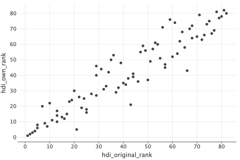
![Scatterplot of ranks for HDI and alternative HDI index.]()
Figure 4.9 Scatterplot of ranks for HDI and alternative HDI index.
We can improve this chart quite a bit. One particularly useful addition would be some text showing some key values. Using
lets_plot’s system for mapping variables onto layers of a chart, we can do this fairly easily using long format data by adding a column calledtextthat has an entry only every ten values (otherwise it would overwhelm the chart). We first sort by the 2021 original HDI rank, then create an empty text column, and then add the real country name into the text column only for every tenth entry.hdr_merged = hdr_merged.sort_values("hdi_rank_2021") hdr_merged["text"] = "" hdr_merged.iloc[::10, -1] = hdr_merged.iloc[::10, 1] hdr_merged.head()
Country Code country educ_index health_index income_index hdi_own hdi_rank hdi gni_hdi_rank hdi_rank_2020 i_health i_education i_income hdi_calc hdi_own_rank hdi_original_rank text 15 CHE Switzerland 0.470143 0.972723 0.796181 0.714074 1 0.962 5 3 0.984418 0.920330 0.982810 0.962050 1 1 Switzerland 23 DNK Denmark 0.551937 0.947001 0.562121 0.664798 6 0.948 6 5 0.944235 0.932016 0.967208 0.947708 2 2 70 SWE Sweden 0.565201 0.965971 0.526429 0.659937 7 0.947 9 9 0.968974 0.920324 0.951740 0.946797 3 3 27 FIN Finland 0.666191 0.931229 0.436748 0.647086 11 0.940 11 12 0.954432 0.929121 0.937088 0.940154 4 4 59 NZL New Zealand 0.521018 0.932627 0.374390 0.566624 13 0.937 16 13 0.960789 0.931490 0.919639 0.937147 8 5 ( ggplot(hdr_merged, aes(x="hdi_original_rank", y="hdi_own_rank")) + geom_point(size=3) + geom_text(aes(label="text"), size=5) + labs( x="HDI rank (2021)", y="Alternative HDI rank (2021)", title="Comparing two human development indices", ) )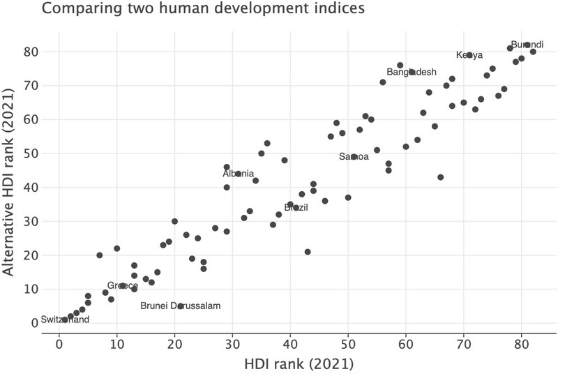
![Scatterplot of ranks for HDI and alternative HDI index with text.]()
Figure 4.10 Scatterplot of ranks for HDI and alternative HDI index with text.
You can see that in general the rankings are similar. If they were identical, the points in the scatterplot would form a straight upward-sloping line. They do not form a straight line, but there is a very strong positive correlation. There are, however, a few countries where the alternative definitions have caused a change in ranking, so let’s look at where the alternative definitions have caused a big change in ranking. We’ll use the
.diffmethod, then theheadandtailmethods to find the largest positive and negative differences in rank (our HDI vs the original HDI).hdr_merged = hdr_merged.assign( rank_diff=hdr_merged[["hdi_own_rank", "hdi_original_rank"]].diff(axis=1)[ "hdi_original_rank" ] ).sort_values("rank_diff", ascending=False) hdr_merged.head(6)
Country Code country educ_index health_index income_index hdi_own hdi_rank hdi gni_hdi_rank hdi_rank_2020 i_health i_education i_income hdi_calc hdi_own_rank hdi_original_rank text rank_diff 78 VUT Vanuatu 0.913125 0.727765 0.025482 0.256794 140 0.607 23 142 0.776138 0.555920 0.518011 0.606872 43 66 23 46 MDV Maldives 0.965888 0.968041 0.080761 0.422675 90 0.747 -14 97 0.921818 0.595056 0.761332 0.747468 21 43 22 12 BRN Brunei Darussalam 0.961584 0.814414 0.277262 0.601046 51 0.829 -42 49 0.840652 0.693549 0.977193 0.829007 5 21 Brunei Darussalam 16 35 JAM Jamaica 1.000000 0.684760 0.042672 0.308008 110 0.709 4 110 0.776928 0.677513 0.676918 0.708943 37 50 13 44 MAR Morocco 0.636719 0.840264 0.027859 0.246098 123 0.683 1 122 0.831414 0.590309 0.648157 0.682641 45 57 12 26 ECU Ecuador 0.883752 0.745624 0.048020 0.316293 95 0.740 11 99 0.825692 0.700133 0.700273 0.739756 36 46 10 hdr_merged.tail(6)
Country Code country educ_index health_index income_index hdi_own hdi_rank hdi gni_hdi_rank hdi_rank_2020 i_health i_education i_income hdi_calc hdi_own_rank hdi_original_rank text rank_diff 0 ALB Albania 0.449018 0.873329 0.042324 0.255080 67 0.796 17 68 0.868655 0.777548 0.747871 0.796405 44 31 Albania -13 14 BWA Botswana 0.138664 0.324398 0.054252 0.134634 117 0.693 -43 110 0.632937 0.685365 0.768495 0.693385 71 56 -15 9 BIH Bosnia and Herzegovina 0.278545 0.889152 0.052261 0.234792 74 0.780 4 73 0.850774 0.734544 0.759302 0.779978 50 35 -15 28 GEO Georgia 0.503483 0.718592 0.040599 0.244904 63 0.802 17 64 0.795292 0.859866 0.753465 0.801691 46 29 -17 49 MKD North Macedonia 0.258053 0.852949 0.045352 0.215316 78 0.770 -3 79 0.828331 0.719395 0.765856 0.769909 53 36 -17 57 NIC Nicaragua 0.118331 0.764462 0.015667 0.112326 126 0.667 6 129 0.828258 0.589282 0.608720 0.667271 76 59 -17 From this, we can see that countries such as Vanuatu, Maldives, and Brunei Darussalam (now called Brunei) do much better on the alternative ranking. Meanwhile, Georgia, North Macedonia and Nicaragua have fared less well on this alternative ranking.
- Compare your alternative index to the HDI:
- The UN classifies countries into four groups depending on their HDI, as shown in Figure 4.11. Would the classification of any country change under your alternative HDI?
- Based on your answers to Questions 5(d) and 6(a), do you think that the HDI is a robust measure of non-material wellbeing? (In other words, does changing the indicators used in the HDI give similar conclusions about the non-material wellbeing of countries?)
| Classification | HDI |
|---|---|
| Very high human development | 0.800 and above |
| High human development | 0.700–0.799 |
| Medium human development | 0.550–0.699 |
| Low human development | Below 0.550 |
Figure 4.11 Classification of countries according to their HDI value.
United Nations Development Programme. 2016. ‘Technical notes’ in Human Development Report 2016: p.3.
We will now investigate whether HDI and GDP per capita give similar information about overall wellbeing, by comparing a country’s rank in both measures. To answer Question 7, first add (merge) this data to the dataframe that contains your HDI calculations, making sure to match the data to the correct country. (Python walk-through 4.8 shows you how to extract the indicator(s) you need and merge them with another dataset.)
- Evaluate GDP per capita and the HDI as measures of overall wellbeing:
- Create a new column showing each country’s rank according to GDP per capita, where 1 is assigned to the country with the highest value. Show this rank on a scatterplot, with GDP per capita rank on the vertical axis and HDI rank on the horizontal axis. (See Python walk-through 4.8 for a step-by-step explanation of how to create scatterplots in R.)
- Does there appear to be a strong correlation between these two variables? Give an explanation for the observed pattern in your chart.
- Create a table similar to Figure 4.12 below. Using your answers to Question 7(a), fill each box with three countries. You can use the UN’s definition of ‘high’ for the HDI, as in Figure 4.11, and choose a reasonable definition of ‘high’ for GDP. Based on this table, which country or countries would you prefer to grow up in, and why?
- Explain the differences between HDI and GDP as measures of wellbeing. You may want to consider the way each measure includes income in its calculation (the actual value or a transformation), and the inclusion of other aspects of wellbeing.
| HDI | |||
|---|---|---|---|
| Low | High | ||
| GDP | Low | ||
| High | |||
Figure 4.12 Classification of countries according to their HDI and GDP values.
- The HDI is one way to measure wellbeing, but there are many other ways to measure wellbeing.
- What are the strengths and limitations of the HDI as a measure of wellbeing?
- Find some alternative measures of non-material wellbeing that we could use alongside the HDI to provide a more comprehensive picture of wellbeing. For each measure, evaluate the elements used to construct the measure, and discuss the additional information we can learn from it. (You may find it helpful to read Our World in Data’s page on happiness and life satisfaction.)
