11. Measuring willingness to pay for climate change abatement Working in Python
Download the code
To download the code chunks used in this project, right-click on the download link and select ‘Save Link As…’. You’ll need to save the code download to your working directory, and open it in Python.
Don’t forget to also download the data into your working directory by following the steps in this project.
Getting started in Python
Head to the ‘Getting Started in Python’ page for help and advice on setting up a Python session to work with. Remember, you can run any page from this book as a notebook by downloading the relevant file from this repository and running it on your own computer. Alternatively, you can run pages online in your browser over at Binder.
Preliminary settings
Let’s import the packages we’ll need and also configure the settings we want:
import pandas as pd
import matplotlib as mpl
import matplotlib.pyplot as plt
import numpy as np
from pathlib import Path
import pingouin as pg
from lets_plot import *
from lets_plot.mapping import as_discrete

LetsPlot.setup_html(no_js=True)
Part 11.1 Summarizing the data
Learning objectives for this part
- Construct indices to measure attitudes or opinions.
- Use Cronbach’s alpha to assess indices for internal consistency.
- Practise recoding and creating new variables.
We will be using data collected from an internet survey sponsored by the German government.
First, download the survey data and documentation:
- Download the data. Open the file in Excel and read the ‘Data dictionary’ tab and make sure you know what each variable represents. (Later, we will discuss exactly how some of these variables were coded.)
- The paper ‘Data in Brief’ gives a summary of how the survey was conducted. You may find it helpful to read it before starting on the questions below.
- While contingent valuation methods can be useful, they also have shortcomings. Read Section 5 of the paper ‘Introduction to economic valuation methods’ (Pages 16–19), and explain which limitations you think apply particularly to the survey we are looking at. You may also find it useful to look at Table 2 of that paper, which compares stated-preference with revealed-preference methods.
Before comparing between question formats (dichotomous choice (DC) and two-way payment ladder (TWPL)), we will first compare the people assigned to each question format to see if they are similar in demographic characteristics and attitudes towards related topics (such as beliefs about climate change and need for government intervention). If the groups are vastly dissimilar then any observed differences in answers between the groups might be due to differences in attitudes and/or demographics rather than the question format.
- Likert scale
- A numerical scale (usually ranging from 1–5 or 1–7) used to measure attitudes or opinions, with each number representing the individual’s level of agreement or disagreement with a particular statement.
Attitudes were assessed using a 1–5 Likert scale, where 1 = strongly disagree, and 5 = strongly agree. The way the questions were asked was not consistent, so an answer of ‘strongly agree’ might mean high climate change skepticism for one question, but low skepticism for another question. In order to combine these questions into an index we need to recode (in this case, reverse-code) some of the variables.
- Import the data into Python and recode or create the variables as specified:
- Reverse-code the following variables (so that 1 is now 5, 2 is now 4, and so on):
cog_2,cog_5,scepticism_6,scepticism_7.
- For the variables
WTP_plminandWTP_plmax, create new variables with the values replaced as shown in Figure 11.1 (these are the actual amounts, in euros, that individuals selected in the survey, and will be useful for calculating summary measures later).
| Original value | New value |
|---|---|
| 1 | 48 |
| 2 | 72 |
| 3 | 84 |
| 4 | 108 |
| 5 | 156 |
| 6 | 192 |
| 7 | 252 |
| 8 | 324 |
| 9 | 432 |
| 10 | 540 |
| 11 | 720 |
| 12 | 960 |
| 13 | 1,200 |
| 14 | 1,440 |
Figure 11.1 WTP survey categories (original value) and euro amounts (new value).
Python walk-through 11.1 Importing data and recoding variables
Before importing data in Excel or .csv format, open it to ensure you understand the structure of the data and check if any additional options are required for the
pd.read_excelfunction in order to import the data correctly. In this case, the data is in a worksheet called ‘Data’, there are no missing values to worry about, and the first row contains the variable names. This format should be straightforward to import but this file is in the ‘Strict Open XML Spreadsheet (.xlsx)’ format rather than the ‘Excel Workbook (.xlsx)’ format, so loading it withpd.read_excelwill fail. You’ll need to re-save it in ‘Excel Workbook (.xlsx)’ format before importing the data using thepd.read_excelfunction.wtp = pd.read_excel( Path("data/doing-economics-datafile-working-in-excel-project-11.xlsx"), sheet_name="Data", ) wtp.head(3)
id sex age education voc_training prob_a prob_b prob_c prob_d prob_e … cog_4 cog_5 cog_6 liv_sit region occ_sit kids_nr member party hhnetinc 0 2 female 50–59 4 3.0 0 0 1 0 0 … 5 4 5 not living with partner in HH Hessen Full-time employment no children no SPD 1,500 bis unter 2,000 Euro 1 6 female 40;–49 6 5.0 0 0 0 0 1 … 4 3 4 married and living with spouse Hamburg Occasionally or irregularly employed one child no Die Linke 2,600 bis unter 3,200 Euro 2 8 male 50–59 6 6.0 0 0 1 0 0 … 3 3 2 married and living with spouse Nordrhein-Westfalen Full-time employment two children no Piraten 5,000 bis unter 6,000 Euro Reverse-code variables
The first task is to recode variables related to the respondents’ views on certain aspects of government behaviour and attitudes about global warming (
cog_2,cog_5,scepticism_6, andscepticism_7). This coding makes the interpretation of high and low values consistent across all questions, since the survey questions do not have this consistency.To recode all of these values (across several variables) in one go, we use dictionary mapping: that is, using the
mapfunction to convert specific values to new values.map_dict = {1: 5, 2: 4, 3: 3, 4: 2, 5: 1} vars_of_interest = ["cog_2", "cog_5", "scepticism_6", "scepticism_7"] for col in vars_of_interest: wtp[col] = wtp[col].map(map_dict)Create new variables containing WTP amounts
Although we could employ the same dictionary technique to recode the values for the minimum and maximum willingness to pay variables, we could use the
pd.mergefunction instead. This function allows us to combine two dataframes via values given in a particular variable.The
pd.mergefunction is an essential tool for doing applied economics in Python. Thehowandonmethods for this function are important to understand, so make sure to use thehelpfunction (runhelp(pd.merge)) to figure out what the different options for these methods are. You can find further information at the excellentpandasdocumentation, via this post, or in the online book Coding for Economists (search forpd.merge).We start by creating a new dataframe (
category_amount) that has two variables: the original category value and the corresponding new euro amount. We then apply thepd.mergefunction to thewtpdataframe and the new dataframe, specifying the variables that link the data in each dataframe together. We’re going to match on theWTP_plminand, separately, theWTP_plmaxoptions, to put in new columns for the min WTP and max WTP (WTP_plmin_euroandWTP_plmax_euro, respectively).# vector containing the euro amounts wtp_euro_levels = [48, 72, 84, 108, 156, 192, 252, 324, 432, 540, 720, 960, 1200, 1440] # create a dataframe from this vector category_amount = pd.DataFrame({"original": range(1, 15), "new": wtp_euro_levels}) # creating a new column for min WTP wtp = pd.merge( category_amount, wtp, how="right", left_on="original", right_on="WTP_plmin" ).rename(columns={"new": "WTP_plmin_euro"}) # creating a new column for max WTP wtp = pd.merge( category_amount, wtp, how="right", left_on="original", right_on="WTP_plmax" ).rename(columns={"new": "WTP_plmax_euro"})Note that after the merging process, you will find the column on which the two dataframes were merged (for example,
"original"and"WTP_plain") twice in the dataset. You may wish to delete one of them to avoid any subsequent confusion!
- Create the following indices, giving them an appropriate name in your spreadsheet (make sure to use the reverse-coded variable wherever relevant):
- Belief that climate change is a real phenomenon: Take the mean of
scepticism_2,scepticism_6, andscepticism_7.
- Preferences for government intervention to solve problems in society: Take the mean of
cog_1,cog_2,cog_3,cog_4,cog_5, andcog_6.
- Feeling of personal responsibility to act pro-environmentally: Take the mean of
PN_1,PN_2,PN_3,PN_4,PN_6, andPN_7.
Python walk-through 11.2 Creating indices from multiple columns
We can create all of the required indices in three steps using column-aggregation operations; here the
meanfunction. In each step, we use the relevant function withaxis=1, that is, aggregation over columns. We then insert the single, created column back into the dataframe. Our new columns are calledclimate,gov_intervention, andpro_environment.wtp["climate"] = wtp[["scepticism_2", "scepticism_6", "scepticism_7"]].mean(axis=1) wtp["gov_intervention"] = wtp[ ["cog_1", "cog_2", "cog_3", "cog_4", "cog_5", "cog_6"] ].mean(axis=1) wtp["pro_environment"] = wtp[["PN_1", "PN_2", "PN_3", "PN_4", "PN_6", "PN_7"]].mean( axis=1 )
- Cronbach’s alpha
- A measure used to assess the extent to which a set of items is a reliable or consistent measure of a concept. This measure ranges from 0–1, with 0 meaning that all of the items are independent of one another, and 1 meaning that all of the items are perfectly correlated with each other.
When creating indices, we may be interested to see if each item used in the index measures the same underlying concept of interest (known as reliability or consistency). There are two common ways to assess reliability: either look at the correlation between items in the index, or use a summary measure called Cronbach’s alpha (this measure is used in the social sciences). We will be calculating and interpreting both of these measures.
Cronbach’s alpha is a way to summarize the correlations between many variables, and ranges from 0 to 1, with 0 meaning that all of the items are independent of one another, and 1 meaning that all of the items are perfectly correlated with each other. While higher values of this measure indicate that the items are closely related and therefore measure the same concept, with values that are very close to 1 (or 1), we could be concerned that our index contains redundant items (for example, two items that tell us the same information, so we would only want to use one or the other, but not both). You can read more about this in the paper ‘Using and interpreting Cronbach’s Alpha’.
- Calculate correlation coefficients and interpret Cronbach’s alpha:
- For one of the indices you created in Question 3, create a correlation table to show the correlation between each of the items in the index. Remember to give the variables meaningful names in your table (refer to the ‘Data dictionary’ tab for descriptions of each variable). Figure 11.2 shows an example for Question 3(a). (Remember that the correlation between A and B is the same as the correlation between B and A, so you only need to calculate the correlation for each pair of items once). Are the items in that index strongly correlated?
| exaggeration | not.human.activity | no.evidence | |
|---|---|---|---|
| exaggeration | 1 | – | – |
| not.human.activity | – | 1 | – |
| no.evidence | – | – | 1 |
Figure 11.2 Correlation table for survey items on climate change scepticism: Climate change is exaggerated (exaggeration), Human activity is not the main cause of climate change (not.human.activity), No evidence of global warming (no.evidence).
- Use the
cronbach_alphafunction (part of Python’spingouinpackage) to compute the Cronbach’s alpha for these indices. Interpret these values in terms of index reliability.
Python walk-through 11.3 Calculating correlation coefficients
Calculate correlation coefficients and Cronbach’s alpha
We showed how to calculate correlation coefficients in Python walk-through 10.1. In this case, since there are no missing values, we can use the
.corrmethod without any additional options. We will round all values to two decimal places.For the questions on climate change:
wtp[["scepticism_2", "scepticism_6", "scepticism_7"]].corr().round(2)
scepticism_2 scepticism_6 scepticism_7 scepticism_2 1.00 0.39 0.42 scepticism_6 0.39 1.00 0.46 scepticism_7 0.42 0.46 1.00 For the questions on government behaviour:
wtp[["cog_1", "cog_2", "cog_3", "cog_4", "cog_5", "cog_6"]].corr().round(2)
cog_1 cog_2 cog_3 cog_4 cog_5 cog_6 cog_1 1.00 0.25 0.32 0.68 0.29 0.41 cog_2 0.25 1.00 0.12 0.28 0.41 0.08 cog_3 0.32 0.12 1.00 0.33 0.02 0.31 cog_4 0.68 0.28 0.33 1.00 0.27 0.46 cog_5 0.29 0.41 0.02 0.27 1.00 0.10 cog_6 0.41 0.08 0.31 0.46 0.10 1.00 And, finally, the questions on personal behaviour:
wtp[["PN_1", "PN_2", "PN_3", "PN_4", "PN_6", "PN_7"]].corr().round(2)
PN_1 PN_2 PN_3 PN_4 PN_6 PN_7 PN_1 1.00 0.48 0.43 0.42 0.41 0.46 PN_2 0.48 1.00 0.63 0.44 0.50 0.65 PN_3 0.43 0.63 1.00 0.46 0.52 0.59 PN_4 0.42 0.44 0.46 1.00 0.57 0.39 PN_6 0.41 0.50 0.52 0.57 1.00 0.46 PN_7 0.46 0.65 0.59 0.39 0.46 1.00 Calculate Cronbach’s alpha
We can compute Cronbach’s alpha using the
cronbach_alphafunction from thepingouinpackage. Let’s calculate it for these three sets of data:pg.cronbach_alpha(data=wtp[["scepticism_2", "scepticism_6", "scepticism_7"]])(0.684752824338845, array([0.656, 0.711]))pg.cronbach_alpha(data=wtp[["cog_1", "cog_2", "cog_3", "cog_4", "cog_5", "cog_6"]])(0.7133064708899756, array([0.69 , 0.735]))pg.cronbach_alpha(data=wtp[["PN_1", "PN_2", "PN_3", "PN_4", "PN_6", "PN_7"]])(0.8521220890874502, array([0.84 , 0.863]))
Now we will compare characteristics of people in the dichotomous choice (DC) group and two-way payment ladder (TWPL) group (the variable abst_format indicates which group an individual belongs to). Since the groups are of different sizes, we will use percentages instead of frequencies.
-
For each group (DC and TWPL), create tables to summarize the distribution of the following variables (a separate table for each variable):
- gender (
sex) - age (
age) - number of children (
kids_nr) - household net income per month in euros (
hhnetinc) - membership in environmental organization (
member) - highest educational attainment (
education).
Using the tables you have created, and without doing formal calculations, discuss any similarities/differences in demographic characteristics between the two groups.
- gender (
Python walk-through 11.4 Using loops to obtain summary statistics
The two different formats (DC and TWPL) are recorded in the variable
abst_format, and take the valuesrefandladder, respectively. We will store all the variables of interest into a list calledvariables, then use aforloop to calculate summary statistics for each variable and present it in a table (usingpd.crosstab).variables = ["sex", "age", "kids_nr", "hhnetinc", "member", "education"] for var in variables: print(pd.crosstab(wtp[var], wtp["abst_format"], normalize="columns").round(2)) print("————\n")abst_format ladder ref sex female 0.52 0.52 male 0.48 0.48 ———— abst_format ladder ref age 18 - 24 0.09 0.10 25 - 29 0.08 0.09 30 - 39 0.18 0.17 40 - 49 0.22 0.23 50 - 59 0.24 0.24 60 - 69 0.18 0.18 ———— abst_format ladder ref kids_nr four or more children 0.01 0.01 no children 0.65 0.66 one child 0.20 0.18 three children 0.03 0.03 two children 0.11 0.12 ———— abst_format ladder ref hhnetinc 1100 bis unter 1500 Euro 0.14 0.13 1500 bis unter 2000 Euro 0.15 0.15 2000 bis unter 2600 Euro 0.11 0.15 2600 bis unter 3200 Euro 0.11 0.11 3200 bis unter 4000 Euro 0.11 0.08 4000 bis unter 5000 Euro 0.05 0.05 500 bis unter 1100 Euro 0.13 0.14 5000 bis unter 6000 Euro 0.03 0.02 6000 bis unter 7500 Euro 0.01 0.00 7500 und mehr 0.00 0.00 bis unter 500 Euro 0.03 0.04 do not want to answer 0.12 0.13 ———— abst_format ladder ref member no 0.92 0.91 yes 0.08 0.09 ———— abst_format ladder ref education 1 0.01 0.01 2 0.02 0.02 3 0.34 0.33 4 0.26 0.27 5 0.07 0.07 6 0.29 0.30 ————The output above gives the required tables, but it is not easy to read. You may want to tidy up the results, for example by translating the household income amounts (
hhnetinc) from German to English, and reordering the options from smallest to largest.
- Create a separate summary table as shown in Figure 11.3 for each of the three indices you created in Question 3. Without doing formal calculations, do the two groups of individuals look similar in the attitudes specified?
| Mean | Standard deviation | Min | Max | |
|---|---|---|---|---|
| DC format | ||||
| TWPL format |
Figure 11.3 Summary table for indices.
Python walk-through 11.5 Calculating summary statistics
The
aggfunction can provide multiple statistics for a number of variables in one command. You will need to provide a list of the variables you want to summarize (after yourgroupby), then use theaggoption to specify the summary statistics you need. Here, we need the mean, standard deviation, minimum value, and maximum value for the variablesclimate,gov_intervention, andpro_environment. Finally,.stackputs the data into a longer (and here more readable) format.( wtp.groupby(["abst_format"])[["climate", "gov_intervention", "pro_environment"]] .agg(["mean", "std", "min", "max"]) .stack() )
climate gov_intervention pro_environment abst_format ladder mean 2.285903 3.145586 3.030962 std 0.836167 0.698730 0.792378 min 1.000000 1.000000 1.000000 max 5.000000 5.000000 5.000000 ref mean 2.373426 3.187210 3.012591 std 0.847227 0.658170 0.819205 min 1.000000 1.000000 1.000000 max 5.000000 5.000000 5.000000
Part 11.2 Comparing willingness to pay across methods and individual characteristics
Learning objectives for this part
- Compare survey measures of willingness to pay.
Before comparing WTP across question formats, we will summarize the distribution of WTP within each question format.
- For individuals who answered the TWPL question:
- Use the variables
WTP_plminandWTP_plmaxto create column charts (one for each variable) with frequency on the vertical axis and category (the numbers 1–14) on the horizontal axis. Describe characteristics of the distributions shown on the charts.
- Using the variables you created in Question 2(b) in Part 11.1 (showing the actual WTP amounts), make a new variable that contains the average of the two variables (i.e. for each individual, calculate the average of the minimum and maximum willingness to pay).
- Calculate the mean and median of the variable you created in Question 1(b).
- Using the variable from Question 1(b), calculate the correlation between individuals’ average WTP and the demographic and attitudinal variables (see Questions 3 and 5 from Part 11.1 for a list of these variables). Interpret the relationships implied by the coefficients.
Python walk-through 11.6 Summarizing willingness to pay variables
Create column charts for minimum and maximum WTP
Before we can plot a column chart, we need to compute frequencies (number of observations) for each value of the willingness to pay (1–14). We do this separately for the minimum and maximum willingness to pay.
In each case, we select the relevant variable and remove any observations with missing values using the
.dropna()method. We can then separate the data by level (WTP amount) of theWTP_plmin_euroorWTP_plmax_eurovariables (usinggroupby), then obtain a frequency count using thetodofunction.Once we have the frequency count stored as a dataframe, we can plot the column charts.
For the minimum willingness to pay:
df_plmin = (
    wtp[["WTP_plmin_euro"]]
    .dropna()
    .astype("int")
    .astype("category")
    .value_counts()
    .sort_values()
    .reset_index()
)
( ggplot( df_plmin.sort_values(by="WTP_plmin_euro"), aes(x=as_discrete("WTP_plmin_euro"), y="count"), ) + geom_bar(stat="identity") + labs( x="Minimum WTP (euros)", y="Frequency", ) )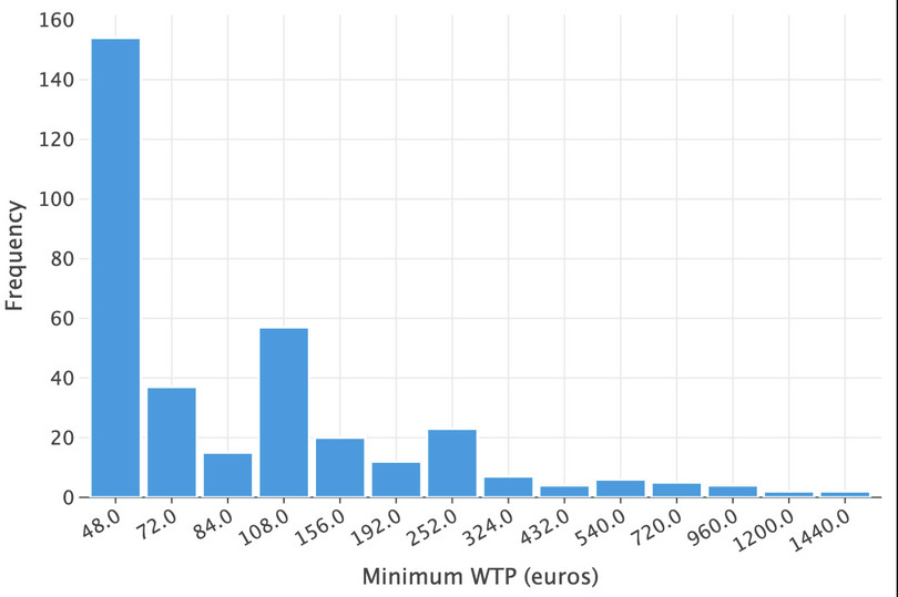
![Minimum WTP (euros).]()
Figure 11.4 Minimum WTP (euros).
Let’s now do the same for the maximum willingness to pay:
df_plmax = (
    wtp[["WTP_plmax_euro"]]
    .dropna()
    .astype("int")
    .astype("category")
    .value_counts()
    .sort_values()
    .reset_index()
)
( ggplot(df_plmax, aes(x=as_discrete("WTP_plmax_euro"), y="count")) + geom_bar(stat="identity") + labs(x="Maximum WTP (euros)", y="Frequency") )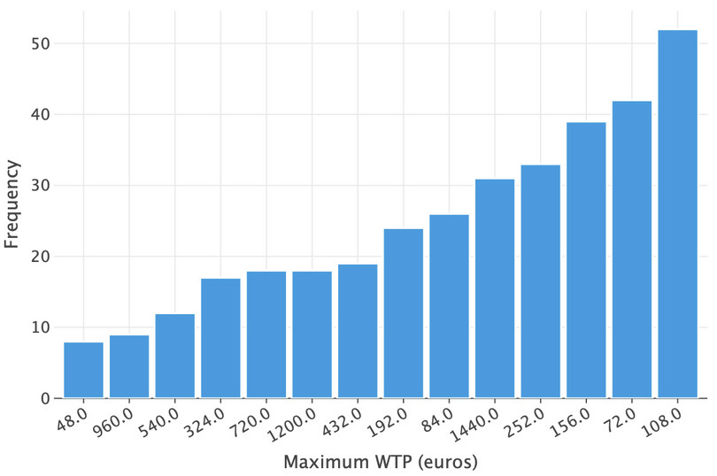
![Maximum WTP (euros).]()
Figure 11.5 Maximum WTP (euros).
Calculate average WTP for each individual
We can use the
meanfunction to obtain the average of the minimum and maximum willingness to pay (combining the two columns at each row using theaxis=1keyword argument). We store the averages as the variablewtp_average.wtp["wtp_average"] = wtp[["WTP_plmin_euro", "WTP_plmax_euro"]].mean(axis=1)Calculate mean and median WTP across individuals
The mean and median of this average value can be obtained using the
meanandmedianfunctions. Note that invalid entries, such asNaN, are omitted by default. Also, since there’s only a single remaining dimension over which to take the mean and median, there’s no need to specifyaxis=0, which is the default in any case.wtp["wtp_average"].mean()268.5344827586207wtp["wtp_average"].median()132.0Calculate correlation coefficients
We showed how to obtain a matrix of correlation coefficients for a number of variables in Python walk-through 8.8. We use the same process here, storing the coefficients in an object called
M_corr.M_corr = ( wtp.assign(gender=lambda x: np.where(x["sex"] == "female", 0, 1)) .loc[ :, [ "wtp_average", "education", "gender", "climate", "gov_intervention", "pro_environment", ], ] .corr() ) M_corr["wtp_average"].round(3)wtp_average 1.000 education 0.138 gender 0.037 climate -0.145 gov_intervention -0.188 pro_environment 0.188 Name: wtp_average, dtype: float64
- For individuals who answered the DC question:
- Each individual was given an amount and had to decide ‘yes’, ‘no’, or ‘no vote/abstain from deciding’. Make a table showing the frequency of
DC_ref_outcome, withcostsas the row variable andDC_ref_outcomeas the column variable.
- Use this table to calculate the percentage of individuals who voted ‘no’ and ‘yes’ for each amount (in other words as a percentage of the row total, not the overall total). Count individuals who chose ‘abstain’ as voting ‘no’.
- Make a line chart showing the ‘demand curve’, with percentage of individuals who voted ‘yes’ as the vertical axis variable and amount (in euros) as the horizontal axis variable. Describe features of this ‘demand curve’ that you find interesting.
- Repeat Question 2(b), this time excluding individuals who chose ‘abstain’ from the calculations. Plot this new ‘demand curve’ on the chart created for Question 2(c). Do your results change qualitatively depending on how you count individuals who did not vote?
Python walk-through 11.7 Summarizing dichotomous choice (DC) variables
Create a frequency table for
DC_ref_outcomeWe can group by
costsandDC_ref_outcometo obtain the number of observations for each combination of amount and vote response. We can also recode the voting options as shorter phrases: ‘Yes’, ‘No’, and ‘Abstain’.recoding_dict = { "do not support referendum and no pay": "No", "support referendum and pay": "Yes", "would not vote": "Abstain", } wtp_dc = ( wtp.dropna(subset=["costs", "DC_ref_outcome"]) .assign(DC_ref_outcome=lambda x: x["DC_ref_outcome"].map(recoding_dict)) .groupby(["costs", "DC_ref_outcome"])["id"] .count() .unstack() ) wtp_dc
DC_ref_outcome Abstain No Yes costs 48 12 21 32 72 11 30 40 84 12 24 45 108 7 35 31 156 13 31 40 192 11 25 25 252 9 32 28 324 16 41 27 432 11 35 29 540 9 31 22 720 12 39 13 960 14 28 15 1,200 11 42 21 1,440 19 42 15 Add column showing the proportion voting yes or no
We can extend the table from Question 2(a) to include the proportion voting yes or no (to obtain percentages, multiply the values by 100). We chain methods in the below; using
assignto create new columns androundto round the values in the float columns.wtp_dc = wtp_dc.assign( total=lambda x: x["Abstain"] + x["No"] + x["Yes"], prop_no=lambda x: (x["Abstain"] + x["No"]) / x["total"], prop_yes=lambda x: x["Yes"] / x["total"], ).round(2) wtp_dc
DC_ref_outcome Abstain No Yes total prop_no prop_yes costs 48 12 21 32 65 0.51 0.49 72 11 30 40 81 0.51 0.49 84 12 24 45 81 0.44 0.56 108 7 35 31 73 0.58 0.42 156 13 31 40 84 0.52 0.48 192 11 25 25 61 0.59 0.41 252 9 32 28 69 0.59 0.41 324 16 41 27 84 0.68 0.32 432 11 35 29 75 0.61 0.39 540 9 31 22 62 0.65 0.35 720 12 39 13 64 0.80 0.20 960 14 28 15 57 0.74 0.26 1,200 11 42 21 74 0.72 0.28 1,440 19 42 15 76 0.80 0.20 Make a line chart of WTP
Using the dataframe generated for Questions 2(a) and (b) (
wtp_dc), we can uselets_plotto plot the demand curve as a scatterplot with connected points.( ggplot(wtp_dc.reset_index(), aes(x="costs", y="prop_yes")) + geom_line(size=1) + geom_point(size=4) + labs( x="Amount (euros)", y="Proportion voting 'Yes'", ) )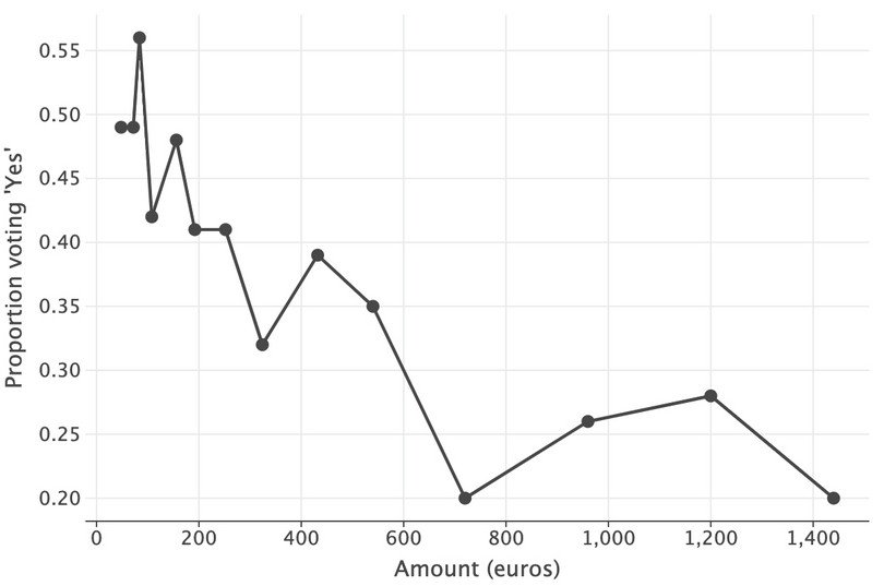
![Demand curve (in euros), DC method.]()
Figure 11.6 Demand curve (in euros), DC method.
Calculate new proportions and add them to the table and chart
It is straightforward to calculate new proportions and add them to the existing dataframe:
wtp_dc = wtp_dc.assign(
    total_ex=lambda x: x["No"] + x["Yes"],
    prop_no_ex=lambda x: (x["No"]) / x["total_ex"],
    prop_yes_ex=lambda x: x["Yes"] / x["total_ex"],
).round(2)
Now we’re going to plot them, too. Because
lets_plotexpects long-format (aka ‘tidy’) data, we need to re-orient the dataframe. We’ll put the results of this long format data in a new dataframe calleddemand_curve. We’ll clean this dataframe up a bit too, by renaming the ref outcome variable tovoteand the entries in that variable to more relevant names for the chart. Finally, we’ll plot the chart using lines and dots as before.demand_curve = ( pd.melt( wtp_dc.reset_index(), id_vars=["costs"], value_vars=["prop_yes", "prop_yes_ex"] ) .rename(columns={"DC_ref_outcome": "Vote"}) .assign( Vote=lambda x: x["Vote"].map( {"prop_yes": "Counted as no", "prop_yes_ex": "Excluded"} ) ) )( ggplot(demand_curve, aes(x="costs", y="value", color="vote")) + geom_line(size=1) + geom_point(size=3) + labs( x="Amount (euros)", y="Proportion voting 'Yes'", ) + ggsize(900, 400) )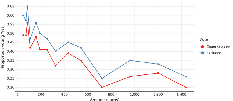
![Demand curve from DC respondents, under different treatments for ‘Abstain’ responses.]()
Figure 11.7 Demand curve from DC respondents, under different treatments for ‘Abstain’ responses.
- Compare the mean and median WTP under both question formats:
- Complete Figure 11.8 and use it to calculate the difference in means (DC minus TWPL), the standard deviation of these differences, and the number of observations. (The mean of DC is the mean of
DC_ref_outcomefor individuals who votedyes.)
| Format | Mean | Standard deviation | Number of observations |
|---|---|---|---|
| DC | |||
| TWPL |
Figure 11.8 Summary table for WTP.
- Obtain 95% confidence intervals for the difference of means for each question format. Discuss your findings.
- Does the median WTP look different across question formats? (You do not need to do any formal calculations.)
- Using your answers to Questions 3(a)–(c), would you recommend that governments use the mean or median WTP in policy making decisions? (That is, which measure appears to be more robust to changes in the question format?)
Python walk-through 11.8 Calculating confidence intervals for differences in means
Calculate the difference in means, standard deviations, and number of observations
We first create two vectors that will contain the
wtpvalues for each of the two question methods. For the DC format, willingness to pay is recorded in thecostsvariable, so we select all observations where theDC_ref_outcomevariable indicates the individual votedyesand drop any missing observations. For the TWPL format we use thewtp_averagevariable that we created in Python walk-through 11.6.dc_wtp = wtp.loc[ wtp["DC_ref_outcome"] == "support referendum and pay", "costs" ].dropna() dc_wtp.agg(["mean", "std", "count"]).round(2)mean 348.19 std 378.65 count 383.00 Name: costs, dtype: float64twpl_wt = wtp.loc[~wtp["wtp_average"].isna(), "wtp_average"].dropna() twpl_wt.agg(["mean", "std", "count"]).round(2)mean 268.53 std 287.71 count 348.00 Name: wtp_average, dtype: float64Calculate 95% confidence intervals
Using the
ttestfunction from thepingouinpackage to obtain 95% confidence intervals was covered in Python walk-throughs 8.10 and 10.6. As we have already separated the data for the two different question formats in Question 3(a), we can obtain the confidence interval directly.pg.ttest(dc_wtp, twpl_wt, confidence=0.05)
T dof alternative p-val CI5% cohen-d BF10 power T-test 3.219251 707.306861 two-sided 0.001344 [78.10141039468779, 81.20560320034237] 0.235367 12.893 0.887627 Calculate median WTP for the DC format
In Python walk-through 11.6 we obtained the median WTP for the TWPL format. We now obtain the WTP using the DC format:
dc_wtp.median()192.0
-
Leading think tanks estimate that the world needs 20 trillion USD of investment in low-carbon energy supplies and energy efficient technologies by 2030 to meet the Paris Agreement targets. This amount roughly corresponds to 3,273 euros total per adult (aged 15 and above), or 298 euros per adult per year (2020 to 2030 inclusive).
Compare this approximate number with the WTP estimates you have found. Assuming people around the world have the same attitudes towards climate change as the Germans surveyed, would a tax equal to the median WTP be enough to finance climate change mitigation? Discuss how governments could increase public support for and involvement in climate change mitigation activities.
