Extra Empirical Project 2: The politics of carbon taxation Working in R
These code downloads have been constructed as supplements to the full Doing Economics projects. You’ll need to download the data before running the code that follows.
Download the code
To download the code chunks used in this project, right-click on the download link and select ‘Save Link As…’. You’ll need to save the code download to your working directory, and open it in RStudio.
Don’t forget to also download the data into your working directory by following the steps in this project.
Getting started in R
For this project you will need the following packages:
tidyverse, to help with data manipulationreadxl, to import an Excel spreadsheet.
If you need to install either of these packages, run the following code:
install.packages(c("readxl", "tidyverse"))
You can import the libraries now, or when they are used in the R walk-throughs.
library(readxl)
library(tidyverse)
Part 1: Measuring and explaining public support for carbon taxation
In this part, we will analyse survey data on public support for carbon taxation in the UK. We will summarize how support for carbon taxes is distributed and how it is associated with the survey respondents’ demographic characteristics and beliefs.
First, download the survey data and documentation:
- Download the data, which is a simplified version of the dataset from the article ‘Unequal treatment perceptions and rural backlashes against carbon taxation’ by Hope, Limberg, and Steinebach (2026). Also download their article for reference.
- Read the Data dictionary tab in the spreadsheet. Familiarize yourself with the definitions of the variables in the dataset and check that each variable listed in the Data dictionary is also in the Data tab.
R walk-through 1 Importing data into R
We start by setting our working directory using the
setwdcommand. This command tells R where your codes and data files are stored. In the code below, replace ‘YOURFILEPATH’ with the full file path that indicates the folder in which you have saved the code chunks file. Note that you have to use forward slashes (‘/’) rather than backslashes (‘\’). If you don’t know how to find the path to your working folder, see the Technical Reference section.setwd(‘YOURFILEPATH’)Since our data is in Excel format, we use the
read_excelfunction to import the data into R. We run this command twice: once to import the data dictionary (which we will callvar_info) and once to import the survey data (which we will calldat). We use thesheetoption to tell R which tab in the Excel file to import.var_info <- read_excel("dataset_hope-et-al_simplified.xlsx", sheet = "Data dictionary") dat <- read_excel("dataset_hope-et-al_simplified.xlsx", sheet = "Data")To check that the data has been imported correctly, you can use the
headfunction to view the first six rows of the dataset, and confirm that they correspond to the columns in the Excel file.head(dat)## # A tibble: 6 × 9 ## respondent_id age neighbou…¹ commute parti…² treat…³ carbo…⁴ unequ…⁵ carbo…⁶ ## <dbl> <dbl> <chr> <chr> <chr> <dbl> <dbl> <dbl> <dbl> ## 1 1 21 Suburban Walk Labour… 1 2 7 3 ## 2 2 24 Suburban Car Labour… 1 3 4 6 ## 3 3 21 Urban Car Labour… 0 2 6 3 ## 4 4 54 Suburban <NA> Labour… 1 2 7 4 ## 5 5 48 Suburban Public… Labour… 1 4 10 8 ## 6 6 46 Suburban Car Libera… 0 4 7 7 ## # … with abbreviated variable names ¹neighbourhood, ²partisanship, ³treatment, ## # ⁴carbon_tax_support, ⁵unequal_treatment, ⁶carbon_tax_unfairnessBefore working with the data, we use the
strfunction to check that the data is formatted correctly.str(dat)## tibble [2,997 × 9] (S3: tbl_df/tbl/data.frame) ## $ respondent_id : num [1:2997] 1 2 3 4 5 6 7 8 9 10 ... ## $ age : num [1:2997] 21 24 21 54 48 46 66 30 28 21 ... ## $ neighbourhood : chr [1:2997] "Suburban" "Suburban" "Urban" "Suburban" ... ## $ commute : chr [1:2997] "Walk" "Car" "Car" NA ... ## $ partisanship : chr [1:2997] "Labour Party" "Labour Party" "Labour Party" "Labour Party" ... ## $ treatment : num [1:2997] 1 1 0 1 1 0 1 0 0 0 ... ## $ carbon_tax_support : num [1:2997] 2 3 2 2 4 4 5 3 3 3 ... ## $ unequal_treatment : num [1:2997] 7 4 6 7 10 7 8 10 9 9 ... ## $ carbon_tax_unfairness: num [1:2997] 3 6 3 4 8 7 10 7 7 4 ...R correctly recognizes variables that are numbers (
num), such asrespondent_idandage, and variables that are words (chr), such aspartisanship.
- Likert scale
- A numerical scale (usually ranging from 1–5 or 1–7) used to measure attitudes or opinions, with each number representing the individual’s level of agreement or disagreement with a particular statement.
Attitudes towards carbon taxation are assessed on a Likert scale. In this case, the scale measured the level of support for a specific policy (on a 5-point scale running from 1 for ‘strongly oppose’ to 5 for ‘strongly support’). This is a common approach in survey research assessing people’s preferences for economic policies.
- Find the survey question used to ask about carbon tax preferences in Part A of the supplementary material for the article. What step do the authors take to try to ensure that they receive accurate information about respondents’ support for the policy?
- Use the data you have imported to answer the following questions:
- Each respondent in the dataset has been assigned an ID (recorded as
respondent_idin the spreadsheet). How many respondents are there in the dataset?
- In the survey, respondents are randomly assigned to the treatment or control group. Use the treatment variable in the spreadsheet. How many respondents are in the treatment group and how many are in the control group? (Hint: Respondents in the treatment group are given a value of 1 and respondents in the control group are given a value of 0. So, you can highlight the column for the treatment variable and use the ‘Sum’ reported on the grey bar at the bottom of the Excel spreadsheet to find out the number of respondents in the treatment group.)
R walk-through 2 Making a frequency table
We use the
countfunction (part of thetidyversepackage) to count the number of respondents in the control and treatment groups. This information is stored in the variabletreatment. The punctuation%>%can be used to link multiple commands together.dat %>% count(treatment)## # A tibble: 2 × 2 ## treatment n ## <dbl> <int> ## 1 0 1516 ## 2 1 1481There are 1,516 respondents in the control group (
treatment= 0) and 1,481 respondents in the treatment group (treatment= 1).
- On page 7 of the article, the authors describe how they recode the variable for carbon tax support for their empirical analysis. How do they recode the variable? What might be the advantages and disadvantages of doing this?
- dummy variable (indicator variable)
- A variable that takes the value 1 if a certain condition is met, and 0 otherwise.
Binary variables are dichotomous—they can only take one of two possible values or categories (for example, ‘yes’ and ‘no’ or ‘true’ and ‘false’). One way to simplify variables in a dataset to make them easier to analyse is to transform them into binary variables. When a binary variable is created that only takes the values of 0 or 1, it is referred to as a dummy variable (also known as an indicator variable).
We will now create dummy variables.
- Create a dummy variable for carbon tax support that takes a value of 1 if the variable
carbon_tax_supportis 1 or 2 (that is, respondents ‘strongly support’ or ‘support’ carbon taxation) and 0 otherwise. When creating this variable, missing data (blank cells that indicate which respondents did not answer the carbon tax support question in the survey) should still be coded as missing (that is,NA).
- Create four more dummy variables that will be used in the analysis for this project. Give each of these new variables an informative name:
- a dummy variable indicating whether respondents are aged 40 or above (coded as 1) or under 40 years of age (coded as 0)
- a dummy variable indicating whether respondents commute by car (1) or by other means (0)
- a dummy variable indicating whether respondents live in a rural area (1) or a non-rural area (0) (Note: people living in ‘urban’ and ‘suburban’ areas should be coded as 0)
- a dummy variable indicating whether respondents have an
unequal_treatmentvalue of 8 or above (1) or below 8 (0) (Note: Part 2 of the project discusses the meaning of this variable in more depth).
R walk-through 3 Creating dummy variables
Here we use the
mutatefunction (within thetidyversepackage) to create new columns in ourdatdataset, one for each dummy variable. We use thecase_whenfunction to specify the condition(s) that R should use to assign values, and theis.nafunction to code any missing data (NA) asNA_real(numerical missing data).# Create carbon tax dummy (1 if support is 1 or 2) dat <- dat %>% mutate( carbon_tax_support_dummy = case_when( carbon_tax_support == 1 ~ 1, carbon_tax_support == 2 ~ 1, is.na(carbon_tax_support) ~ NA_real_, TRUE ~ 0 ) )In the code above, we set the values of our carbon tax support dummy variable (called
carbon_tax_support_dummy) to equal 1 if the variablecarbon_tax_supportequals 1 or 2. Otherwise, this dummy variable should equal 0 (TRUE ~ 0).We repeat the same steps to create dummy variables for age (
age_dummy), commuting by car (car_dummy), rural neighbourhood (rural), and unequal treatment perceptions (unequal_treatment_dummy).# Create age dummy (1 if age is greater than 40) dat <- dat %>% mutate( age_dummy = case_when( age > 40 ~ 1, is.na(age) ~ NA_real_, TRUE ~ 0 ) ) #Create car dummy (1 if people commute by car) dat <- dat %>% mutate( car_dummy = case_when( commute == "Car" ~ 1, is.na(commute) ~ NA_real_, TRUE ~ 0 ) ) #Create rural dummy (1 if people live in rural neighborhood) dat <- dat %>% mutate( rural = case_when( neighbourhood == "Rural" ~ 1, is.na(neighbourhood) ~ NA_real_, TRUE ~ 0 ) ) #Create unequal treatment perceptions dummy (1 if value is 8 and above) dat <- dat %>% mutate( unequal_treatment_dummy = case_when( unequal_treatment >= 8 ~ 1, is.na(unequal_treatment) ~ NA_real_, TRUE ~ 0 ) )
We will now use the dataset to explore public support for carbon taxation in the UK. For the rest of Part 1, we will only use data from the control group (as we want to look at baseline support without any influence from the treatment in the experiment, which will be discussed further in Part 2 of the project).
- Create a new data frame called
Controlthat only contains data for the control group (in other words, only for the respondents whose value for the variabletreatmentis 0).
For Questions 7–12, use the data in the dataframe Control.
We will start by using the original carbon tax variable with all five answer categories to see how carbon tax support is distributed. We will then turn to our dummy variable for carbon tax support to help simplify the remainder of the analysis.
- Create a frequency table (like Figure 1) that shows the number and percentage of respondents in each of the five answer categories for the variable
carbon_tax_support.
| Carbon tax support | Number of respondents | Percentage of respondents |
|---|---|---|
| Strongly oppose | ||
| Oppose | ||
| Neither support nor oppose | ||
| Support | ||
| Strongly support |
Figure 1 The distribution of carbon tax support in the UK.
- Use the data from the frequency table in Question 7 to create a column chart showing the percentage of respondents in each category of carbon tax support.
R walk-through 4 Making a frequency and column chart on a subset of data
We apply the
filterfunction to select observations in the control group (treatment == 0) and save these in a new dataframe calledControl.Control <- dat %>% filter(treatment == 0)We will create a frequency table (called
freq_table) using threetidyversepackage functions. First, we filter (filter) out the missing data in thecarbon_tax_supportvariable. Second, we count (count) the number of respondents in this variable. Third, we usemutateto create a new column calledPercentagethat contains the percentages.#Frequency table for carbon tax support freq_table <- dat %>% filter(!is.na(carbon_tax_support)) %>% count(carbon_tax_support) %>% mutate(Percentage = (n / sum(n)) * 100)We now use
ggplotto make a column chart (geom_col()) withcarbon_tax_supportas the horizontal (x) variable andPercentageas the vertical (y) variable.#Create column chart ggplot(freq_table, aes(x = carbon_tax_support, y = Percentage)) + geom_col() + labs( title = "Share of respondents by carbon tax support", x = "Carbon tax support", y = "Percentage of respondents" )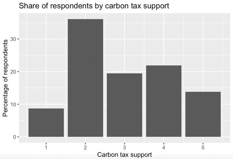
![Share of respondents by carbon tax support.]()
Figure 2 Share of respondents by carbon tax support.
- Use your chart from Question 8 to discuss the extent of support for carbon taxation in the UK. (For example, how does the percentage of respondents who support or strongly support carbon taxation compare with the percentage of respondents who oppose or strongly oppose carbon taxation?)
- Use the dummy variable for carbon tax support to do the following:
- Calculate the average of this dummy variable. How does this average relate to the table you created in Question 7?
- Provide an interpretation of the average of the carbon tax support dummy variable.
R walk-through 5 Calculating the average of a dummy variable
The average of a dummy variable is a proportion (between 0 and 1) that can be multiplied by 100 to represent the percentage of respondents for which the variable equals 1. We use the
countandmutatefunctions, just like in R walk-through 4, and store the results infreq_table_dummy.freq_table_dummy <- dat %>% count(carbon_tax_support_dummy) %>% mutate(Percentage = (n / sum(n)) * 100) freq_table_dummy## # A tibble: 3 × 3 ## carbon_tax_support_dummy n Percentage ## <dbl> <int> <dbl> ## 1 0 1623 54.2 ## 2 1 1318 44.0 ## 3 NA 56 1.87R creates a separate row for the missing data (56 observations). To remove this missing data, we use the
filteroption before creating the frequency table.freq_table_dummy <- dat %>% filter(!is.na(carbon_tax_support)) %>% count(carbon_tax_support_dummy) %>% mutate(Percentage = (n / sum(n)) * 100) freq_table_dummy## # A tibble: 2 × 3 ## carbon_tax_support_dummy n Percentage ## <dbl> <int> <dbl> ## 1 0 1623 55.2 ## 2 1 1318 44.8The counts (
n) remain the same, but the percentages are now calculated over the non-missing data only.1,318 respondents (44%, or 44.8% if excluding the missing data) support the carbon tax.
- conditional mean
- An average of a variable, taken over a subgroup of observations that satisfy certain conditions, rather than all observations.
We will now use our carbon tax support dummy variable and other variables in the dataset to explore how support for carbon taxes varies across different groups in the UK. Specifically, we will calculate the average of the carbon tax dummy variable for different subgroups in the dataset (in other words, we will calculate conditional means for the carbon tax dummy variable).
- Create the following tables:
- a table showing how average carbon tax support differs for respondents under 40, and those aged 40 and over
- a table showing how average carbon tax support differs for respondents who commute by car and those who do not
- a table showing how average carbon tax support differs for respondents living in rural areas and non-rural areas
- a table showing how average carbon tax support differs for respondents who support different political parties.
R walk-through 6 Creating summary tables for different groups
Using the
Controldataframe, we first usegroup_byto specify the groups for which the calculations will be done separately (age_dummyin this case), then usefilterto remove rows with missing data for age and carbon tax support. Finally, we use thesummarisefunction to calculate the mean (mean()) and store it in a new variable calledmean_carbon_tax_support_dummy.# Carbon tax support by age group (1 = age above 40) Control %>% group_by(age_dummy) %>% filter(!is.na(age_dummy))%>% filter(!is.na(carbon_tax_support_dummy)) %>% summarise(mean_carbon_tax_support_dummy = mean(carbon_tax_support_dummy))## # A tibble: 2 × 2 ## age_dummy mean_carbon_tax_support_dummy ## <dbl> <dbl> ## 1 0 0.528 ## 2 1 0.413Now we repeat the same steps for the other dummy variables.
#Carbon tax support by commuting by car (1 = car)
Control %>%
  group_by(car_dummy) %>%
  filter(!is.na(car_dummy))%>%
  filter(!is.na(carbon_tax_support_dummy)) %>%
  summarise(mean_carbon_tax_support_dummy = mean(carbon_tax_support_dummy))
## # A tibble: 2 × 2 ## car_dummy mean_carbon_tax_support_dummy ## <dbl> <dbl> ## 1 0 0.552 ## 2 1 0.407#Carbon tax support by rural status (1 = rural) Control %>% group_by(rural) %>% filter(!is.na(rural))%>% filter(!is.na(carbon_tax_support_dummy)) %>% summarise(mean_carbon_tax_support_dummy = mean(carbon_tax_support_dummy))## # A tibble: 2 × 2 ## rural mean_carbon_tax_support_dummy ## <dbl> <dbl> ## 1 0 0.468 ## 2 1 0.431#Carbon tax support by partisanship Control %>% group_by(partisanship) %>% filter(!is.na(partisanship))%>% filter(!is.na(carbon_tax_support_dummy)) %>% summarise(mean_carbon_tax_support_dummy = mean(carbon_tax_support_dummy))## # A tibble: 11 × 2 ## partisanship mean_carbon_tax_support_dummy ## <chr> <dbl> ## 1 Conservative Party 0.343 ## 2 Democratic Unionist Party 0.75 ## 3 Green Party of England and Wales 0.690 ## 4 Labour Party 0.552 ## 5 Liberal Democrats 0.529 ## 6 Other 0.5 ## 7 Plaid Cymru 0.333 ## 8 Prefer not to say 0.262 ## 9 Reform UK 0.167 ## 10 Scottish National Party 0.617 ## 11 Sinn Féin 0.375
- Use the tables in Question 11 to describe how support for carbon taxation in the UK varies across population subgroups. Suggest two other variables (not included in the dataset) that might be associated with people’s support for carbon taxes.
Part 2: Explaining rural backlashes against carbon taxation
Note
You will need to complete Part 1 before starting Part 2.
In Part 2 of the project, we focus on explaining rural backlashes against carbon taxation. In recent years, there have been several high-profile examples of this phenomenon including the 2018–2020 ‘Gilet Jaunes’ protests in France, which were sparked by a proposed rise in fuel taxes, and the mobilization of rural communities in British Columbia in Canada to fight the introduction of a new carbon tax. If governments hope to build broad-based support for carbon taxation, then it is important to understand better why these communities have such fierce resistance to carbon taxes.
That is the research question at the centre of Hope, Limberg, and Steinebach’s (2026) article ‘Unequal treatment perceptions and rural backlashes against carbon taxation’. In the article, the authors argue that rural backlashes against carbon taxation are not only driven by the direct costs borne by rural communities, but also by fairness considerations. People living in rural areas may oppose carbon taxes on the grounds that these taxes unfairly punish rural communities that are already disadvantaged and marginalized compared with the urban centres of economic and political power. Hence, the article argues that underlying resentments at unequal treatment by the government are an important reason for rural backlashes against carbon taxes.
We will use the simplified version of the dataset from the article to explore the empirical support for the authors’ argument. We will also learn about information provision survey experiments and how they can be utilized to test causal arguments about what drives people’s beliefs and policy preferences.
For this part of the project, we will add to the dataset that you worked on for Part 1 of the project. We will only use data from the rural respondents in the dataset, as this is the subgroup that we are interested in investigating further.
- Before you begin the tasks below, look at the Data dictionary tab in the original Excel file and familiarize yourself with how the survey measures respondents’ perceptions of unequal treatment by the government and respondents’ perceptions of the unfairness of carbon taxes. Think about how we can we interpret high values for these two variables.
- We start by selecting all the data for the rural respondents in the control group. Create a new dataframe called
rural_controlthat only contains data for rural respondents in the control group.
- Create the following tables:
- a table showing how average carbon tax unfairness perceptions (
carbon_tax_unfairness) differ for rural respondents in the control group who perceive a high degree of unequal treatment (8 or above on the 0–10 scale) compared with those who do not (Hint: Use the dummy variable for unequal treatment that you created in Part 1 Question 5 of the project.)
- a table showing how average carbon tax support differs for rural respondents in the control group who perceive a lot of unequal treatment (8 or above on the 0–10 scale) and those who do not.
R walk-through 7 Creating summary tables on a subset of data
First, we use
filterto select only the rows in theControldataframe that have rural respondents, and call this dataframerural_control.rural_control <- Control %>% filter(rural == 1)To create the summary tables, we use the
group_by,filter,is.na, andsummarisefunctions just like in R walk-through 6 from Part 1. Within themeanfunction, thena.rm = Toption tells R to exclude any missing data from the calculation.#Perception of carbon tax unfairness among rural respondents by unequal treatment perceptions (1 if people 8 and above) rural_control %>% group_by(unequal_treatment_dummy) %>% filter(!is.na(unequal_treatment_dummy))%>% filter(!is.na(carbon_tax_unfairness)) %>% summarise(mean_unfairness = mean(carbon_tax_unfairness, na.rm = T))## # A tibble: 2 × 2 ## unequal_treatment_dummy mean_unfairness ## <dbl> <dbl> ## 1 0 5.13 ## 2 1 6.20#Support for carbon taxation among rural respondents by unequal treatment perceptions (1 if people 8 and above) rural_control %>% group_by(unequal_treatment_dummy) %>% filter(!is.na(unequal_treatment_dummy))%>% filter(!is.na(carbon_tax_support_dummy)) %>% summarise(mean_carbon_tax_support_dummy = mean(carbon_tax_support_dummy, na.rm = T))## # A tibble: 2 × 2 ## unequal_treatment_dummy mean_carbon_tax_support_dummy ## <dbl> <dbl> ## 1 0 0.472 ## 2 1 0.405
- Use the tables from Question 2 to describe the relationship between perceptions of unequal treatment and a) carbon tax unfairness perceptions, and b) support for carbon taxation.
- correlation
- A measure of how closely related two variables are. Two variables are correlated if knowing the value of one variable provides information on the likely value of the other, for example high values of one variable being commonly observed along with high values of the other variable. Correlation can be positive or negative. It is negative when high values of one variable are observed with low values of the other. Correlation does not mean that there is a causal relationship between the variables. Example: When the weather is hotter, purchases of ice cream are higher. Temperature and ice cream sales are positively correlated. On the other hand, if purchases of hot beverages decrease when the weather is hotter, we say that temperature and hot beverage sales are negatively correlated.
- causation
- A direction from cause to effect, establishing that a change in one variable produces a change in another. While a correlation gives an indication of whether two variables move together (either in the same or opposite directions), causation means that there is a mechanism that explains this association. Example: We know that higher levels of CO2 in the atmosphere lead to a greenhouse effect, which warms the Earth’s surface. Therefore we can say that higher CO2 levels are the cause of higher surface temperatures.
- information provision survey experiment
- A research methodology where survey respondents are randomly assigned to receive different information. Researchers then look at how the information provided affects respondents’ beliefs and preferences. Information provision survey experiments are a useful tool for testing causal arguments about what drives people’s economic policy preferences.
Correlation and causation are distinct concepts: a correlation between two variables does not necessarily mean that there is a causal relationship between them (Part 1.3 of Empirical Project 1 discusses these concepts in more detail). So, we need more evidence to determine whether there is a causal relationship between the variables you summarized in Question 2.
In the article, the authors carry out an information provision survey experiment to examine the causal relationship between unequal treatment perceptions and lower support for carbon taxation.
The survey respondents were randomly assigned to the control or treatment group when beginning the survey. They first answered some questions about their demographic characteristics (such as ethnicity, level of education, and household income). After this, the treatment group was shown some information, whereas the control group was not. The survey then asked respondents about their beliefs and policy preferences related to carbon taxation. The full survey that respondents completed is included in the supplementary material for the article.
Since the treatment and control group were randomly assigned, any differences in beliefs and policy preferences between these two groups would reflect the effect of the information provided to the treatment group. The authors wanted to test whether perceptions of unequal treatment affected carbon tax support for rural respondents, so they provided information that would particularly strengthen perceptions of unequal treatment among rural respondents.
Figure 3 shows the information provided to respondents in the treatment group. It highlights the highly uneven distribution of government spending on transport (per person) across regions in the UK. London stands out as the region with the highest per capita government spending on transport by far. The level spent in London is almost double the amount spent across the whole UK. Crucially, London is the largest urban area in the UK and the seat of political power. The information therefore particularly highlights unequal treatment by the UK government along urban–rural lines.
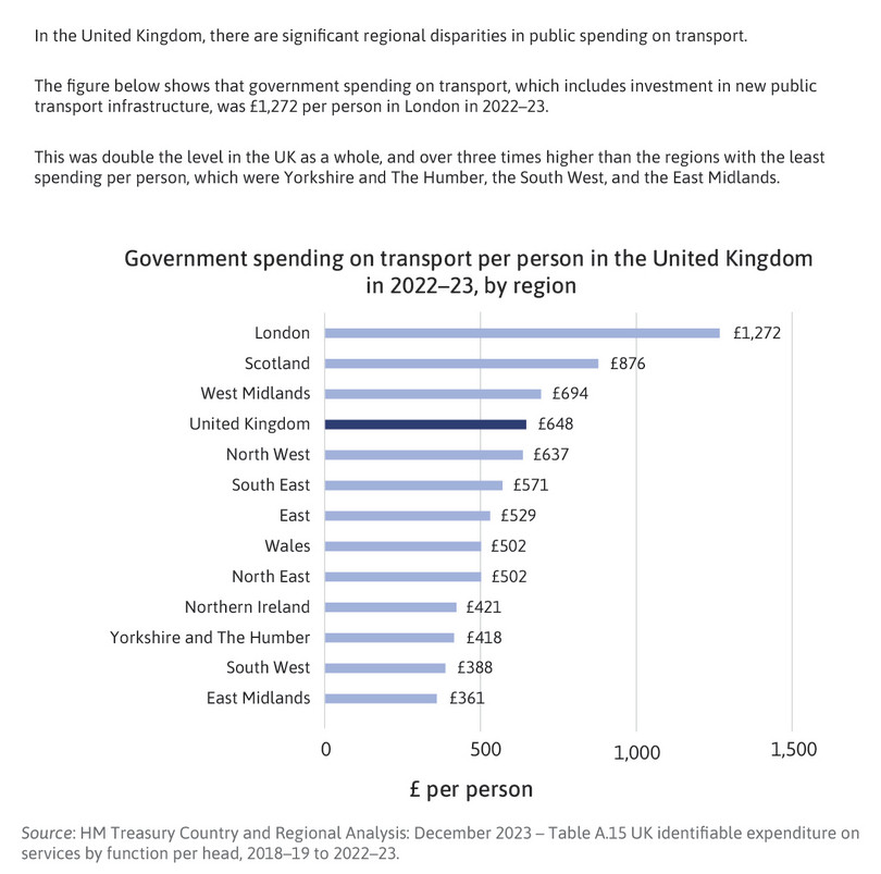
Figure 3 The information provided to the treatment group in the experiment.
- conditional mean
- An average of a variable, taken over a subgroup of observations that satisfy certain conditions, rather than all observations.
In the remaining tasks, we will follow the approach used in the article by comparing average values for our key variables for rural respondents in the treatment and control groups. Your results for Questions 4–9 will look similar to Figures 5 and 6 of the article—but not exactly alike, as the authors have controlled for other characteristics between the groups, like taking the conditional mean, whereas your results will show the unconditional mean.
- Create a new dataframe called
ruralthat contains rural respondents in the control and treatment group.
- Create the following column charts:
- a chart showing how average unequal treatment perceptions differ for rural respondents in the control and treatment groups
- a chart showing how average carbon tax unfairness perceptions differ for rural respondents in the control and treatment groups
- a chart showing how average carbon tax support differs for rural respondents in the control and treatment groups.
R walk-through 8 Creating column charts
We use
filterto create a new dataframe calledruralthat contains all rows that satisfy the conditionrural == 1.rural <- dat %>% filter(rural == 1)To create the column charts, we first use the
group_byandsummarisefunctions to calculate the mean separately for each group (treatment and control). Then we ‘pipe’ this output into theggplotfunction, using thefactoroption to specify that each category in thetreatmentvariable should have a separate column.rural %>% group_by(treatment) %>% summarise(mean_unequal_treatment = mean(unequal_treatment, na.rm = T)) %>% ggplot(., aes(x = factor(treatment), y = mean_unequal_treatment, fill = treatment)) + geom_col(width = 0.3) + labs( title = "Average unequal treatment perceptions", x = "Treatment group", y = "Average perceived unequal treatment" ) + theme(legend.position = "none")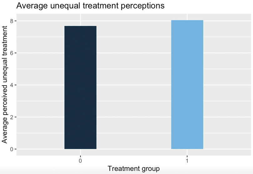
![Average unequal treatment perceptions.]()
Figure 4 Average unequal treatment perceptions.
We repeat the same steps for unfairness perceptions (
carbon_tax_unfairness) and carbon tax support (carbon_tax_support_dummy).# Unfairness perception by treatment group rural %>% group_by(treatment) %>% summarise(mean_carbon_tax_unfairness = mean(carbon_tax_unfairness, na.rm = T)) %>% ggplot(., aes(x = factor(treatment), y = mean_carbon_tax_unfairness, fill = treatment)) + geom_col(width = 0.3) + labs( title = "Average carbon tax unfairness perception", x = "Treatment group", y = "Average carbon tax unfairness perception" ) + theme(legend.position = "none") # Carbon tax support by treatment group rural %>% group_by(treatment) %>% summarise(mean_carbon_tax_support_dummy = mean(carbon_tax_support_dummy, na.rm = T)) %>% ggplot(., aes(x = factor(treatment), y = mean_carbon_tax_support_dummy, fill = treatment)) + geom_col(width = 0.3) + labs( title = "Average carbon tax support", x = "Treatment group", y = "Average carbon tax support" ) + theme(legend.position = "none")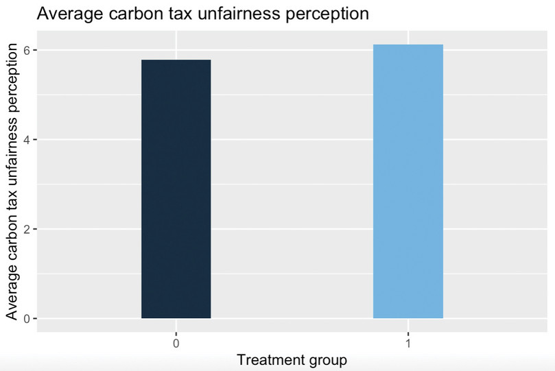
![Average carbon tax unfairness perception.]()
Figure 5 Average carbon tax unfairness perception.
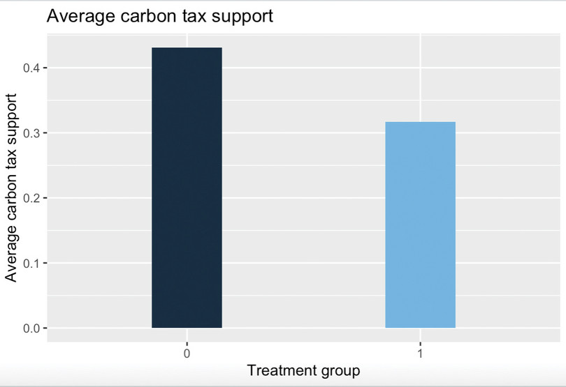
![Average carbon tax support.]()
Figure 6 Average carbon tax support.
- Use the
arrangefunction (from thetidyversepackage) to sort thetreatmentvariable in ascending order. This will move all the observations for the control group to the top of the dataframe, and all the observations for the treatment group below.
We will now conduct a formal statistical test to assess how likely it is that the observed differences between the treatment and control group are due to chance (variation that naturally occurs when sampling from the whole UK population) or due to the information treatment (systematic changes in the treatment group’s beliefs and preferences).
- p-value
- The probability of observing data at least as extreme as the data collected if a particular hypothesis about the population is true. The p-value ranges from 0 to 1: the lower the probability (the lower the p-value), the less likely it is to observe the given data, and therefore the less compatible the data are with the hypothesis.
- Calculate the p-value for the difference in means between the control and treatment groups for:
- unequal treatment perceptions
- carbon tax unfairness perceptions
- carbon tax support.
R walk-through 9 Calculating p-values for differences in means
First, we use the
arrangefunction to sort the data according totreatment.rural <- rural %>% arrange(treatment, .by_group=TRUE) head(rural$treatment)## [1] 0 0 0 0 0 0tail(rural$treatment)## [1] 1 1 1 1 1 1To calculate the p-value for
unequal_treatment, we usepullto extract the data for that variable only, and create separate vectors to store the data for the control and treatment groups (p1_candp1_trespectively). We then use these vectors as inputs in thet.testfunction. Thet.testfunction stores the p-value asp.value.# Create vectors for control and treatment group and run t test, unequal treatment perceptions p1_c <- rural %>% filter(treatment == 0) %>% pull(unequal_treatment) p1_t <- rural %>% filter(treatment == 1) %>% pull(unequal_treatment) t1 <- t.test(x = p1_c, y = p1_t) t1$p.value## [1] 0.0233547We repeat these steps for
carbon_tax_unfairnessandcarbon_tax_support_dummy.# t-test for unequal treatment perceptions p2_c <- rural %>% filter(treatment == 0) %>% pull(carbon_tax_unfairness) p2_t <- rural %>% filter(treatment == 1) %>% pull(carbon_tax_unfairness) t2 <- t.test(x = p2_c, y = p2_t) t2$p.value## [1] 0.08197306# t-test for carbon tax support p3_c <- rural %>% filter(treatment == 0) %>% pull(carbon_tax_support_dummy) p3_t <- rural %>% filter(treatment == 1) %>% pull(carbon_tax_support_dummy) t3 <- t.test(x = p1_c, y = p1_t) t3$p.value## [1] 0.0233547
- How do the p-values differ across the three variables? What can this tell us about the statistical significance of the treatment effects found in the experiment? (In other words, how likely is it that the observed differences between treatment and control groups are due to chance?) (Hint: see the discussion on interpreting p-values in Part 2.3 of Empirical Project 2.)
- Extension: Calculate a 95% confidence interval for each of the variables in Question 7 and create a new chart showing the differences in means with their corresponding confidence intervals. (You can either show all three outcomes on the same chart, with carbon tax support expressed as a proportion instead of a percentage, or you can make three separate charts.) Provide an interpretation of these confidence intervals and compare them across the three variables.
R walk-through 10 Calculating confidence intervals and adding them to a chart
We will use
unequal_treatmentas an example; the steps for the other variables are exactly the same (just change the variable name in the code below).The
t.testfunction calculates confidence intervals automatically, along with other information (including the p-value, which we used in R walk-through 9). The confidence interval is stored asconf.int[1:2].# Confidence interval for unequal_treatment t1$conf.int[1:2]## [1] -0.6670331 -0.0487137
- standard error
- A measure of the degree to which the sample mean deviates from the population mean. It is calculated by dividing the standard deviation of the sample by the square root of the number of observations.
For R to plot the confidence intervals, instead of the actual values, we need to store the interval values as the amount to add/subtract from the mean value. The easiest way is to calculate the standard error for the sample mean and multiply this by 1.96 (
m_err= \(1.96 \times \text{standard deviation}/\sqrt{\text{number of observations}}\)), where 1.96 is the factor required to get a 95% confidence interval (assuming a normal distribution). The confidence interval is then [mean_m−m_err,mean_m+m_err].We use
group_byandsummariseto create a summary table showing the number of observations, the mean, standard deviation, and standard error for the treatment and control group. We arrange the data according to the mean values ofunequal_treatment(revsorts from highest to lowest), and save the final result intable_stats.table_stats <- rural %>% group_by(treatment) %>% summarise(obs = length(unequal_treatment), mean_m = mean(unequal_treatment), sd_m = sd(unequal_treatment, na.rm = TRUE), m_err = 1.96 * sqrt(sd_m^2 / (obs - 1))) %>% arrange(rev(mean_m)) table_stats## # A tibble: 2 × 5 ## treatment obs mean_m sd_m m_err ## <dbl> <int> <dbl> <dbl> <dbl> ## 1 1 290 8.05 1.82 0.210 ## 2 0 323 7.69 2.08 0.227Now we can use this information to make a bar chart.
ggplot(table_stats, aes(y = mean_m, x = treatment)) +
    geom_bar(position = position_dodge(),
    # Use black outlines and add thinner bar outlines
    stat = "identity", colour = "black", width = .5) +
  ylab("Mean of unequal treatment perceptions") + xlab("") +
  geom_errorbar(aes(ymin = mean_m - m_err,
    ymax = mean_m + m_err),
    # Thinner lines for confidence intervals
    size = .6, width = .2, position = position_dodge(.2))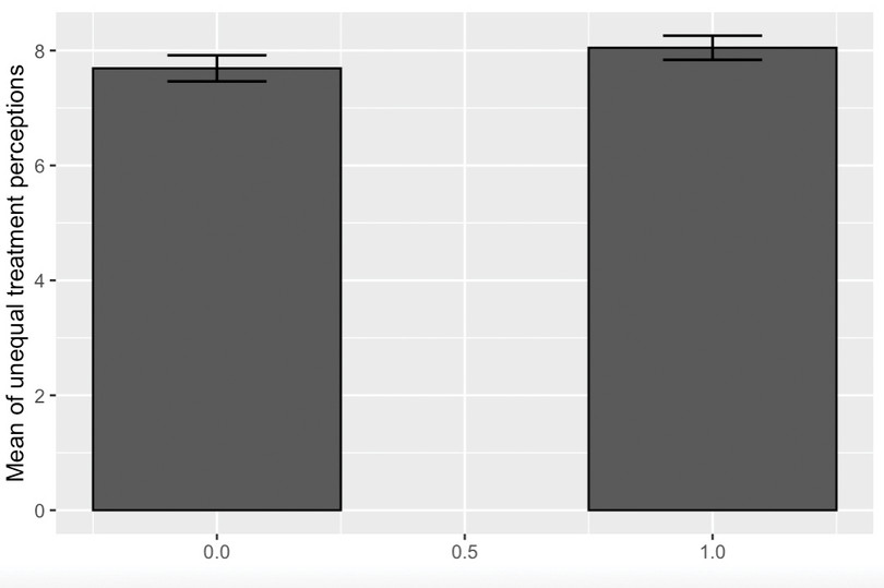
![Mean of unequal treatment perceptions, with 95% confidence intervals.]()
Figure 7 Mean of unequal treatment perceptions, with 95% confidence intervals.
- Information provision survey experiments are an increasingly widely used research methodology in economics. The article, Designing information provision experiments by Haaland et al. (2021) in the Journal of Economic Literature reviews the existing literature and discusses how to best design this type of experiment. Use this article to answer the following questions:
- What are some of the strengths and weaknesses of information provision survey experiments?
- If you were going to re-run the experiment in Hope et al. (2026), what changes would you make to improve the experimental design?
- Use a generative-AI tool to (i) find some strengths and weaknesses of survey experiments that are not mentioned in the Haaland et al. (2023) article and (ii) critique the design of the Hope et al. (2026) experiment. Use the answers provided by the AI tool to revise and enhance your answers to Questions 10(a) and 10(b).
