Extra Empirical Project 2: The politics of carbon taxation Working in Google Sheets
Part 1: Measuring and explaining public support for carbon taxation
In this part, we will analyse survey data on public support for carbon taxation in the UK. We will summarize how support for carbon taxes is distributed and how it is associated with the survey respondents’ demographic characteristics and beliefs.
First, download the survey data and documentation:
- Download the data, which is a simplified version of the dataset from the article ‘Unequal treatment perceptions and rural backlashes against carbon taxation’ by Hope, Limberg, and Steinebach (2026). Also download their article for reference.
- Read the Data dictionary tab in the spreadsheet. Familiarize yourself with the definitions of the variables in the dataset and check that each variable listed in the Data dictionary is also in the Data tab.
- Likert scale
- A numerical scale (usually ranging from 1–5 or 1–7) used to measure attitudes or opinions, with each number representing the individual’s level of agreement or disagreement with a particular statement.
Attitudes towards carbon taxation are assessed on a Likert scale. In this case, the scale measured the level of support for a specific policy (on a 5-point scale running from 1 for ‘strongly oppose’ to 5 for ‘strongly support’). This is a common approach in survey research assessing people’s preferences for economic policies.
- Find the survey question used to ask about carbon tax preferences in Part A of the supplementary material for the article. What step do the authors take to try to ensure that they receive accurate information about respondents’ support for the policy?
- Use the Data tab to answer the following questions:
- Each respondent in the dataset has been assigned an ID (recorded as
respondent_idin the spreadsheet). How many respondents are there in the dataset?
- In the survey, respondents are randomly assigned to the treatment or control group. Use the treatment variable in the spreadsheet. How many respondents are in the treatment group and how many are in the control group? (Hint: Respondents in the treatment group are given a value of 1 and respondents in the control group are given a value of 0. So, you can highlight the column for the treatment variable and use the ‘Sum’ reported on the grey bar at the bottom of the spreadsheet to find out the number of respondents in the treatment group. You could also use the COUNTIF function to check this result formally.)
- On page 7 of the article, the authors describe how they recode the variable for carbon tax support for their empirical analysis. How do they recode the variable? What might be the advantages and disadvantages of doing this?
- dummy variable (indicator variable)
- A variable that takes the value 1 if a certain condition is met, and 0 otherwise.
Binary variables are dichotomous—they can only take one of two possible values or categories (for example, ‘yes’ and ‘no’ or ‘true’ and ‘false’). One way to simplify variables in a dataset to make them easier to analyse is to transform them into binary variables. When a binary variable is created that only takes the values of 0 or 1, it is referred to as a dummy variable (also known as an indicator variable).
We will now create dummy variables using the IF function. The IF function allows you to fill in the values of the new variable based on the values of the original variable.
Each dummy variable you create in Questions 4 and 5 should be a new column in the Data tab of your spreadsheet. The first cell at the top of each column will be the name of the new variable. The names for the newly created dummy variables should be different from the underlying variables, so you can easily identify which is which.
- In column J of the Data tab, create a dummy variable for carbon tax support that takes a value of 1 if the variable
carbon_tax_supportis 1 or 2 (i.e., respondents ‘strongly support’ or ‘support’ carbon taxation) and 0 otherwise. When creating this variable, missing data (blank cells that indicate which respondents did not answer the carbon tax support question in the survey) should still be coded as missing (i.e., a blank cell). (Hint: You need to use the IF function twice in the same formula. For help on using the IF function, see Google Sheets walk-through 6.1. Make sure to give your new variable an informative name.)
- Use the IF function to create four more dummy variables that will be used in the analysis for this project (in each case, missing values should be coded as blank cells). Give each of these new variables an informative name. Create:
- a dummy variable indicating whether respondents are aged 40 or above (coded as 1) or under 40 years of age (coded as 0)
- a dummy variable indicating whether respondents commute by car (1) or by other means (0)
- a dummy variable indicating whether respondents live in a rural area (1) or a non-rural area (0) (Note: people living in ‘urban’ and ‘suburban’ areas should be coded as 0)
- a dummy variable indicating whether respondents have an
unequal_treatmentvalue of 8 or above (1) or below 8 (0) (Note: Part 2 of the project discusses the meaning of this variable in more depth).
We will now use the dataset to explore public support for carbon taxation in the UK. For the rest of Part 1, we will only use data from the control group (as we want to look at baseline support without any influence from the treatment in the experiment, which will be discussed further in Part 2 of the project).
- Using Google Sheet’s filter function, select just the control group (i.e., only the respondents whose value for the variable
treatmentis 0). Create a new tab in your spreadsheet and name it ‘Control’. Copy-and-paste the data for the control group (all columns) into the Control tab. (Use the ‘Paste as values’ option).
For Questions 7–12, use the data in the Control tab.
We will start by using the original carbon tax variable with all five answer categories to see how carbon tax support is distributed. We will then turn to our dummy variable for carbon tax support to help simplify the remainder of the analysis.
- Create a new tab named ‘Part 1. Tasks’. In this tab:
- Use the COUNTIF function, which counts the number of cells in a given selection that meet the specified criteria, to create a frequency table (like Figure 1) that shows the number of respondents in each of the five answer categories for the variable
carbon_tax_support.
- Add another column to your table that uses a percentage formula to calculate the percentage of total respondents in each answer category. (Hint: For help on using the COUNTIF function, see Google Sheets walk-through 1.5.)
| Carbon tax support | Number of respondents | Percentage of respondents |
|---|---|---|
| Strongly oppose | ||
| Oppose | ||
| Neither support nor oppose | ||
| Support | ||
| Strongly support |
Figure 1 The distribution of carbon tax support in the UK.
- Using the data from the first and third columns of your table from Question 7, create a column chart showing the percentage of respondents in each category of carbon tax support. Add data labels showing the percentage values for each column in the chart. (Hint: For some guidance on creating column charts in Google Sheets, see Section 1.3 of Economy, Society, and Public Policy. For help on adding data labels to a chart, see Google Sheets walk-through 4.2.)
- Use your chart from Question 8 to discuss the extent of support for carbon taxation in the UK. (For example, how does the percentage of respondents who support or strongly support carbon taxation compare with the percentage of respondents who oppose or strongly oppose carbon taxation?)
- Select all the cells in the column of the Control tab showing your dummy variable for carbon tax support.
- Use the summary statistics Google Sheets provides on the grey bar at the bottom of the spreadsheet to determine the average for this variable. (You may need to click this bar to view further summary statistics.) How does this average relate to the table you created in Question 7?
- Provide an interpretation of the average of the carbon tax support dummy variable.
- conditional mean
- An average of a variable, taken over a subgroup of observations that satisfy certain conditions, rather than all observations.
We will now use our carbon tax support dummy variable and other variables in the dataset to explore how support for carbon taxes varies across different groups in the UK. Specifically, we will use Google Sheet’s PivotTable option to calculate the average of the carbon tax dummy variable for different subgroups in the dataset (in other words, we will calculate conditional means for the carbon tax dummy variable).
- Use Google Sheet’s PivotTable option to create the following tables in your Part 1. Tasks tab. For each PivotTable, the source data should be all the data in the Control tab, the ‘Values’ should be the average of the carbon tax dummy variable, and the ‘Columns’ should be the variable that divides the sample into the relevant sub-groups. (Hint: For help on using Google Sheet’s PivotTable option, see Google Sheets walk-through 3.1.)
- a table showing how average carbon tax support differs for respondents under 40, and those aged 40 and over
- a table showing how average carbon tax support differs for respondents who commute by car and those who do not
- a table showing how average carbon tax support differs for respondents living in rural areas and non-rural areas
- a table showing how average carbon tax support differs for respondents who support different political parties.
- Use the tables in Question 11 to describe how support for carbon taxation in the UK varies across population subgroups. Suggest two other variables (not included in the dataset) that might be associated with people’s support for carbon taxes.
Part 2: Explaining rural backlashes against carbon taxation
Note
You will need to complete Part 1 before starting Part 2.
In Part 2 of the project, we focus on explaining rural backlashes against carbon taxation. In recent years, there have been several high-profile examples of this phenomenon including the 2018–2020 ‘Gilet Jaunes’ protests in France, which were sparked by a proposed rise in fuel taxes, and the mobilization of rural communities in British Columbia in Canada to fight the introduction of a new carbon tax. If governments hope to build broad-based support for carbon taxation, then it is important to understand better why these communities have such fierce resistance to carbon taxes.
That is the research question at the centre of Hope, Limberg, and Steinebach’s (2026) article ‘Unequal treatment perceptions and rural backlashes against carbon taxation’. In the article, the authors argue that rural backlashes against carbon taxation are not only driven by the direct costs borne by rural communities, but also by fairness considerations. People living in rural areas may oppose carbon taxes on the grounds that these taxes unfairly punish rural communities that are already disadvantaged and marginalized compared with the urban centres of economic and political power. Hence, the article argues that underlying resentments at unequal treatment by the government are an important reason for rural backlashes against carbon taxes.
We will use the simplified version of the dataset from the article to explore the empirical support for the authors’ argument. We will also learn about information provision survey experiments and how they can be utilized to test causal arguments about what drives people’s beliefs and policy preferences.
For this part of the project, we will add to the Google Sheets file that you worked on for Part 1 of the project. We will only use data from the rural respondents in the dataset, as this is the subgroup that we are interested in investigating further.
- Before you begin the tasks below, look at the Data dictionary tab and familiarize yourself with how the survey measures respondents’ perceptions of unequal treatment by the government and respondents’ perceptions of the unfairness of carbon taxes. Think about how we can interpret high values for these two variables.
- We start by selecting all the data for the rural respondents in the control group.
- Using Google Sheet’s filter function on the Data tab, select only the rural respondents in the control group. Create a new tab in your spreadsheet and name it ‘Rural & control’.
- Copy-and-paste the data for the rural respondents in the control group into the Rural & control tab. (Use the ‘Paste as values’ option.)
- Create another new tab and name it ‘Part 2. Tasks’. Use Google Sheet’s PivotTable option to create the following tables in your Part 2. Tasks tab:
- a table showing how average carbon tax unfairness perceptions (
carbon_tax_unfairness) differ for rural respondents in the control group who perceive a high degree of unequal treatment (8 or above on the 0–10 scale) compared with those who do not (Hint: Use the dummy variable for unequal treatment that you created in Part 1 Question 5 of the project.)
- a table showing how average carbon tax support differs for rural respondents in the control group who perceive a lot of unequal treatment (8 or above on the 0–10 scale) and those who do not.
- Use the tables from Question 2 to describe the relationship between perceptions of unequal treatment and a) carbon tax unfairness perceptions, and b) support for carbon taxation.
- correlation
- A measure of how closely related two variables are. Two variables are correlated if knowing the value of one variable provides information on the likely value of the other, for example high values of one variable being commonly observed along with high values of the other variable. Correlation can be positive or negative. It is negative when high values of one variable are observed with low values of the other. Correlation does not mean that there is a causal relationship between the variables. Example: When the weather is hotter, purchases of ice cream are higher. Temperature and ice cream sales are positively correlated. On the other hand, if purchases of hot beverages decrease when the weather is hotter, we say that temperature and hot beverage sales are negatively correlated.
- causation
- A direction from cause to effect, establishing that a change in one variable produces a change in another. While a correlation gives an indication of whether two variables move together (either in the same or opposite directions), causation means that there is a mechanism that explains this association. Example: We know that higher levels of CO2 in the atmosphere lead to a greenhouse effect, which warms the Earth’s surface. Therefore we can say that higher CO2 levels are the cause of higher surface temperatures.
- information provision survey experiment
- A research methodology where survey respondents are randomly assigned to receive different information. Researchers then look at how the information provided affects respondents’ beliefs and preferences. Information provision survey experiments are a useful tool for testing causal arguments about what drives people’s economic policy preferences.
Correlation and causation are distinct concepts: a correlation between two variables does not necessarily mean that there is a causal relationship between them (Part 1.3 of Empirical Project 1 discusses these concepts in more detail). So, we need more evidence to determine whether there is a causal relationship between the variables you summarized in Question 2.
In the article, the authors carry out an information provision survey experiment to examine the causal relationship between unequal treatment perceptions and lower support for carbon taxation.
The survey respondents were randomly assigned to the control or treatment group when beginning the survey. They first answered some questions about their demographic characteristics (such as ethnicity, level of education, and household income). After this, the treatment group was shown some information, whereas the control group was not. The survey then asked respondents about their beliefs and policy preferences related to carbon taxation. The full survey that respondents completed is included in the supplementary material for the article.
Since the treatment and control group were randomly assigned, any differences in beliefs and policy preferences between these two groups would reflect the effect of the information provided to the treatment group. The authors wanted to test whether perceptions of unequal treatment affected carbon tax support for rural respondents, so they provided information that would particularly strengthen perceptions of unequal treatment among rural respondents.
Figure 2 shows the information provided to respondents in the treatment group. It highlights the highly uneven distribution of government spending on transport (per person) across regions in the UK. London stands out as the region with the highest per capita government spending on transport by far. The level spent in London is almost double the amount spent across the whole UK. Crucially, London is the largest urban area in the UK and the seat of political power. The information therefore particularly highlights unequal treatment by the UK government along urban–rural lines.
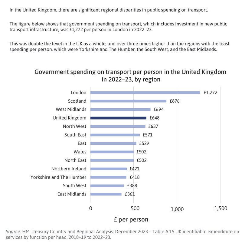
Figure 2 The information provided to the treatment group in the experiment.
- conditional mean
- An average of a variable, taken over a subgroup of observations that satisfy certain conditions, rather than all observations.
In the remaining tasks, we will follow the approach used in the article by comparing average values for our key variables for rural respondents in the treatment and control groups. Your results for Questions 4–9 will look similar to Figures 5 and 6 of the article—but not exactly alike, as the authors have controlled for other characteristics between the groups, like taking the conditional mean, whereas your results will show the unconditional mean.
- Using Google Sheet’s filter function on the Data tab, select only the rural respondents. Create a new tab in your spreadsheet and name it ‘Rural’. Copy-and-paste the data for the rural respondents into the Rural tab.
- Create the following column charts in Google Sheets on the Part 2. Tasks tab:
- a chart showing how average unequal treatment perceptions differ for rural respondents in the control and treatment groups
- a chart showing how average carbon tax unfairness perceptions differ for rural respondents in the control and treatment groups
- a chart showing how average carbon tax support differs for rural respondents in the control and treatment groups.
(Hint: Use Google Sheet’s PivotTable option to create three tables showing the average of each variable in the control and treatment groups. Then use these tables as the source data for your charts.)
- Use Google Sheet’s filter function on the Rural tab to sort the
treatmentvariable in ascending order. This will move all the observations for the control group to the top of the spreadsheet and all the observations for the treatment group below.
We will now conduct a formal statistical test to assess how likely it is that the observed differences between the treatment and control group are due to chance (variation that naturally occurs when sampling from the whole UK population) or due to the information treatment (systematic changes in the treatment group’s beliefs and preferences).
- p-value
- The probability of observing data at least as extreme as the data collected if a particular hypothesis about the population is true. The p-value ranges from 0 to 1: the lower the probability (the lower the p-value), the less likely it is to observe the given data, and therefore the less compatible the data are with the hypothesis.
- Use the T.TEST function in Google Sheets to calculate the p-value for the difference in means between the control and treatment groups for:
- unequal treatment perceptions
- carbon tax unfairness perceptions
- carbon tax support.
(Hint: For help on using Google Sheet’s T.TEST function, see Google Sheets walk-through 2.6. As the number of observations in the treatment and control groups are not exactly equal in the experiment, you will need to use option 3 to carry out a two-sample unequal variance t-test. You will also need to remove the respondents that have not answered the carbon tax support question before calculating the p-value for carbon tax support.)
- How do the p-values differ across the three variables? What can this tell us about the statistical significance of the treatment effects found in the experiment? (In other words, how likely is it that the observed differences between treatment and control groups are due to chance?) (Hint: see the discussion on interpreting p-values in Part 2.3 of Empirical Project 2.)
- Extension: Calculate a 95% confidence interval for each of the variables in Question 7 and create a new chart showing the differences in means with their corresponding confidence intervals. (You can either show all three outcomes on the same chart, with carbon tax support expressed as a proportion instead of a percentage, or you can make three separate charts.) Provide an interpretation of these confidence intervals and compare them across the three variables.
(Hint: see Part 6.2 of Empirical Project 6 for an explanation of confidence intervals, and Google Sheets walk-through 1 for guidance on how to add confidence intervals to a chart.)
Google Sheets Walk-through 1 How to add confidence intervals to a chart
![How to add confidence intervals to a chart]()
Figure 3 How to add confidence intervals to a chart
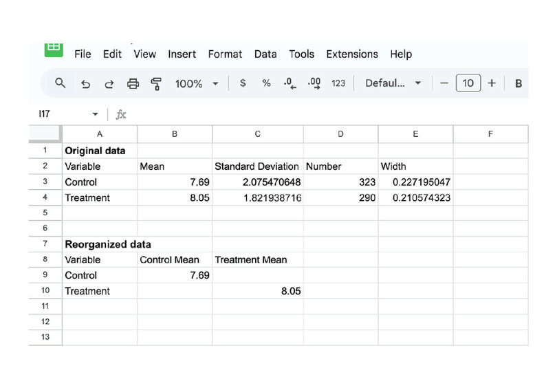
![Reorganize the means into different columns
: Create a new table where the mean for the control and treatment group are in separate columns (called ‘Control Mean’ and ‘Treatment Mean’ respectively). Google Sheets will plot each column as a separate data series.]()
Reorganize the means into different columns
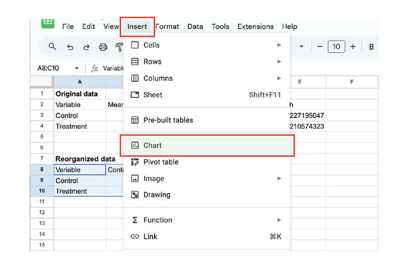
![Plot a chart
: Select the reorganized data. In the menu, select ‘Insert’, then ‘Chart’.]()
Plot a chart
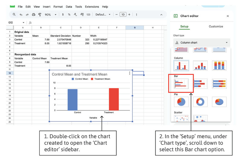
![Change the chart type to a bar chart
: We need to change the default chart to a bar chart so that we can add the confidence intervals.]()
Change the chart type to a bar chart
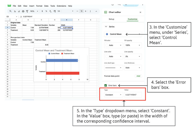
![Add confidence intervals to the chart
: Now use the ‘Customize’ options to add confidence intervals to each bar. You will need to add each confidence interval separately, so repeat steps 3–5 for the treatment mean.]()
Add confidence intervals to the chart
- Information provision survey experiments are an increasingly widely used research methodology in economics. The article, Designing information provision experiments by Haaland et al. (2021) in the Journal of Economic Literature reviews the existing literature and discusses how to best design this type of experiment. Use this article to answer the following questions:
- What are some of the strengths and weaknesses of information provision survey experiments?
- If you were going to re-run the experiment in Hope et al. (2026), what changes would you make to improve the experimental design?
- Use a generative-AI tool to (i) find some strengths and weaknesses of survey experiments that are not mentioned in the Haaland et al. (2023) article and (ii) critique the design of the Hope et al. (2026) experiment. Use the answers provided by the AI tool to revise and enhance your answers to Questions 10(a) and 10(b).
