Extra Empirical Project 2: The politics of carbon taxation Working in Python
Download the code
To download the code chunks used in this project, right-click on the download link and select ‘Save Link As…’. You’ll need to save the code download to your working directory, and open it in Python.
Don’t forget to also download the data into your working directory by following the steps in this project.
Getting started in Python
Visit the ‘Getting started in Python’ page for help and advice on setting up a Python session to work with.
Preliminary settings
Start by importing the packages that you will need. You can either run the code below before starting, or when you need them in the Python walk-throughs.
import pandas as pd
import numpy as np
import matplotlib.pyplot as plt
from scipy import stats
Part 1: Measuring and explaining public support for carbon taxation
In this part, we will analyse survey data on public support for carbon taxation in the UK. We will summarize how support for carbon taxes is distributed and how it is associated with the survey respondents’ demographic characteristics and beliefs.
First, download the survey data and documentation:
- Download the data, which is a simplified version of the dataset from the article ‘Unequal treatment perceptions and rural backlashes against carbon taxation’ by Hope, Limberg, and Steinebach (2026). Also download their article for reference.
- Read the Data dictionary tab in the spreadsheet. Familiarize yourself with the definitions of the variables in the dataset and check that each variable listed in the Data dictionary is also in the Data tab.
Python walk-through 1 Importing data into Python
Since our data is in Excel format, we use the
read_excelfunction (in thepandaspackage) to import the data into Python. We run this command twice: once to import the data dictionary (which we will callvar_info) and once to import the survey data (which we will calldat). We use thesheetoption to tell Python which tab in the Excel file to import.Note that you may have to modify the filepath, depending on where you saved your data.
# Load the data dictionary sheet (variable descriptions and coding)
var_info = pd.read_excel(
    "/ dataset_hope-et-al_simplified.xlsx",
    sheet_name="Data dictionary"
)
# Load the main dataset (survey responses)
dat = pd.read_excel(
    "/ dataset_hope-et-al_simplified.xlsx",
    sheet_name="Data"
)
To check that the data has been imported correctly, you can use the
headfunction to view the first six rows of the dataset, and confirm that they correspond to the columns in the Excel file.dat.head()
respondent_id age neighbourhood commute partisanship treatment carbon_tax_support unequal_treatment carbon_tax_unfairness 0 1 21.0 Suburban Walk Labour Party 1 2.0 7 3 1 2 24.0 Suburban Car Labour Party 1 3.0 4 6 2 3 21.0 Urban Car Labour Party 0 2.0 6 3 3 4 54.0 Suburban NaN Labour Party 1 2.0 7 4 4 5 48.0 Suburban Public transport (bus, train etc.) Labour Party 1 4.0 10 8
- Likert scale
- A numerical scale (usually ranging from 1–5 or 1–7) used to measure attitudes or opinions, with each number representing the individual’s level of agreement or disagreement with a particular statement.
Attitudes towards carbon taxation are assessed on a Likert scale. In this case, the scale measured the level of support for a specific policy (on a 5-point scale running from 1 for ‘strongly oppose’ to 5 for ‘strongly support’). This is a common approach in survey research assessing people’s preferences for economic policies.
- Find the survey question used to ask about carbon tax preferences in Part A of the supplementary material for the article. What step do the authors take to try to ensure that they receive accurate information about respondents’ support for the policy?
- Use the data you have imported to answer the following questions:
- Each respondent in the dataset has been assigned an ID (recorded as
respondent_idin the spreadsheet). How many respondents are there in the dataset?
- In the survey, respondents are randomly assigned to the treatment or control group. Use the treatment variable in the spreadsheet. How many respondents are in the treatment group and how many are in the control group? (Hint: Respondents in the treatment group are given a value of 1 and respondents in the control group are given a value of 0. So, you can highlight the column for the treatment variable and use the ‘Sum’ reported on the grey bar at the bottom of the Excel spreadsheet to find out the number of respondents in the treatment group.)
Python walk-through 2 Making a frequency table
We first use
groupbyto split the data into control and treatment groups, then use thesizefunction to count the number of respondents in each group. This information is stored in the variabletreatment_counts. The punctuation.can be used to link multiple commands together.# Group the data by treatment status and count the number of respondents in each group treatment_counts = ( dat .groupby("treatment") # split data into control (0) and treatment (1) .size() # count number of rows in each group .reset_index(name="n") # convert result to a dataframe with column name 'n' ) # Display the counts treatment_counts
treatment n 0 0 1516 1 1 1481 There are 1,516 respondents in the control group (
treatment= 0) and 1,481 respondents in the treatment group (treatment= 1).
- On page 7 of the article, the authors describe how they recode the variable for carbon tax support for their empirical analysis. How do they recode the variable? What might be the advantages and disadvantages of doing this?
- dummy variable (indicator variable)
- A variable that takes the value 1 if a certain condition is met, and 0 otherwise.
Binary variables are dichotomous—they can only take one of two possible values or categories (for example, ‘yes’ and ‘no’ or ‘true’ and ‘false’). One way to simplify variables in a dataset to make them easier to analyse is to transform them into binary variables. When a binary variable is created that only takes the values of 0 or 1, it is referred to as a dummy variable (also known as an indicator variable).
We will now create dummy variables.
- Create a dummy variable for carbon tax support that takes a value of 1 if the variable
carbon_tax_supportis 1 or 2 (that is, respondents ‘strongly support’ or ‘support’ carbon taxation) and 0 otherwise. When creating this variable, missing data (blank cells that indicate which respondents did not answer the carbon tax support question in the survey) should still be coded as missing (that is,NA).
- Create four more dummy variables that will be used in the analysis for this project. Give each of these new variables an informative name:
- a dummy variable indicating whether respondents are aged 40 or above (coded as 1) or under 40 years of age (coded as 0)
- a dummy variable indicating whether respondents commute by car (1) or by other means (0)
- a dummy variable indicating whether respondents live in a rural area (1) or a non-rural area (0) (Note: people living in ‘urban’ and ‘suburban’ areas should be coded as 0)
- a dummy variable indicating whether respondents have an
unequal_treatmentvalue of 8 or above (1) or below 8 (0) (Note: Part 2 of the project discusses the meaning of this variable in more depth).
Python walk-through 3 Creating dummy variables
First, we create a new column and set all its values to missing,
NA. We then use theisinfunction to fill this column with 0 or 1, depending on whether certain conditions are met.# Import Numpy - used to create missing values, python's way of representing NA values import numpy as np # Carbon tax support dummy # We create a new column and start by setting all values to missing (NA) dat["carbon_tax_support_dummy"] = np.nan # Set value to 1 if the respondent supports the carbon tax (coded as 1 or 2) dat.loc[dat["carbon_tax_support"].isin([1, 2]), "carbon_tax_support_dummy"] = 1 # Set value to 0 if the respondent does not support the carbon tax dat.loc[dat["carbon_tax_support"].isin([3, 4, 5]), "carbon_tax_support_dummy"] = 0 # Age dummy # Create a new column with missing values dat["age_dummy"] = np.nan # Set value to 1 if the respondent is older than 40 dat.loc[dat["age"] > 40, "age_dummy"] = 1 # Set value to 0 only if age is observed and 40 or younger # The notna() condition ensures missing ages remain missing dat.loc[(dat["age"].notna()) & (dat["age"] <= 40), "age_dummy"] = 0 # Car commuting dummy # Create a new column with missing values dat["car_dummy"] = np.nan # Set value to 1 if the respondent commutes by car dat.loc[dat["commute"] == "Car", "car_dummy"] = 1 # Set value to 0 only if commute information is observed # This avoids incorrectly coding missing values as non-car commuters dat.loc[ (dat["commute"].notna()) & (dat["commute"] != "Car"), "car_dummy" ] = 0 # Rural dummy # Create a new column with missing values dat["rural"] = np.nan # Set value to 1 if the respondent lives in a rural neighbourhood dat.loc[dat["neighbourhood"] == "Rural", "rural"] = 1 # Set value to 0 only if neighbourhood information is observed # This prevents missing neighbourhoods from being coded as non-rural dat.loc[ (dat["neighbourhood"].notna()) & (dat["neighbourhood"] != "Rural"), "rural" ] = 0 # Unequal treatment perception dummy # Create a new column with missing values dat["unequal_treatment_dummy"] = np.nan # Set value to 1 if perceived unequal treatment is 8 or higher dat.loc[dat["unequal_treatment"] >= 8, "unequal_treatment_dummy"] = 1 # Set value to 0 only if unequal treatment is observed and below 8 # The notna() condition ensures missing values remain missing dat.loc[ (dat["unequal_treatment"].notna()) & (dat["unequal_treatment"] < 8), "unequal_treatment_dummy" ] = 0To check we have coded the dummy variables correctly, we can create a summary table showing the number of zeros, ones, and missing data.
# A good check point: Summary tables for the dummy variables
# List of dummy variable names we want to check
dummy_variables = [
    "carbon_tax_support_dummy",
    "age_dummy",
    "car_dummy",
    "rural",
    "unequal_treatment_dummy"
]

# Create an empty DataFrame to store the summary results
dummy_summary = pd.DataFrame()

# Loop over each dummy variable in the list above
for var in dummy_variables:
    # dat[var] selects one column from the dataset
    # value_counts(dropna=False) counts how many times
    # each value (0, 1, and missing values) appears
    dummy_summary[var] = dat[var].value_counts(dropna=False)
# To display the result
dummy_summary
carbon_tax_support_dummy age_dummy car_dummy rural unequal_treatment_dummy carbon_tax_support_dummy 0.0 1623 1104 917 2384.0 1270.0 1.0 1318 1695 1124 613.0 1727.0 NaN 56 198 956 NaN NaN
We will now use the dataset to explore public support for carbon taxation in the UK. For the rest of Part 1, we will only use data from the control group (as we want to look at baseline support without any influence from the treatment in the experiment, which will be discussed further in Part 2 of the project).
- Create a new data frame called
Controlthat only contains data for the control group (in other words, only for the respondents whose value for the variabletreatmentis 0).
For Questions 7–12, use the data in the dataframe Control.
We will start by using the original carbon tax variable with all five answer categories to see how carbon tax support is distributed. We will then turn to our dummy variable for carbon tax support to help simplify the remainder of the analysis.
- Create a frequency table (like that in Figure 1) that shows the number and percentage of respondents in each of the five answer categories for the variable
carbon_tax_support.
| Carbon tax support | Number of respondents | Percentage of respondents |
|---|---|---|
| Strongly oppose | ||
| Oppose | ||
| Neither support nor oppose | ||
| Support | ||
| Strongly support |
Figure 1 The distribution of carbon tax support in the UK.
- Use the data from the frequency table in Question 7 to create a column chart showing the percentage of respondents in each category of carbon tax support.
Python walk-through 4 Making a frequency and column chart on a subset of data
We select observations in the control group (
treatment == 0) and save these in a new dataframe calledControl.# Create a new dataset that includes only the control group (treatment == 0) Control = dat[dat["treatment"] == 0] # Display the first few rows to check the subset of data selected Control.head()
respondent_id age neighbourhood commute partisanship treatment carbon_tax_support unequal_treatment carbon_tax_unfairness carbon_tax_support_dummy age_dummy car_dummy rural unequal_treatment_dummy 2 3 21.0 Urban Car Labour Party 0 2.0 6 3 1.0 0.0 1.0 0.0 0.0 5 6 46.0 Suburban Car Liberal Democrats 0 4.0 7 7 0.0 1.0 1.0 0.0 0.0 7 8 30.0 Suburban Walk Reform UK 0 3.0 10 7 0.0 0.0 0.0 0.0 1.0 8 9 28.0 Urban Public transport (bus, train etc.) Scottish National Party 0 3.0 9 7 0.0 0.0 0.0 0.0 1.0 9 10 21.0 Suburban Car Conservative Party 0 3.0 9 4 0.0 0.0 1.0 0.0 1.0 We will create a frequency table (called
freq_table) using three functions. First, we count (value_counts) the occurrences of each value in thecarbon_tax_supportvariable. Second, we order the categories numerically (sort_index). Third, we usereset_indexto convert the result into a dataframe.# Frequency table for carbon tax support # Create a dictionary to map numeric response codes to descriptive labels carbon_tax_labels = { 1: "Strongly support", 2: "Support", 3: "Neither support nor oppose", 4: "Oppose", 5: "Strongly oppose" } # Remove observations where carbon_tax_support is missing (count only valid responses) freq_table = Control[Control["carbon_tax_support"].notna()] # Count how many respondents chose each support category freq_table = ( freq_table["carbon_tax_support"] .value_counts() .sort_index() .reset_index() ) # Rename columns to make the table easier to read freq_table.columns = ["carbon_tax_support", "n"] # Add descriptive labels using the dictionary above freq_table["Support label"] = freq_table["carbon_tax_support"].map(carbon_tax_labels) # Calculate the percentage of respondents in each category freq_table["Percentage"] = freq_table["n"] / freq_table["n"].sum() * 100 # Reorder columns to make the table easier to read freq_table = freq_table[ ["Support label", "carbon_tax_support", "n", "Percentage"] ] # Display the frequency table freq_table
Support label carbon_tax_support n Percentage 0 Strongly support 1.0 131 8.768407 1 Support 2.0 557 37.282463 2 Neither support nor oppose 3.0 282 18.875502 3 Oppose 4.0 317 21.218206 4 Strongly oppose 5.0 207 13.855422 We now use the
pltpackage to make a column chart (plt.bar) withcarbon_tax_supportas the horizontal variable andPercentageas the vertical variable.# Importing Matplotlib to create graphs and charts in Python import matplotlib.pyplot as plt # Create a new figure plt.figure(figsize=(8, 5)) # make the figure wider so labels fit naturally # Create the column bar chart bars = plt.bar(freq_table["Support label"], freq_table["Percentage"]) # Add title and axis labels plt.title("Distribution of support for carbon taxation in the UK") plt.xlabel("Carbon Tax Support") plt.ylabel("Percentage of Respondents") # Reduce the font size of x-axis tick labels plt.xticks(fontsize=8) # Add percentage labels on top of each bar for bar in bars: height = bar.get_height() plt.text( bar.get_x() + bar.get_width() / 2, height, f"{height:.1f}%", ha="center", va="bottom", fontsize=8 ) # Adjust layout so everything fits plt.tight_layout() # Display the plot plt.show()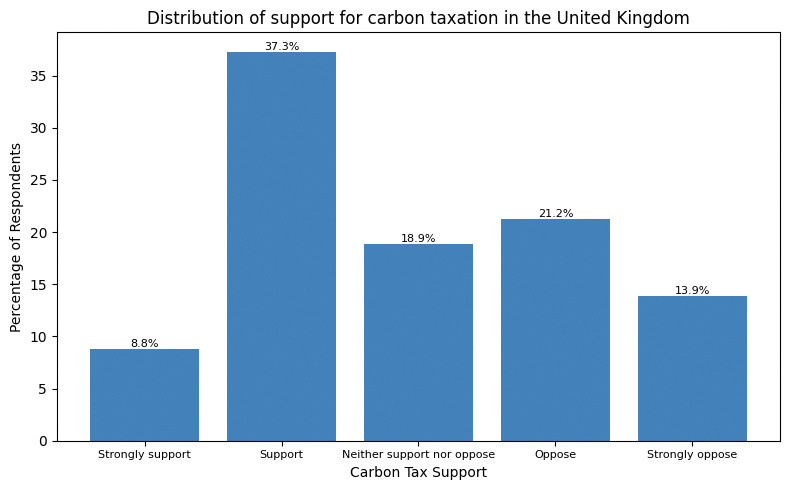
![Share of respondents by carbon tax support.]()
Figure 2 Share of respondents by carbon tax support.
- Use your chart from Question 8 to discuss the extent of support for carbon taxation in the UK. (For example, how does the percentage of respondents who support or strongly support carbon taxation compare with the percentage of respondents who oppose or strongly oppose carbon taxation?)
- Use the dummy variable for carbon tax support to do the following:
- Calculate the average of this dummy variable. How does this average relate to the table you created in Question 7?
- Provide an interpretation of the average of the carbon tax support dummy variable.
Python walk-through 5 Calculating the average of a dummy variable
The average of a dummy variable is a proportion (between 0 and 1) that can be multiplied by 100 to represent the percentage of respondents for which the variable equals 1.
In Python walk-through 3, we already calculated summary statistics (counts) for all the dummy variables. We can display this table again.
dummy_summary
carbon_tax_support_dummy age_dummy car_dummy rural unequal_treatment_dummy unequal_treatment_dummy carbon_tax_support_dummy 0.0 1623 1104 917 2384.0 1270.0 1270.0 1.0 1318 1695 1124 613.0 1727.0 1727.0 NaN 56 198 956 NaN NaN NaN Python creates a separate row for the missing data (56 observations). 1,318 respondents support the carbon tax, which corresponds to 44% of the sample (or 44.8%, if excluding the missing data).
- conditional mean
- An average of a variable, taken over a subgroup of observations that satisfy certain conditions, rather than all observations.
We will now use our carbon tax support dummy variable and other variables in the dataset to explore how support for carbon taxes varies across different groups in the UK. Specifically, we will calculate the average of the carbon tax dummy variable for different subgroups in the dataset (in other words, we will calculate conditional means for the carbon tax dummy variable).
- Create the following tables:
- a table showing how average carbon tax support differs for respondents under 40, and those aged 40 and over
- a table showing how average carbon tax support differs for respondents who commute by car and those who do not
- a table showing how average carbon tax support differs for respondents living in rural areas and non-rural areas
- a table showing how average carbon tax support differs for respondents who support different political parties.
Python walk-through 6 Creating summary tables for different groups
Using the
Controldataframe, we first usedropnato remove rows with missing data for age and carbon tax support, then usegroup_byto specify the groups for which the calculations will be done separately (age_dummyin this case). Finally, we use themeanfunction to calculate the mean for each group and convert (reset_index) the result to a dataframe calledage_support.# (a) Carbon tax support by age group # (age_dummy = 1 if age > 40) age_support = ( Control # Remove observations with missing age or missing support dummy .dropna(subset=["age_dummy", "carbon_tax_support_dummy"]) # Group respondents by age group .groupby("age_dummy")["carbon_tax_support_dummy"] # Calculate the mean support within each group .mean() # Convert the result to a DataFrame .reset_index() ) # Display results age_support
age_dummy carbon_tax_support_dummy 0 0.0 0.528233 1 1.0 0.412530 Now we repeat the same steps for the other dummy variables.
# (b) Carbon tax support by commuting by car
# (car_dummy = 1 if respondent commutes by car)
car_support = (
    Control
    # Remove observations with missing commute information or support
    .dropna(subset=["car_dummy", "carbon_tax_support_dummy"])
    # Group respondents by car commuting status
    .groupby("car_dummy")["carbon_tax_support_dummy"]
    # Calculate the mean support within each group
    .mean()
    # Convert the result to a DataFrame
    .reset_index()
)

# Display results
car_support
car_dummy carbon_tax_support_dummy 0 0.0 0.552106 1 1.0 0.407473 # (c) Carbon tax support by rural status # (rural = 1 if respondent lives in a rural area) rural_support = ( Control # Remove observations with missing rural status or support .dropna(subset=["rural", "carbon_tax_support_dummy"]) # Group respondents by rural status .groupby("rural")["carbon_tax_support_dummy"] # Calculate the mean support within each group .mean() # Convert the result to a DataFrame .reset_index() ) # Display results rural_support
rural carbon_tax_support_dummy 0 0.0 0.468484 1 1.0 0.431250 # (d) Carbon tax support by partisanship partisanship_support = ( Control # Remove observations with missing partisanship or support .dropna(subset=["partisanship", "carbon_tax_support_dummy"]) # Group respondents by political partisanship .groupby("partisanship")["carbon_tax_support_dummy"] # Calculate the mean support within each group .mean() # Convert the result to a DataFrame .reset_index() ) # Display results partisanship_support
partisanship carbon_tax_support_dummy 0 Conservative Party 0.343396 1 Democratic Unionist Party 0.750000 2 Green Party of England and Wales 0.690141 3 Labour Party 0.552000 4 Liberal Democrats 0.528571 5 Other 0.500000 6 Plaid Cymru 0.333333 7 Prefer not to say 0.261905 8 Reform UK 0.166667 9 Scottish National Party 0.617021 10 Sinn Féin 0.375000
- Use the tables in Question 11 to describe how support for carbon taxation in the UK varies across population subgroups. Suggest two other variables (not included in the dataset) that might be associated with people’s support for carbon taxes.
Part 2: Explaining rural backlashes against carbon taxation
Note
You will need to complete Part 1 before starting Part 2.
In Part 2 of the project, we focus on explaining rural backlashes against carbon taxation. In recent years, there have been several high-profile examples of this phenomenon including the 2018–2020 ‘Gilet Jaunes’ protests in France, which were sparked by a proposed rise in fuel taxes, and the mobilization of rural communities in British Columbia in Canada to fight the introduction of a new carbon tax. If governments hope to build broad-based support for carbon taxation, then it is important to understand better why these communities have such fierce resistance to carbon taxes.
That is the research question at the centre of Hope, Limberg, and Steinebach’s (2026) article ‘Unequal treatment perceptions and rural backlashes against carbon taxation’. In the article, the authors argue that rural backlashes against carbon taxation are not only driven by the direct costs borne by rural communities, but also by fairness considerations. People living in rural areas may oppose carbon taxes on the grounds that these taxes unfairly punish rural communities that are already disadvantaged and marginalized compared with the urban centres of economic and political power. Hence, the article argues that underlying resentments at unequal treatment by the government are an important reason for rural backlashes against carbon taxes.
We will use the simplified version of the dataset from the article to explore the empirical support for the authors’ argument. We will also learn about information provision survey experiments and how they can be utilized to test causal arguments about what drives people’s beliefs and policy preferences.
For this part of the project, we will add to the dataset that you worked on for Part 1 of the project. We will only use data from the rural respondents in the dataset, as this is the subgroup that we are interested in investigating further.
- Before you begin the tasks below, look at the Data dictionary tab in the original Excel file and familiarize yourself with how the survey measures respondents’ perceptions of unequal treatment by the government and respondents’ perceptions of the unfairness of carbon taxes. Think about how we can we interpret high values for these two variables.
- We start by selecting all the data for the rural respondents in the control group. Create a new dataframe called
rural_controlthat only contains data for rural respondents in the control group.
- Create the following tables:
- a table showing how average carbon tax unfairness perceptions (
carbon_tax_unfairness) differ for rural respondents in the control group who perceive a high degree of unequal treatment (8 or above on the 0–10 scale) compared with those who do not (Hint: Use the dummy variable for unequal treatment that you created in Part 1 Question 5 of the project.)
- a table showing how average carbon tax support differs for rural respondents in the control group who perceive a lot of unequal treatment (8 or above on the 0–10 scale) and those who do not.
Python walk-through 7 Creating summary tables on a subset of data
First, we select only the rows in the
Controldataframe that have rural respondents, and call this dataframerural_control.# (a) Focus is only on respondents who live in rural areas and belong to the control group # Create a dataset with only rural respondents in the control group rural_control = Control[Control["rural"] == 1]To create the summary tables, we use the
dropna,group_by,mean, andreset_indexfunctions just like in Python walk-through 6 from Part 1.# Perceived unfairness of carbon tax by unequal treatment perceptions # (unequal_treatment_dummy = 1 if perception >= 8) unfairness_by_group =( rural_control .dropna(subset=["unequal_treatment_dummy", "carbon_tax_unfairness"]) .groupby("unequal_treatment_dummy")["carbon_tax_unfairness"] .mean() .reset_index() ) # Display results unfairness_by_group
unequal_treatment_dummy carbon_tax_unfairness 0 0.0 5.126984 1 1.0 6.203046 #(b) Average carbon tax support by unequal treatment perception support_by_group = ( rural_control .dropna(subset=["unequal_treatment_dummy", "carbon_tax_support_dummy"]) .groupby("unequal_treatment_dummy")["carbon_tax_support_dummy"] .mean() .reset_index() ) # Display results support_by_group
unequal_treatment_dummy carbon_tax_support_dummy 0 0.0 0.472000 1 1.0 0.405128
- Use the tables from Question 2 to describe the relationship between perceptions of unequal treatment and a) carbon tax unfairness perceptions, and b) support for carbon taxation.
- correlation
- A measure of how closely related two variables are. Two variables are correlated if knowing the value of one variable provides information on the likely value of the other, for example high values of one variable being commonly observed along with high values of the other variable. Correlation can be positive or negative. It is negative when high values of one variable are observed with low values of the other. Correlation does not mean that there is a causal relationship between the variables. Example: When the weather is hotter, purchases of ice cream are higher. Temperature and ice cream sales are positively correlated. On the other hand, if purchases of hot beverages decrease when the weather is hotter, we say that temperature and hot beverage sales are negatively correlated.
- causation
- A direction from cause to effect, establishing that a change in one variable produces a change in another. While a correlation gives an indication of whether two variables move together (either in the same or opposite directions), causation means that there is a mechanism that explains this association. Example: We know that higher levels of CO2 in the atmosphere lead to a greenhouse effect, which warms the Earth’s surface. Therefore we can say that higher CO2 levels are the cause of higher surface temperatures.
- information provision survey experiment
- A research methodology where survey respondents are randomly assigned to receive different information. Researchers then look at how the information provided affects respondents’ beliefs and preferences. Information provision survey experiments are a useful tool for testing causal arguments about what drives people’s economic policy preferences.
Correlation and causation are distinct concepts: a correlation between two variables does not necessarily mean that there is a causal relationship between them (Part 1.3 of Empirical Project 1 discusses these concepts in more detail). So, we need more evidence to determine whether there is a causal relationship between the variables you summarized in Question 2.
In the article, the authors carry out an information provision survey experiment to examine the causal relationship between unequal treatment perceptions and lower support for carbon taxation.
The survey respondents were randomly assigned to the control or treatment group when beginning the survey. They first answered some questions about their demographic characteristics (such as ethnicity, level of education, and household income). After this, the treatment group was shown some information, whereas the control group was not. The survey then asked respondents about their beliefs and policy preferences related to carbon taxation. The full survey that respondents completed is included in the supplementary material for the article.
Since the treatment and control group were randomly assigned, any differences in beliefs and policy preferences between these two groups would reflect the effect of the information provided to the treatment group. The authors wanted to test whether perceptions of unequal treatment affected carbon tax support for rural respondents, so they provided information that would particularly strengthen perceptions of unequal treatment among rural respondents.
Figure 3 shows the information provided to respondents in the treatment group. It highlights the highly uneven distribution of government spending on transport (per person) across regions in the UK. London stands out as the region with the highest per-capita government spending on transport by far. The level spent in London is almost double the amount spent across the whole UK. Crucially, London is the largest urban area in the UK and the seat of political power. The information therefore particularly highlights unequal treatment by the UK government along urban–rural lines.
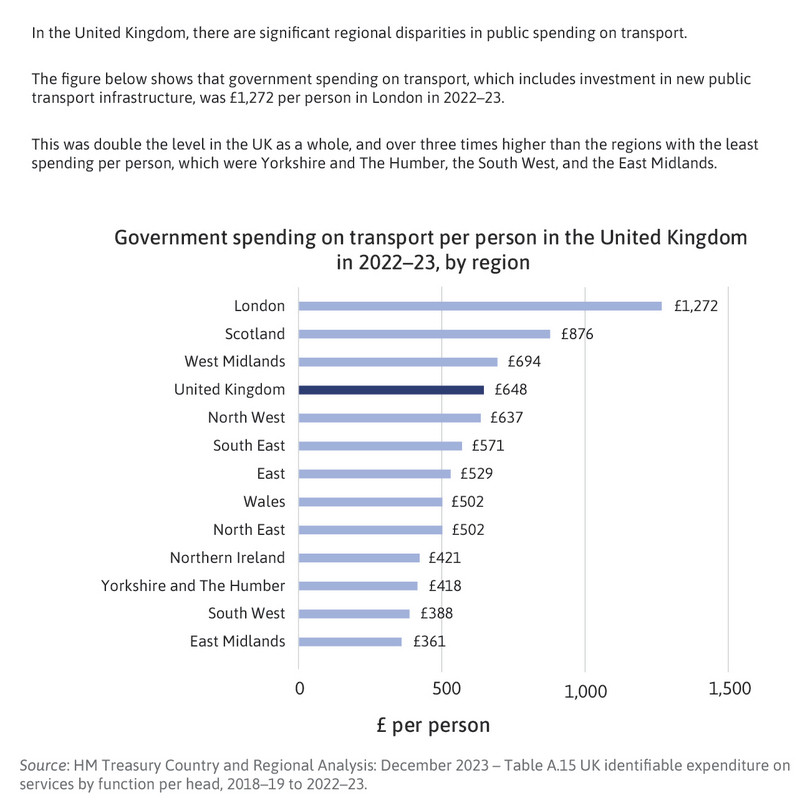
Figure 3 The information provided to the treatment group in the experiment.
- conditional mean
- An average of a variable, taken over a subgroup of observations that satisfy certain conditions, rather than all observations.
In the remaining tasks, we will follow the approach used in the article by comparing average values for our key variables for rural respondents in the treatment and control groups. Your results for Questions 4–9 will look similar to Figures 5 and 6 of the article—but not exactly alike, as the authors have controlled for other characteristics between the groups, like taking the conditional mean, whereas your results will show the unconditional mean.
- Create a new dataframe called
ruralthat contains rural respondents in the control and treatment group.
- Create the following column charts:
- a chart showing how average unequal treatment perceptions differ for rural respondents in the control and treatment groups
- a chart showing how average carbon tax unfairness perceptions differ for rural respondents in the control and treatment groups
- a chart showing how average carbon tax support differs for rural respondents in the control and treatment groups.
Python walk-through 8 Creating column charts
We create a new dataframe called
ruralthat contains all the rows that satisfy the conditionrural == 1.# Subset data to include only rural respondents rural = dat[dat["rural"] == 1]To create the column charts, we first use the
dropna,group_by,mean, andreset_indexfunctions to calculate the mean separately for each group (treatment and control). Then we use thepltpackage to create the column chart, and useplt.textto add data labels (the averages) above each column.# Create labels for treatment groups # 0 = Control group, 1 = Treatment group treatment_labels = {0: "Control", 1: "Treatment"} # Average unequal treatment perception by treatment group unequal_treatment_by_treatment = ( rural # Remove missing values .dropna(subset=["unequal_treatment"]) # Group respondents by treatment status (0 = control, 1 = treatment) .groupby("treatment")["unequal_treatment"] # Calculate the average perception in each group .mean() .reset_index() ) # Replace numeric treatment codes with labels unequal_treatment_by_treatment["treatment"] = ( unequal_treatment_by_treatment["treatment"].map(treatment_labels) ) # Create column chart plt.figure(figsize=(6, 4)) bars = plt.bar( unequal_treatment_by_treatment["treatment"], unequal_treatment_by_treatment["unequal_treatment"] ) # Add title and axis labels plt.title("Average Unequal Treatment Perceptions") plt.xlabel("Group") plt.ylabel("Average Perceived Unequal Treatment") # Add data labels on top of bars for bar in bars: height = bar.get_height() plt.text( bar.get_x() + bar.get_width() / 2, height, f"{height:.2f}", ha="center", va="bottom", fontsize=8 ) plt.tight_layout() plt.show()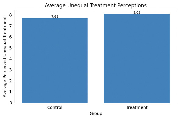
![Average unequal treatment perceptions.]()
Figure 4 Average unequal treatment perceptions.
We repeat the same steps for unfairness perceptions (
carbon_tax_unfairness) and carbon tax support (carbon_tax_support_dummy).# Average carbon tax unfairness by treatment group unfairness_by_treatment = ( rural # Remove observations with missing unfairness perceptions .dropna(subset=["carbon_tax_unfairness"]) # Group respondents by treatment status .groupby("treatment")["carbon_tax_unfairness"] # Calculate the average unfairness perception .mean() .reset_index() ) # Replace numeric treatment codes with labels unfairness_by_treatment["treatment"] = ( unfairness_by_treatment["treatment"].map(treatment_labels) ) plt.figure(figsize=(6, 4)) bars = plt.bar( unfairness_by_treatment["treatment"], unfairness_by_treatment["carbon_tax_unfairness"] ) plt.title("Average Carbon Tax Unfairness Perception") plt.xlabel("Group") plt.ylabel("Average Carbon Tax Unfairness Perception") for bar in bars: height = bar.get_height() plt.text( bar.get_x() + bar.get_width() / 2, height, f"{height:.2f}", ha="center", va="bottom", fontsize=8 ) plt.tight_layout() plt.show() # Average carbon tax support by treatment group support_by_treatment = ( rural # Remove observations with missing carbon tax support dummy .dropna(subset=["carbon_tax_support_dummy"]) # Group respondents by treatment status .groupby("treatment")["carbon_tax_support_dummy"] # Calculate the average support (share supporting the tax) .mean() .reset_index() ) # Replace numeric treatment codes with labels support_by_treatment["treatment"] = ( support_by_treatment["treatment"].map(treatment_labels) ) plt.figure(figsize=(6, 4)) bars = plt.bar( support_by_treatment["treatment"], support_by_treatment["carbon_tax_support_dummy"] ) plt.title("Average Carbon Tax Support") plt.xlabel("Group") plt.ylabel("Average Carbon Tax Support") for bar in bars: height = bar.get_height() plt.text( bar.get_x() + bar.get_width() / 2, height, f"{height:.2f}", ha="center", va="bottom", fontsize=8 ) plt.tight_layout() plt.show()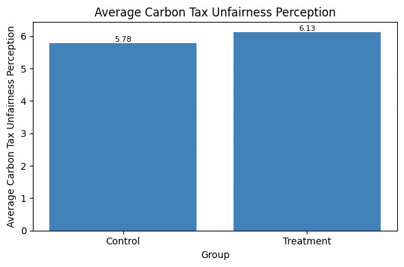
![Average carbon tax unfairness perception.]()
Figure 5 Average carbon tax unfairness perception.

![Average carbon tax support.]()
Figure 6 Average carbon tax support.
- Sort the
treatmentvariable in ascending order (move all the observations for the control group to the top of the dataframe and all the observations for the treatment group below).
We will now conduct a formal statistical test to assess how likely it is that the observed differences between the treatment and control group are due to chance (variation that naturally occurs when sampling from the whole UK population) or due to the information treatment (systematic changes in the treatment group’s beliefs and preferences).
- p-value
- The probability of observing data at least as extreme as the data collected if a particular hypothesis about the population is true. The p-value ranges from 0 to 1: the lower the probability (the lower the p-value), the less likely it is to observe the given data, and therefore the less compatible the data are with the hypothesis.
- Calculate the p-value for the difference in means between the control and treatment groups for:
- unequal treatment perceptions
- carbon tax unfairness perceptions
- carbon tax support.
Python walk-through 9 Calculating p-values for differences in means
To calculate the p-value for
unequal_treatment, we uselocto extract data for that variable and create separate vectors to store the data for control and treatment group (unequal_controlandunequal_treatment, respectively). We then use these vectors as inputs in thettest_indfunction. Here we use the assumption of equal variances (equal_var = True).# Import the t-test function from scipy # scipy.stats provides standard statistical tests in Python from scipy import stats # Restrict the sample to rural respondents rural = dat[dat["rural"] == 1] # 1. Unequal treatment perceptions # Control group values unequal_control = ( rural .loc[rural["treatment"] == 0, "unequal_treatment"] .dropna() ) # Treatment group values unequal_treatment = ( rural .loc[rural["treatment"] == 1, "unequal_treatment"] .dropna() ) # Two-sample t-test (equal variances, two-sided) unequal_ttest = stats.ttest_ind( unequal_control, unequal_treatment, equal_var=True )We repeat these steps for
carbon_tax_unfairnessandcarbon_tax_support_dummy. To display the results, we create a table calledttest_resultsthat shows the means and p-values.# 2. Carbon tax unfairness perceptions # Control group values unfairness_control = ( rural .loc[rural["treatment"] == 0, "carbon_tax_unfairness"] .dropna() ) # Treatment group values unfairness_treatment = ( rural .loc[rural["treatment"] == 1, "carbon_tax_unfairness"] .dropna() ) # Two-sample t-test (equal variances, two-sided) unfairness_ttest = stats.ttest_ind( unfairness_control, unfairness_treatment, equal_var=True ) # 3. Carbon tax support support_control = rural.loc[ rural["treatment"] == 0, "carbon_tax_support" ].dropna() support_treatment = rural.loc[ rural["treatment"] == 1, "carbon_tax_support" ].dropna() support_ttest = stats.ttest_ind( support_control, support_treatment, equal_var=True ) # Display results: means and p-values # Means of the dummy variable correspond to shares supporting the tax ttest_results = pd.DataFrame({ "Control mean": [ unequal_control.mean(), unfairness_control.mean(), support_control.mean() ], "Treatment mean": [ unequal_treatment.mean(), unfairness_treatment.mean(), support_treatment.mean() ], "Difference (Treatment − Control)": [ unequal_treatment.mean() - unequal_control.mean(), unfairness_treatment.mean() - unfairness_control.mean(), support_treatment.mean() - support_control.mean() ], "p-value": [ unequal_ttest.pvalue, unfairness_ttest.pvalue, support_ttest.pvalue ] }, index=[ "Unequal treatment perception", "Carbon tax unfairness perception", "Carbon tax support (1–5 scale)" ]) ttest_results
Control mean Treatment mean Difference (Treatment − Control) p-value Unequal treatment perception 7.690402 8.048276 0.357873 0.024331 Carbon tax unfairness perception 5.783282 6.127586 0.344304 0.082255 Carbon tax support (1–5 scale) 3.009375 3.271127 0.261752 0.006153
- How do the p-values differ across the three variables? What can this tell us about the statistical significance of the treatment effects found in the experiment? (In other words, how likely is it that the observed differences between treatment and control groups are due to chance?) (Hint: see the discussion on interpreting p-values in Part 2.3 of Empirical Project 2.)
- Extension: Calculate a 95% confidence interval for each of the variables in Question 7 and create a new chart showing the differences in means with their corresponding confidence intervals. (You can either show all three outcomes on the same chart, with carbon tax support expressed as a proportion instead of a percentage, or you can make three separate charts.) Provide an interpretation of these confidence intervals and compare them across the three variables.
Python walk-through 10 Calculating confidence intervals and adding them to a chart
First, we import the libraries we need (if this hasn’t been done at the start of the project) and create a dataframe called
ruralthat only contains data for rural respondents.# (a) In this walk-through, we construct 95% confidence intervals # for the mean of each outcome variable (among rural respondents), # separately for the control and treatment groups. # We then visualise these confidence intervals using error-bar charts. import numpy as np import matplotlib.pyplot as plt # Restrict the sample to rural respondents rural = dat[dat["rural"] == 1]Now we create our own function called
mean_cito compute the mean and 95% confidence interval. This function takes any variable (defined asseries), drops missing values (dropna), computes the mean (mean), computes the standard error (\(\text{standard deviation}/\sqrt{\text{number of observations}}\)), and constructs a 95% confidence interval using 1.96 \(\times\) SE. We calculateci_lowerandci_upperas the lower and upper bounds of the confidence interval.# Create function to compute mean and 95% CI def mean_ci(series): series = series.dropna() mean = series.mean() se = series.std(ddof=1) / np.sqrt(series.shape[0]) ci_lower = mean - 1.96 * se ci_upper = mean + 1.96 * se return mean, ci_lower, ci_upperWe now create a summary table called
ci_tablethat shows the number of observations, the mean and confidence interval (lower and upper bound) for the treatment and control group.# Variables to analyse variables = { "Unequal treatment perception": "unequal_treatment", "Carbon tax unfairness perception": "carbon_tax_unfairness", "Carbon tax support (1–5 scale)": "carbon_tax_support" } # Construct confidence interval table ci_results = [] for label, var in variables.items(): # Control group statistics control_series = rural.loc[rural["treatment"] == 0, var] c_mean, c_low, c_high = mean_ci(control_series) # Treatment group statistics treatment_series = rural.loc[rural["treatment"] == 1, var] t_mean, t_low, t_high = mean_ci(treatment_series) # Store results ci_results.append([ label, "Control", c_mean, c_low, c_high ]) ci_results.append([ label, "Treatment", t_mean, t_low, t_high ]) # Convert results to a DataFrame ci_table = pd.DataFrame( ci_results, columns=[ "Variable", "Group", "Mean", "CI lower (95%)", "CI upper (95%)" ] ) # Display the confidence interval table ci_table
Variable Group Mean CI lower (95%) CI upper (95%) 0 Unequal treatment perception Control 7.690402 7.464057 7.916748 1 Unequal treatment perception Treatment 8.048276 7.838580 8.257972 2 Carbon tax unfairness perception Control 5.783282 5.514436 6.052128 3 Carbon tax unfairness perception Treatment 6.127586 5.848745 6.406427 4 Carbon tax support (1–5 scale) Control 3.009375 2.881138 3.137612 5 Carbon tax support (1–5 scale) Treatment 3.271127 3.135627 3.406627 Now we can use this table to make column (bar) charts with the mean and 95% confidence interval for each variable. Instead of writing the same code for each variable separately, we use a
forloop to run the same code on all three variables.# Confidence interval plots # Each chart shows: # - bar length = group mean # - horizontal error bars = 95% confidence interval for variable in ci_table["Variable"].unique(): plot_data = ci_table[ci_table["Variable"] == variable] plt.figure(figsize=(6, 4)) plt.barh( plot_data["Group"], plot_data["Mean"], xerr=[ plot_data["Mean"] - plot_data["CI lower (95%)"], plot_data["CI upper (95%)"] - plot_data["Mean"] ], capsize=6 ) plt.title(variable) plt.xlabel("Mean value") plt.ylabel("") plt.tight_layout() plt.show()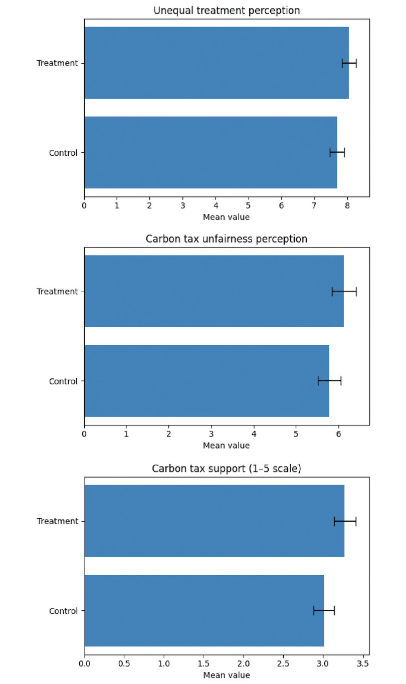
![Mean of unequal treatment perceptions (top), carbon tax unfairness perception (middle), and carbon tax support (bottom), with 95% confidence intervals.]()
Figure 7 Mean of unequal treatment perceptions (top), carbon tax unfairness perception (middle), and carbon tax support (bottom), with 95% confidence intervals.
- Information provision survey experiments are an increasingly widely used research methodology in economics. The article, Designing information provision experiments by Haaland et al. (2021) in the Journal of Economic Literature reviews the existing literature and discusses how to best design this type of experiment. Use this article to answer the following questions:
- What are some of the strengths and weaknesses of information provision survey experiments?
- If you were going to re-run the experiment in Hope et al. (2026), what changes would you make to improve the experimental design?
- Use a generative-AI tool to (i) find some strengths and weaknesses of survey experiments that are not mentioned in the Haaland et al. (2023) article and (ii) critique the design of the Hope et al. (2026) experiment. Use the answers provided by the AI tool to revise and enhance your answers to Questions 10(a) and 10(b).
